Design detail
Airtable
DESIGN.md extracted from the public Airtable website. This is not the official design system. Colors, fonts, and spacing may not be 100% accurate. But it's a good starting point for building something similar.
Live preview
Theme-aware preview frame
Both light and dark preview assets are available.
Documentation
README and DESIGN in one place
Airtable Inspired Design System
DESIGN.md extracted from the public Airtable website. This is not the official design system. Colors, fonts, and spacing may not be 100% accurate. But it's a good starting point for building something similar.
Files
| File | Description |
|---|---|
DESIGN.md |
Complete design system documentation (9 sections) |
preview.html |
Interactive design token catalog (light) |
preview-dark.html |
Interactive design token catalog (dark) |
Use DESIGN.md to use as a reference for AI agents (Claude, Cursor, Stitch) to generate UI that looks like the Airtable design language.
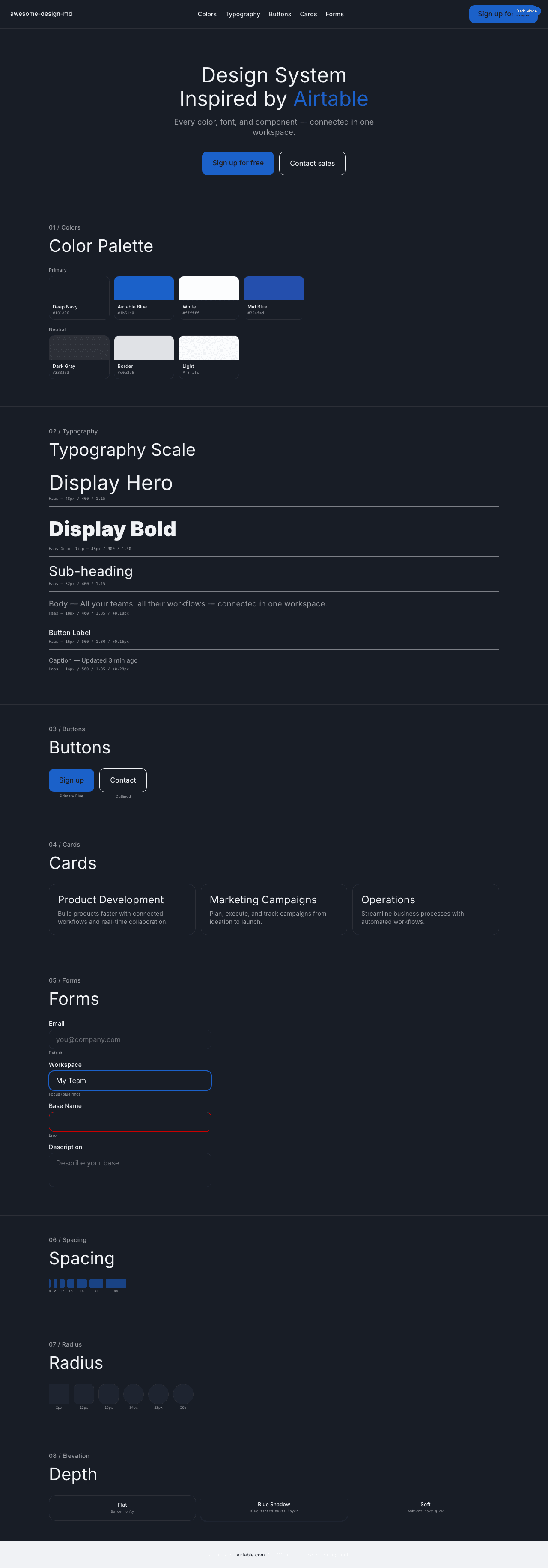
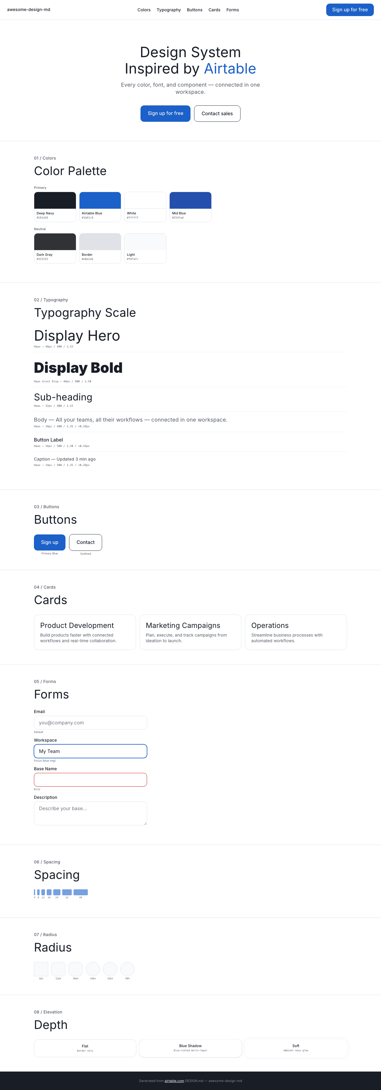
Preview
A sample landing page built with DESIGN.md. It shows the actual colors, typography, buttons, cards, spacing, and elevation, all in one page.
Dark Mode
Light Mode
Design System Inspiration of Airtable
1. Visual Theme & Atmosphere
Airtable's website is a clean, enterprise-friendly platform that communicates "sophisticated simplicity" through a white canvas with deep navy text (#181d26) and Airtable Blue (#1b61c9) as the primary interactive accent. The Haas font family (display + text variants) creates a Swiss-precision typography system with positive letter-spacing throughout.
Key Characteristics:
- White canvas with deep navy text (
#181d26) - Airtable Blue (
#1b61c9) as primary CTA and link color - Haas + Haas Groot Disp dual font system
- Positive letter-spacing on body text (0.08px–0.28px)
- 12px radius buttons, 16px–32px for cards
- Multi-layer blue-tinted shadow:
rgba(45,127,249,0.28) 0px 1px 3px - Semantic theme tokens:
--theme_*CSS variable naming
2. Color Palette & Roles
Primary
- Deep Navy (
#181d26): Primary text - Airtable Blue (
#1b61c9): CTA buttons, links - White (
#ffffff): Primary surface - Spotlight (
rgba(249,252,255,0.97)):--theme_button-text-spotlight
Semantic
- Success Green (
#006400):--theme_success-text - Weak Text (
rgba(4,14,32,0.69)):--theme_text-weak - Secondary Active (
rgba(7,12,20,0.82)):--theme_button-text-secondary-active
Neutral
- Dark Gray (
#333333): Secondary text - Mid Blue (
#254fad): Link/accent blue variant - Border (
#e0e2e6): Card borders - Light Surface (
#f8fafc): Subtle surface
Shadows
- Blue-tinted (
rgba(0,0,0,0.32) 0px 0px 1px, rgba(0,0,0,0.08) 0px 0px 2px, rgba(45,127,249,0.28) 0px 1px 3px, rgba(0,0,0,0.06) 0px 0px 0px 0.5px inset) - Soft (
rgba(15,48,106,0.05) 0px 0px 20px)
3. Typography Rules
Font Families
- Primary:
Haas, fallbacks:-apple-system, system-ui, Segoe UI, Roboto - Display:
Haas Groot Disp, fallback:Haas
Hierarchy
| Role | Font | Size | Weight | Line Height | Letter Spacing |
|---|---|---|---|---|---|
| Display Hero | Haas | 48px | 400 | 1.15 | normal |
| Display Bold | Haas Groot Disp | 48px | 900 | 1.50 | normal |
| Section Heading | Haas | 40px | 400 | 1.25 | normal |
| Sub-heading | Haas | 32px | 400–500 | 1.15–1.25 | normal |
| Card Title | Haas | 24px | 400 | 1.20–1.30 | 0.12px |
| Feature | Haas | 20px | 400 | 1.25–1.50 | 0.1px |
| Body | Haas | 18px | 400 | 1.35 | 0.18px |
| Body Medium | Haas | 16px | 500 | 1.30 | 0.08–0.16px |
| Button | Haas | 16px | 500 | 1.25–1.30 | 0.08px |
| Caption | Haas | 14px | 400–500 | 1.25–1.35 | 0.07–0.28px |
4. Component Stylings
Buttons
- Primary Blue:
#1b61c9, white text, 16px 24px padding, 12px radius - White: white bg,
#181d26text, 12px radius, 1px border white - Cookie Consent:
#1b61c9bg, 2px radius (sharp)
Cards: 1px solid #e0e2e6, 16px–24px radius
Inputs: Standard Haas styling
5. Layout
- Spacing: 1–48px (8px base)
- Radius: 2px (small), 12px (buttons), 16px (cards), 24px (sections), 32px (large), 50% (circles)
6. Depth
- Blue-tinted multi-layer shadow system
- Soft ambient:
rgba(15,48,106,0.05) 0px 0px 20px
7. Do's and Don'ts
Do: Use Airtable Blue for CTAs, Haas with positive tracking, 12px radius buttons
Don't: Skip positive letter-spacing, use heavy shadows
8. Responsive Behavior
Breakpoints: 425–1664px (23 breakpoints)
9. Agent Prompt Guide
- Text: Deep Navy (
#181d26) - CTA: Airtable Blue (
#1b61c9) - Background: White (
#ffffff) - Border:
#e0e2e6