Design detail
Bmw
DESIGN.md extracted from the public BMW website. This is not the official design system. Colors, fonts, and spacing may not be 100% accurate. But it's a good starting point for building something similar.
Live preview
Theme-aware preview frame
Both light and dark preview assets are available.
Documentation
README and DESIGN in one place
Bmw Inspired Design System
DESIGN.md extracted from the public BMW website. This is not the official design system. Colors, fonts, and spacing may not be 100% accurate. But it's a good starting point for building something similar.
Files
| File | Description |
|---|---|
DESIGN.md |
Complete design system documentation (9 sections) |
preview.html |
Interactive design token catalog (light) |
preview-dark.html |
Interactive design token catalog (dark) |
Use DESIGN.md to use as a reference for AI agents (Claude, Cursor, Stitch) to generate UI that looks like the Bmw design language.
Preview
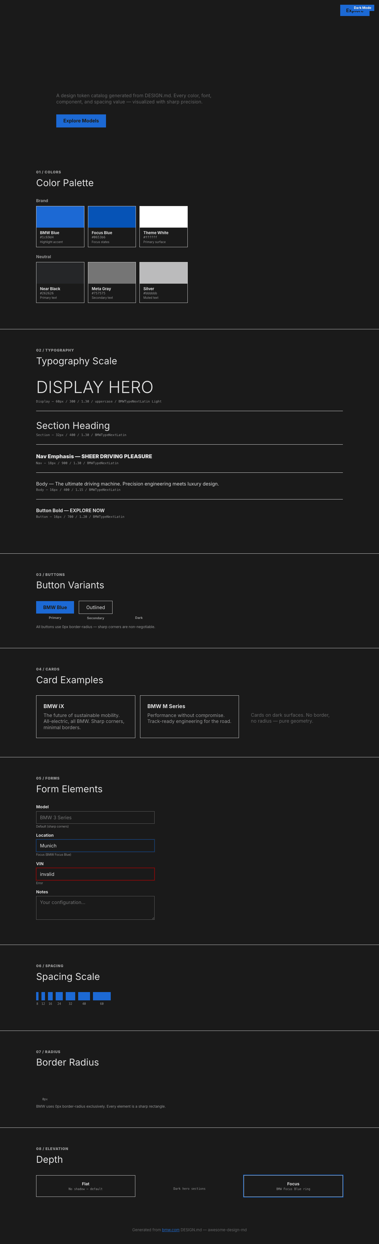
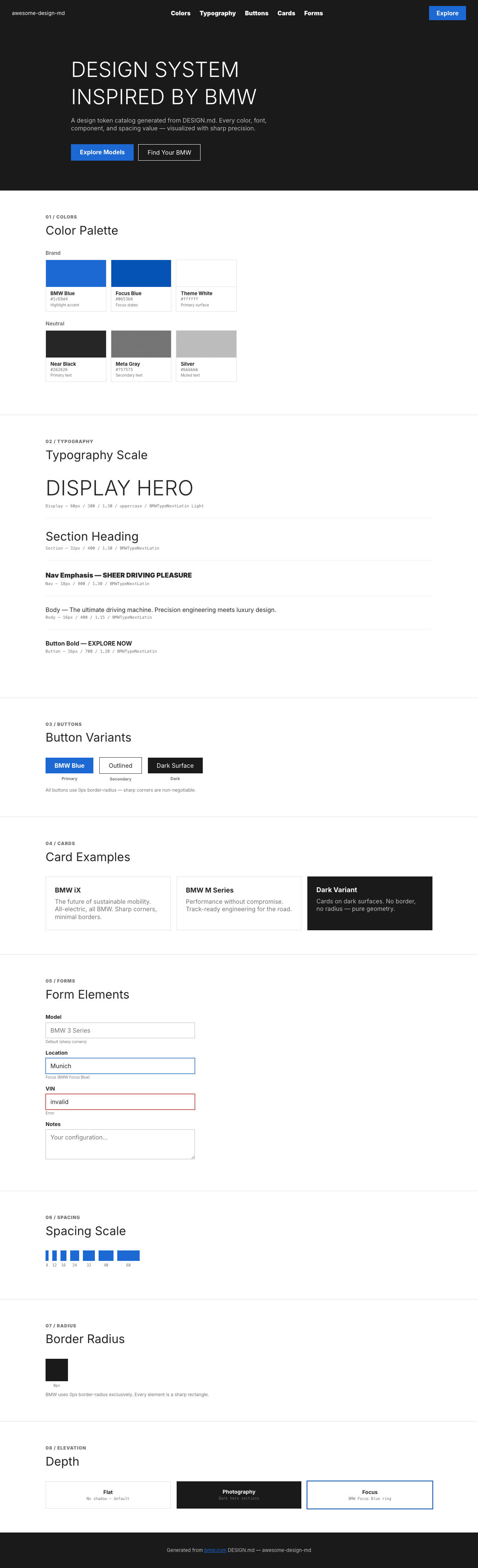
A sample landing page built with DESIGN.md. It shows the actual colors, typography, buttons, cards, spacing, and elevation, all in one page.
Dark Mode
Light Mode
Design System Inspiration of BMW
1. Visual Theme & Atmosphere
BMW's website is automotive engineering made visual — a design system that communicates precision, performance, and German industrial confidence. The page alternates between deep dark hero sections (featuring full-bleed automotive photography) and clean white content areas, creating a cinematic rhythm reminiscent of a luxury car showroom where vehicles are lit against darkness. The BMW CI2020 design language (their corporate identity refresh) defines every element.
The typography is built on BMWTypeNextLatin — a proprietary typeface in two variants: BMWTypeNextLatin Light (weight 300) for massive uppercase display headings, and BMWTypeNextLatin Regular for body and UI text. The 60px uppercase headline at weight 300 is the defining typographic gesture — light-weight type that whispers authority rather than shouting it. The fallback stack includes Helvetica and Japanese fonts (Hiragino, Meiryo), reflecting BMW's global presence.
What makes BMW distinctive is its CSS variable-driven theming system. Context-aware variables (--site-context-highlight-color: #1c69d4, --site-context-focus-color: #0653b6, --site-context-metainfo-color: #757575) suggest a design system built for multi-brand, multi-context deployment where colors can be swapped globally. The blue highlight color (#1c69d4) is BMW's signature blue — used sparingly for interactive elements and focus states, never decoratively. Zero border-radius was detected — BMW's design is angular, sharp-cornered, and uncompromisingly geometric.
Key Characteristics:
- BMWTypeNextLatin Light (weight 300) uppercase for display — whispered authority
- BMW Blue (
#1c69d4) as singular accent — used only for interactive elements - Zero border-radius detected — angular, sharp-cornered, industrial geometry
- Dark hero photography + white content sections — showroom lighting rhythm
- CSS variable-driven theming:
--site-context-*tokens for brand flexibility - Weight 900 for navigation emphasis — extreme contrast with 300 display
- Tight line-heights (1.15–1.30) throughout — compressed, efficient, German engineering
- Full-bleed automotive photography as primary visual content
2. Color Palette & Roles
Primary Brand
- Pure White (
#ffffff):--site-context-theme-color, primary surface, card backgrounds - BMW Blue (
#1c69d4):--site-context-highlight-color, primary interactive accent - BMW Focus Blue (
#0653b6):--site-context-focus-color, keyboard focus and active states
Neutral Scale
- Near Black (
#262626): Primary text on light surfaces, dark link text - Meta Gray (
#757575):--site-context-metainfo-color, secondary text, metadata - Silver (
#bbbbbb): Tertiary text, muted links, footer elements
Interactive States
- All links hover to white (
#ffffff) — suggesting primarily dark-surface navigation - Text links use underline: none on hover — clean interaction
Shadows
- Minimal shadow system — depth through photography and dark/light section contrast
3. Typography Rules
Font Families
- Display Light:
BMWTypeNextLatin Light, fallbacks:Helvetica, Arial, Hiragino Kaku Gothic ProN, Hiragino Sans, Meiryo - Body / UI:
BMWTypeNextLatin, same fallback stack
Hierarchy
| Role | Font | Size | Weight | Line Height | Notes |
|---|---|---|---|---|---|
| Display Hero | BMWTypeNextLatin Light | 60px (3.75rem) | 300 | 1.30 (tight) | text-transform: uppercase |
| Section Heading | BMWTypeNextLatin | 32px (2.00rem) | 400 | 1.30 (tight) | Major section titles |
| Nav Emphasis | BMWTypeNextLatin | 18px (1.13rem) | 900 | 1.30 (tight) | Navigation bold items |
| Body | BMWTypeNextLatin | 16px (1.00rem) | 400 | 1.15 (tight) | Standard body text |
| Button Bold | BMWTypeNextLatin | 16px (1.00rem) | 700 | 1.20–2.88 | CTA buttons |
| Button | BMWTypeNextLatin | 16px (1.00rem) | 400 | 1.15 (tight) | Standard buttons |
Principles
- Light display, heavy navigation: Weight 300 for hero headlines creates whispered elegance; weight 900 for navigation creates stark authority. This extreme weight contrast (300 vs 900) is the signature typographic tension.
- Universal uppercase display: The 60px hero is always uppercase — creating a monumental, architectural quality.
- Tight everything: Line-heights from 1.15 to 1.30 across the entire system. Nothing breathes — every line is compressed, efficient, German-engineered.
- Single font family: BMWTypeNextLatin handles everything from 60px display to 16px body — unity through one typeface at different weights.
4. Component Stylings
Buttons
- Text: 16px BMWTypeNextLatin, weight 700 for primary, 400 for secondary
- Line-height: 1.15–2.88 (large variation suggests padding-driven sizing)
- Border: white bottom-border on dark surfaces (
1px solid #ffffff) - No border-radius — sharp rectangular buttons
Cards & Containers
- No border-radius — all containers are sharp-cornered rectangles
- White backgrounds on light sections
- Dark backgrounds for hero/feature sections
- No visible borders on most elements
Navigation
- BMWTypeNextLatin 18px weight 900 for primary nav links
- White text on dark header
- BMW logo 54x54px
- Hover: remains white, text-decoration none
- "Home" text link in header
Image Treatment
- Full-bleed automotive photography
- Dark cinematic lighting
- Edge-to-edge hero images
- Car photography as primary visual content
5. Layout Principles
Spacing System
- Base unit: 8px
- Scale: 1px, 5px, 8px, 10px, 12px, 15px, 16px, 20px, 24px, 30px, 32px, 40px, 45px, 56px, 60px
Grid & Container
- Full-width hero photography
- Centered content sections
- Footer: multi-column link grid
Whitespace Philosophy
- Showroom pacing: Dark hero sections with generous padding create the feeling of walking through a showroom where each vehicle is spotlit in its own space.
- Compressed content: Body text areas use tight line-heights and compact spacing — information-dense, no waste.
Border Radius Scale
- None detected. BMW uses sharp corners exclusively — every element is a precise rectangle. This is the most angular design system analyzed.
6. Depth & Elevation
| Level | Treatment | Use |
|---|---|---|
| Photography (Level 0) | Full-bleed dark imagery | Hero backgrounds |
| Flat (Level 1) | White surface, no shadow | Content sections |
| Focus (Accessibility) | BMW Focus Blue (#0653b6) |
Focus states |
Shadow Philosophy: BMW uses virtually no shadows. Depth is created entirely through the contrast between dark photographic sections and white content sections — the automotive lighting does the elevation work.
7. Do's and Don'ts
Do
- Use BMWTypeNextLatin Light (300) uppercase for all display headings
- Keep ALL corners sharp (0px radius) — angular geometry is non-negotiable
- Use BMW Blue (
#1c69d4) only for interactive elements — never decoratively - Apply weight 900 for navigation emphasis — the extreme weight contrast is intentional
- Use full-bleed automotive photography for hero sections
- Keep line-heights tight (1.15–1.30) throughout
- Use
--site-context-*CSS variables for theming
Don't
- Don't round corners — zero radius is the BMW identity
- Don't use BMW Blue for backgrounds or large surfaces — it's an accent only
- Don't use medium font weights (500–600) — the system uses 300, 400, 700, 900 extremes
- Don't add decorative elements — the photography and typography carry everything
- Don't use relaxed line-heights — BMW text is always compressed
- Don't lighten the dark hero sections — the contrast with white IS the design
8. Responsive Behavior
Breakpoints
| Name | Width | Key Changes |
|---|---|---|
| Mobile Small | <375px | Minimum supported |
| Mobile | 375–480px | Single column |
| Mobile Large | 480–640px | Slight adjustments |
| Tablet Small | 640–768px | 2-column begins |
| Tablet | 768–920px | Standard tablet |
| Desktop Small | 920–1024px | Desktop layout begins |
| Desktop | 1024–1280px | Standard desktop |
| Large Desktop | 1280–1440px | Expanded |
| Ultra-wide | 1440–1600px | Maximum layout |
Collapsing Strategy
- Hero: 60px → scales down, maintains uppercase
- Navigation: horizontal → hamburger
- Photography: full-bleed maintained at all sizes
- Content sections: stack vertically
- Footer: multi-column → stacked
9. Agent Prompt Guide
Quick Color Reference
- Background: Pure White (
#ffffff) - Text: Near Black (
#262626) - Secondary text: Meta Gray (
#757575) - Accent: BMW Blue (
#1c69d4) - Focus: BMW Focus Blue (
#0653b6) - Muted: Silver (
#bbbbbb)
Example Component Prompts
- "Create a hero: full-width dark automotive photography background. Heading at 60px BMWTypeNextLatin Light weight 300, uppercase, line-height 1.30, white text. No border-radius anywhere."
- "Design navigation: dark background. BMWTypeNextLatin 18px weight 900 for links, white text. BMW logo 54x54. Sharp rectangular layout."
- "Build a button: 16px BMWTypeNextLatin weight 700, line-height 1.20. Sharp corners (0px radius). White bottom border on dark surface."
- "Create content section: white background. Heading at 32px weight 400, line-height 1.30, #262626. Body at 16px weight 400, line-height 1.15."
Iteration Guide
- Zero border-radius — every corner is sharp, no exceptions
- Weight extremes: 300 (display), 400 (body), 700 (buttons), 900 (nav)
- BMW Blue for interactive only — never as background or decoration
- Photography carries emotion — the UI is pure precision
- Tight line-heights everywhere — 1.15 to 1.30 is the range