Design detail
Linear
DESIGN.md extracted from the public Linear website. This is not the official design system. Colors, fonts, and spacing may not be 100% accurate. But it's a good starting point for building something similar.
Live preview
Theme-aware preview frame
Both light and dark preview assets are available.
Documentation
README and DESIGN in one place
Linear Inspired Design System
DESIGN.md extracted from the public Linear website. This is not the official design system. Colors, fonts, and spacing may not be 100% accurate. But it's a good starting point for building something similar.
Files
| File | Description |
|---|---|
DESIGN.md |
Complete design system documentation (9 sections) |
preview.html |
Interactive design token catalog (light) |
preview-dark.html |
Interactive design token catalog (dark) |
Use DESIGN.md to use as a reference for AI agents (Claude, Cursor, Stitch) to generate UI that looks like the Linear design language.
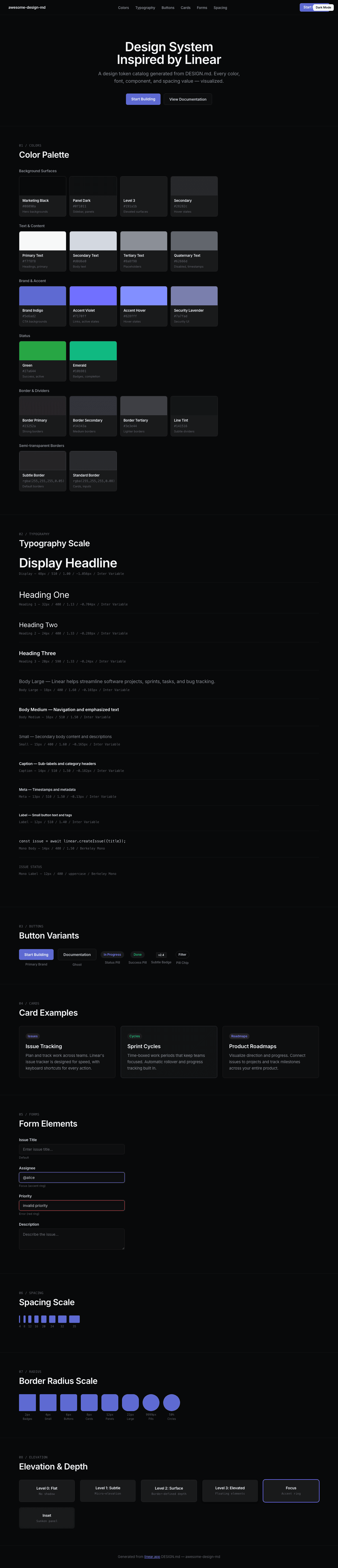
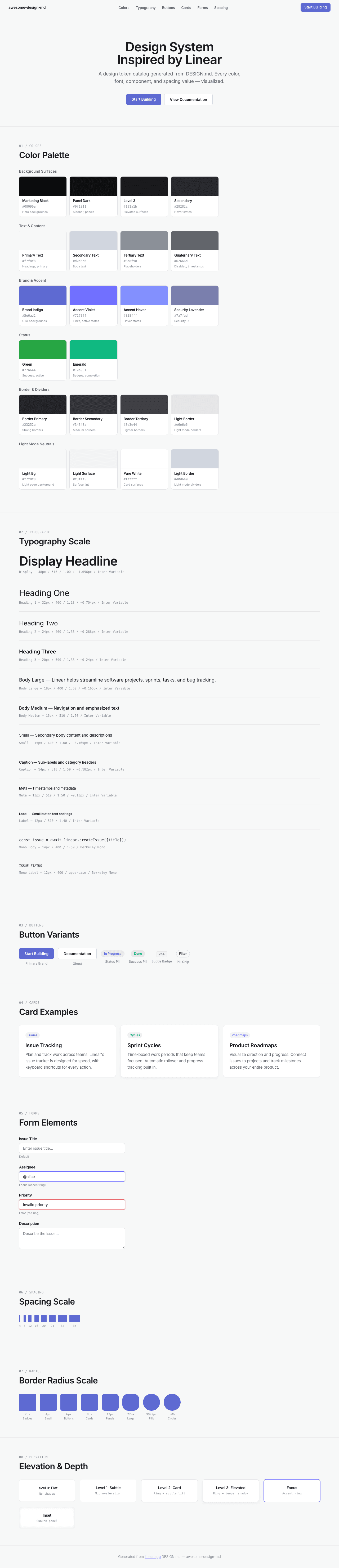
Preview
A sample landing page built with DESIGN.md. It shows the actual colors, typography, buttons, cards, spacing, and elevation, all in one page.
Dark Mode
Light Mode
Design System Inspiration of Linear
1. Visual Theme & Atmosphere
Linear's website is a masterclass in dark-mode-first product design — a near-black canvas (#08090a) where content emerges from darkness like starlight. The overall impression is one of extreme precision engineering: every element exists in a carefully calibrated hierarchy of luminance, from barely-visible borders (rgba(255,255,255,0.05)) to soft, luminous text (#f7f8f8). This is not a dark theme applied to a light design — it is darkness as the native medium, where information density is managed through subtle gradations of white opacity rather than color variation.
The typography system is built entirely on Inter Variable with OpenType features "cv01" and "ss03" enabled globally, giving the typeface a cleaner, more geometric character. Inter is used at a remarkable range of weights — from 300 (light body) through 510 (medium, Linear's signature weight) to 590 (semibold emphasis). The 510 weight is particularly distinctive: it sits between regular and medium, creating a subtle emphasis that doesn't shout. At display sizes (72px, 64px, 48px), Inter uses aggressive negative letter-spacing (-1.584px to -1.056px), creating compressed, authoritative headlines that feel engineered rather than designed. Berkeley Mono serves as the monospace companion for code and technical labels, with fallbacks to ui-monospace, SF Mono, and Menlo.
The color system is almost entirely achromatic — dark backgrounds with white/gray text — punctuated by a single brand accent: Linear's signature indigo-violet (#5e6ad2 for backgrounds, #7170ff for interactive accents). This accent color is used sparingly and intentionally, appearing only on CTAs, active states, and brand elements. The border system uses ultra-thin, semi-transparent white borders (rgba(255,255,255,0.05) to rgba(255,255,255,0.08)) that create structure without visual noise, like wireframes drawn in moonlight.
Key Characteristics:
- Dark-mode-native:
#08090amarketing background,#0f1011panel background,#191a1belevated surfaces - Inter Variable with
"cv01", "ss03"globally — geometric alternates for a cleaner aesthetic - Signature weight 510 (between regular and medium) for most UI text
- Aggressive negative letter-spacing at display sizes (-1.584px at 72px, -1.056px at 48px)
- Brand indigo-violet:
#5e6ad2(bg) /#7170ff(accent) /#828fff(hover) — the only chromatic color in the system - Semi-transparent white borders throughout:
rgba(255,255,255,0.05)torgba(255,255,255,0.08) - Button backgrounds at near-zero opacity:
rgba(255,255,255,0.02)torgba(255,255,255,0.05) - Multi-layered shadows with inset variants for depth on dark surfaces
- Radix UI primitives as the component foundation (6 detected primitives)
- Success green (
#27a644,#10b981) used only for status indicators
2. Color Palette & Roles
Background Surfaces
- Marketing Black (
#010102/#08090a): The deepest background — the canvas for hero sections and marketing pages. Near-pure black with an imperceptible blue-cool undertone. - Panel Dark (
#0f1011): Sidebar and panel backgrounds. One step up from the marketing black. - Level 3 Surface (
#191a1b): Elevated surface areas, card backgrounds, dropdowns. - Secondary Surface (
#28282c): The lightest dark surface — used for hover states and slightly elevated components.
Text & Content
- Primary Text (
#f7f8f8): Near-white with a barely-warm cast. The default text color — not pure white, preventing eye strain on dark backgrounds. - Secondary Text (
#d0d6e0): Cool silver-gray for body text, descriptions, and secondary content. - Tertiary Text (
#8a8f98): Muted gray for placeholders, metadata, and de-emphasized content. - Quaternary Text (
#62666d): The most subdued text — timestamps, disabled states, subtle labels.
Brand & Accent
- Brand Indigo (
#5e6ad2): Primary brand color — used for CTA button backgrounds, brand marks, and key interactive surfaces. - Accent Violet (
#7170ff): Brighter variant for interactive elements — links, active states, selected items. - Accent Hover (
#828fff): Lighter, more saturated variant for hover states on accent elements. - Security Lavender (
#7a7fad): Muted indigo used specifically for security-related UI elements.
Status Colors
- Green (
#27a644): Primary success/active status. Used for "in progress" indicators. - Emerald (
#10b981): Secondary success — pill badges, completion states.
Border & Divider
- Border Primary (
#23252a): Solid dark border for prominent separations. - Border Secondary (
#34343a): Slightly lighter solid border. - Border Tertiary (
#3e3e44): Lightest solid border variant. - Border Subtle (
rgba(255,255,255,0.05)): Ultra-subtle semi-transparent border — the default. - Border Standard (
rgba(255,255,255,0.08)): Standard semi-transparent border for cards, inputs, code blocks. - Line Tint (
#141516): Nearly invisible line for the subtlest divisions. - Line Tertiary (
#18191a): Slightly more visible divider line.
Light Mode Neutrals (for light theme contexts)
- Light Background (
#f7f8f8): Page background in light mode. - Light Surface (
#f3f4f5/#f5f6f7): Subtle surface tinting. - Light Border (
#d0d6e0): Visible border in light contexts. - Light Border Alt (
#e6e6e6): Alternative lighter border. - Pure White (
#ffffff): Card surfaces, highlights.
Overlay
- Overlay Primary (
rgba(0,0,0,0.85)): Modal/dialog backdrop — extremely dark for focus isolation.
3. Typography Rules
Font Family
- Primary:
Inter Variable, with fallbacks:SF Pro Display, -apple-system, system-ui, Segoe UI, Roboto, Oxygen, Ubuntu, Cantarell, Open Sans, Helvetica Neue - Monospace:
Berkeley Mono, with fallbacks:ui-monospace, SF Mono, Menlo - OpenType Features:
"cv01", "ss03"enabled globally — cv01 provides an alternate lowercase 'a' (single-story), ss03 adjusts specific letterforms for a cleaner geometric appearance.
Hierarchy
| Role | Font | Size | Weight | Line Height | Letter Spacing | Notes |
|---|---|---|---|---|---|---|
| Display XL | Inter Variable | 72px (4.50rem) | 510 | 1.00 (tight) | -1.584px | Hero headlines, maximum impact |
| Display Large | Inter Variable | 64px (4.00rem) | 510 | 1.00 (tight) | -1.408px | Secondary hero text |
| Display | Inter Variable | 48px (3.00rem) | 510 | 1.00 (tight) | -1.056px | Section headlines |
| Heading 1 | Inter Variable | 32px (2.00rem) | 400 | 1.13 (tight) | -0.704px | Major section titles |
| Heading 2 | Inter Variable | 24px (1.50rem) | 400 | 1.33 | -0.288px | Sub-section headings |
| Heading 3 | Inter Variable | 20px (1.25rem) | 590 | 1.33 | -0.24px | Feature titles, card headers |
| Body Large | Inter Variable | 18px (1.13rem) | 400 | 1.60 (relaxed) | -0.165px | Introduction text, feature descriptions |
| Body Emphasis | Inter Variable | 17px (1.06rem) | 590 | 1.60 (relaxed) | normal | Emphasized body, sub-headings in content |
| Body | Inter Variable | 16px (1.00rem) | 400 | 1.50 | normal | Standard reading text |
| Body Medium | Inter Variable | 16px (1.00rem) | 510 | 1.50 | normal | Navigation, labels |
| Body Semibold | Inter Variable | 16px (1.00rem) | 590 | 1.50 | normal | Strong emphasis |
| Small | Inter Variable | 15px (0.94rem) | 400 | 1.60 (relaxed) | -0.165px | Secondary body text |
| Small Medium | Inter Variable | 15px (0.94rem) | 510 | 1.60 (relaxed) | -0.165px | Emphasized small text |
| Small Semibold | Inter Variable | 15px (0.94rem) | 590 | 1.60 (relaxed) | -0.165px | Strong small text |
| Small Light | Inter Variable | 15px (0.94rem) | 300 | 1.47 | -0.165px | De-emphasized body |
| Caption Large | Inter Variable | 14px (0.88rem) | 510–590 | 1.50 | -0.182px | Sub-labels, category headers |
| Caption | Inter Variable | 13px (0.81rem) | 400–510 | 1.50 | -0.13px | Metadata, timestamps |
| Label | Inter Variable | 12px (0.75rem) | 400–590 | 1.40 | normal | Button text, small labels |
| Micro | Inter Variable | 11px (0.69rem) | 510 | 1.40 | normal | Tiny labels |
| Tiny | Inter Variable | 10px (0.63rem) | 400–510 | 1.50 | -0.15px | Overline text, sometimes uppercase |
| Link Large | Inter Variable | 16px (1.00rem) | 400 | 1.50 | normal | Standard links |
| Link Medium | Inter Variable | 15px (0.94rem) | 510 | 2.67 | normal | Spaced navigation links |
| Link Small | Inter Variable | 14px (0.88rem) | 510 | 1.50 | normal | Compact links |
| Link Caption | Inter Variable | 13px (0.81rem) | 400–510 | 1.50 | -0.13px | Footer, metadata links |
| Mono Body | Berkeley Mono | 14px (0.88rem) | 400 | 1.50 | normal | Code blocks |
| Mono Caption | Berkeley Mono | 13px (0.81rem) | 400 | 1.50 | normal | Code labels |
| Mono Label | Berkeley Mono | 12px (0.75rem) | 400 | 1.40 | normal | Code metadata, sometimes uppercase |
Principles
- 510 is the signature weight: Linear uses Inter Variable's 510 weight (between regular 400 and medium 500) as its default emphasis weight. This creates a subtly bolded feel without the heaviness of traditional medium or semibold.
- Compression at scale: Display sizes use progressively tighter letter-spacing — -1.584px at 72px, -1.408px at 64px, -1.056px at 48px, -0.704px at 32px. Below 24px, spacing relaxes toward normal.
- OpenType as identity:
"cv01", "ss03"aren't decorative — they transform Inter into Linear's distinctive typeface, giving it a more geometric, purposeful character. - Three-tier weight system: 400 (reading), 510 (emphasis/UI), 590 (strong emphasis). The 300 weight appears only in deliberately de-emphasized contexts.
4. Component Stylings
Buttons
Ghost Button (Default)
- Background:
rgba(255,255,255,0.02) - Text:
#e2e4e7(near-white) - Padding: comfortable
- Radius: 6px
- Border:
1px solid rgb(36, 40, 44) - Outline: none
- Focus shadow:
rgba(0,0,0,0.1) 0px 4px 12px - Use: Standard actions, secondary CTAs
Subtle Button
- Background:
rgba(255,255,255,0.04) - Text:
#d0d6e0(silver-gray) - Padding: 0px 6px
- Radius: 6px
- Use: Toolbar actions, contextual buttons
Primary Brand Button (Inferred)
- Background:
#5e6ad2(brand indigo) - Text:
#ffffff - Padding: 8px 16px
- Radius: 6px
- Hover:
#828fffshift - Use: Primary CTAs ("Start building", "Sign up")
Icon Button (Circle)
- Background:
rgba(255,255,255,0.03)orrgba(255,255,255,0.05) - Text:
#f7f8f8or#ffffff - Radius: 50%
- Border:
1px solid rgba(255,255,255,0.08) - Use: Close, menu toggle, icon-only actions
Pill Button
- Background: transparent
- Text:
#d0d6e0 - Padding: 0px 10px 0px 5px
- Radius: 9999px
- Border:
1px solid rgb(35, 37, 42) - Use: Filter chips, tags, status indicators
Small Toolbar Button
- Background:
rgba(255,255,255,0.05) - Text:
#62666d(muted) - Radius: 2px
- Border:
1px solid rgba(255,255,255,0.05) - Shadow:
rgba(0,0,0,0.03) 0px 1.2px 0px 0px - Font: 12px weight 510
- Use: Toolbar actions, quick-access controls
Cards & Containers
- Background:
rgba(255,255,255,0.02)torgba(255,255,255,0.05)(never solid — always translucent) - Border:
1px solid rgba(255,255,255,0.08)(standard) or1px solid rgba(255,255,255,0.05)(subtle) - Radius: 8px (standard), 12px (featured), 22px (large panels)
- Shadow:
rgba(0,0,0,0.2) 0px 0px 0px 1pxor layered multi-shadow stacks - Hover: subtle background opacity increase
Inputs & Forms
Text Area
- Background:
rgba(255,255,255,0.02) - Text:
#d0d6e0 - Border:
1px solid rgba(255,255,255,0.08) - Padding: 12px 14px
- Radius: 6px
Search Input
- Background: transparent
- Text:
#f7f8f8 - Padding: 1px 32px (icon-aware)
Button-style Input
- Text:
#8a8f98 - Padding: 1px 6px
- Radius: 5px
- Focus shadow: multi-layer stack
Badges & Pills
Success Pill
- Background:
#10b981 - Text:
#f7f8f8 - Radius: 50% (circular)
- Font: 10px weight 510
- Use: Status dots, completion indicators
Neutral Pill
- Background: transparent
- Text:
#d0d6e0 - Padding: 0px 10px 0px 5px
- Radius: 9999px
- Border:
1px solid rgb(35, 37, 42) - Font: 12px weight 510
- Use: Tags, filter chips, category labels
Subtle Badge
- Background:
rgba(255,255,255,0.05) - Text:
#f7f8f8 - Padding: 0px 8px 0px 2px
- Radius: 2px
- Border:
1px solid rgba(255,255,255,0.05) - Font: 10px weight 510
- Use: Inline labels, version tags
Navigation
- Dark sticky header on near-black background
- Linear logomark left-aligned (SVG icon)
- Links: Inter Variable 13–14px weight 510,
#d0d6e0text - Active/hover: text lightens to
#f7f8f8 - CTA: Brand indigo button or ghost button
- Mobile: hamburger collapse
- Search: command palette trigger (
/orCmd+K)
Image Treatment
- Product screenshots on dark backgrounds with subtle border (
rgba(255,255,255,0.08)) - Top-rounded images:
12px 12px 0px 0pxradius - Dashboard/issue previews dominate feature sections
- Subtle shadow beneath screenshots:
rgba(0,0,0,0.4) 0px 2px 4px
5. Layout Principles
Spacing System
- Base unit: 8px
- Scale: 1px, 4px, 7px, 8px, 11px, 12px, 16px, 19px, 20px, 22px, 24px, 28px, 32px, 35px
- The 7px and 11px values suggest micro-adjustments for optical alignment
- Primary rhythm: 8px, 16px, 24px, 32px (standard 8px grid)
Grid & Container
- Max content width: approximately 1200px
- Hero: centered single-column with generous vertical padding
- Feature sections: 2–3 column grids for feature cards
- Full-width dark sections with internal max-width constraints
- Changelog: single-column timeline layout
Whitespace Philosophy
- Darkness as space: On Linear's dark canvas, empty space isn't white — it's absence. The near-black background IS the whitespace, and content emerges from it.
- Compressed headlines, expanded surroundings: Display text at 72px with -1.584px tracking is dense and compressed, but sits within vast dark padding. The contrast between typographic density and spatial generosity creates tension.
- Section isolation: Each feature section is separated by generous vertical padding (80px+) with no visible dividers — the dark background provides natural separation.
Border Radius Scale
- Micro (2px): Inline badges, toolbar buttons, subtle tags
- Standard (4px): Small containers, list items
- Comfortable (6px): Buttons, inputs, functional elements
- Card (8px): Cards, dropdowns, popovers
- Panel (12px): Panels, featured cards, section containers
- Large (22px): Large panel elements
- Full Pill (9999px): Chips, filter pills, status tags
- Circle (50%): Icon buttons, avatars, status dots
6. Depth & Elevation
| Level | Treatment | Use |
|---|---|---|
| Flat (Level 0) | No shadow, #010102 bg |
Page background, deepest canvas |
| Subtle (Level 1) | rgba(0,0,0,0.03) 0px 1.2px 0px |
Toolbar buttons, micro-elevation |
| Surface (Level 2) | rgba(255,255,255,0.05) bg + 1px solid rgba(255,255,255,0.08) border |
Cards, input fields, containers |
| Inset (Level 2b) | rgba(0,0,0,0.2) 0px 0px 12px 0px inset |
Recessed panels, inner shadows |
| Ring (Level 3) | rgba(0,0,0,0.2) 0px 0px 0px 1px |
Border-as-shadow technique |
| Elevated (Level 4) | rgba(0,0,0,0.4) 0px 2px 4px |
Floating elements, dropdowns |
| Dialog (Level 5) | Multi-layer stack: rgba(0,0,0,0) 0px 8px 2px, rgba(0,0,0,0.01) 0px 5px 2px, rgba(0,0,0,0.04) 0px 3px 2px, rgba(0,0,0,0.07) 0px 1px 1px, rgba(0,0,0,0.08) 0px 0px 1px |
Popovers, command palette, modals |
| Focus | rgba(0,0,0,0.1) 0px 4px 12px + additional layers |
Keyboard focus on interactive elements |
Shadow Philosophy: On dark surfaces, traditional shadows (dark on dark) are nearly invisible. Linear solves this by using semi-transparent white borders as the primary depth indicator. Elevation isn't communicated through shadow darkness but through background luminance steps — each level slightly increases the white opacity of the surface background (0.02 → 0.04 → 0.05), creating a subtle stacking effect. The inset shadow technique (rgba(0,0,0,0.2) 0px 0px 12px 0px inset) creates a unique "sunken" effect for recessed panels, adding dimensional depth that traditional dark themes lack.
7. Do's and Don'ts
Do
- Use Inter Variable with
"cv01", "ss03"on ALL text — these features are fundamental to Linear's typeface identity - Use weight 510 as your default emphasis weight — it's Linear's signature between-weight
- Apply aggressive negative letter-spacing at display sizes (-1.584px at 72px, -1.056px at 48px)
- Build on near-black backgrounds:
#08090afor marketing,#0f1011for panels,#191a1bfor elevated surfaces - Use semi-transparent white borders (
rgba(255,255,255,0.05)torgba(255,255,255,0.08)) instead of solid dark borders - Keep button backgrounds nearly transparent:
rgba(255,255,255,0.02)torgba(255,255,255,0.05) - Reserve brand indigo (
#5e6ad2/#7170ff) for primary CTAs and interactive accents only - Use
#f7f8f8for primary text — not pure#ffffff, which would be too harsh - Apply the luminance stacking model: deeper = darker bg, elevated = slightly lighter bg
Don't
- Don't use pure white (
#ffffff) as primary text —#f7f8f8prevents eye strain - Don't use solid colored backgrounds for buttons — transparency is the system (rgba white at 0.02–0.05)
- Don't apply the brand indigo decoratively — it's reserved for interactive/CTA elements only
- Don't use positive letter-spacing on display text — Inter at large sizes always runs negative
- Don't use visible/opaque borders on dark backgrounds — borders should be whisper-thin semi-transparent white
- Don't skip the OpenType features (
"cv01", "ss03") — without them, it's generic Inter, not Linear's Inter - Don't use weight 700 (bold) — Linear's maximum weight is 590, with 510 as the workhorse
- Don't introduce warm colors into the UI chrome — the palette is cool gray with blue-violet accent only
- Don't use drop shadows for elevation on dark surfaces — use background luminance stepping instead
8. Responsive Behavior
Breakpoints
| Name | Width | Key Changes |
|---|---|---|
| Mobile Small | <600px | Single column, compact padding |
| Mobile | 600–640px | Standard mobile layout |
| Tablet | 640–768px | Two-column grids begin |
| Desktop Small | 768–1024px | Full card grids, expanded padding |
| Desktop | 1024–1280px | Standard desktop, full navigation |
| Large Desktop | >1280px | Full layout, generous margins |
Touch Targets
- Buttons use comfortable padding with 6px radius minimum
- Navigation links at 13–14px with adequate spacing
- Pill tags have 10px horizontal padding for touch accessibility
- Icon buttons at 50% radius ensure circular, easy-to-tap targets
- Search trigger is prominently placed with generous hit area
Collapsing Strategy
- Hero: 72px → 48px → 32px display text, tracking adjusts proportionally
- Navigation: horizontal links + CTAs → hamburger menu at 768px
- Feature cards: 3-column → 2-column → single column stacked
- Product screenshots: maintain aspect ratio, may reduce padding
- Changelog: timeline maintains single-column through all sizes
- Footer: multi-column → stacked single column
- Section spacing: 80px+ → 48px on mobile
Image Behavior
- Dashboard screenshots maintain border treatment at all sizes
- Hero visuals simplify on mobile (fewer floating UI elements)
- Product screenshots use responsive sizing with consistent radius
- Dark background ensures screenshots blend naturally at any viewport
9. Agent Prompt Guide
Quick Color Reference
- Primary CTA: Brand Indigo (
#5e6ad2) - Page Background: Marketing Black (
#08090a) - Panel Background: Panel Dark (
#0f1011) - Surface: Level 3 (
#191a1b) - Heading text: Primary White (
#f7f8f8) - Body text: Silver Gray (
#d0d6e0) - Muted text: Tertiary Gray (
#8a8f98) - Subtle text: Quaternary Gray (
#62666d) - Accent: Violet (
#7170ff) - Accent Hover: Light Violet (
#828fff) - Border (default):
rgba(255,255,255,0.08) - Border (subtle):
rgba(255,255,255,0.05) - Focus ring: Multi-layer shadow stack
Example Component Prompts
- "Create a hero section on
#08090abackground. Headline at 48px Inter Variable weight 510, line-height 1.00, letter-spacing -1.056px, color#f7f8f8, font-feature-settings'cv01', 'ss03'. Subtitle at 18px weight 400, line-height 1.60, color#8a8f98. Brand CTA button (#5e6ad2, 6px radius, 8px 16px padding) and ghost button (rgba(255,255,255,0.02)bg,1px solid rgba(255,255,255,0.08)border, 6px radius)." - "Design a card on dark background:
rgba(255,255,255,0.02)background,1px solid rgba(255,255,255,0.08)border, 8px radius. Title at 20px Inter Variable weight 590, letter-spacing -0.24px, color#f7f8f8. Body at 15px weight 400, color#8a8f98, letter-spacing -0.165px." - "Build a pill badge: transparent background,
#d0d6e0text, 9999px radius, 0px 10px padding,1px solid #23252aborder, 12px Inter Variable weight 510." - "Create navigation: dark sticky header on
#0f1011. Inter Variable 13px weight 510 for links,#d0d6e0text. Brand indigo CTA#5e6ad2right-aligned with 6px radius. Bottom border:1px solid rgba(255,255,255,0.05)." - "Design a command palette:
#191a1bbackground,1px solid rgba(255,255,255,0.08)border, 12px radius, multi-layer shadow stack. Input at 16px Inter Variable weight 400,#f7f8f8text. Results list with 13px weight 510 labels in#d0d6e0and 12px metadata in#62666d."
Iteration Guide
- Always set font-feature-settings
"cv01", "ss03"on all Inter text — this is non-negotiable for Linear's look - Letter-spacing scales with font size: -1.584px at 72px, -1.056px at 48px, -0.704px at 32px, normal below 16px
- Three weights: 400 (read), 510 (emphasize/navigate), 590 (announce)
- Surface elevation via background opacity:
rgba(255,255,255, 0.02 → 0.04 → 0.05)— never solid backgrounds on dark - Brand indigo (
#5e6ad2/#7170ff) is the only chromatic color — everything else is grayscale - Borders are always semi-transparent white, never solid dark colors on dark backgrounds
- Berkeley Mono for any code or technical content, Inter Variable for everything else