Design detail
NVIDIA
DESIGN.md extracted from the public NVIDIA website. This is not the official design system. Colors, fonts, and spacing may not be 100% accurate. But it's a good starting point for building something similar.
Live preview
Theme-aware preview frame
Both light and dark preview assets are available.
Documentation
README and DESIGN in one place
NVIDIA Inspired Design System
DESIGN.md extracted from the public NVIDIA website. This is not the official design system. Colors, fonts, and spacing may not be 100% accurate. But it's a good starting point for building something similar.
Files
| File | Description |
|---|---|
DESIGN.md |
Complete design system documentation (9 sections) |
preview.html |
Interactive design token catalog (light) |
preview-dark.html |
Interactive design token catalog (dark) |
Use DESIGN.md to use as a reference for AI agents (Claude, Cursor, Stitch) to generate UI that looks like the NVIDIA design language.
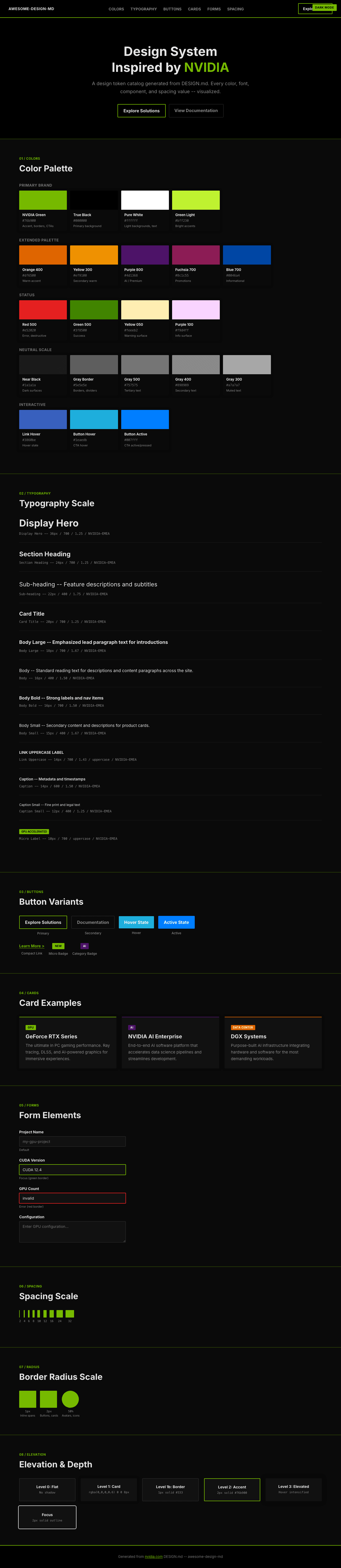
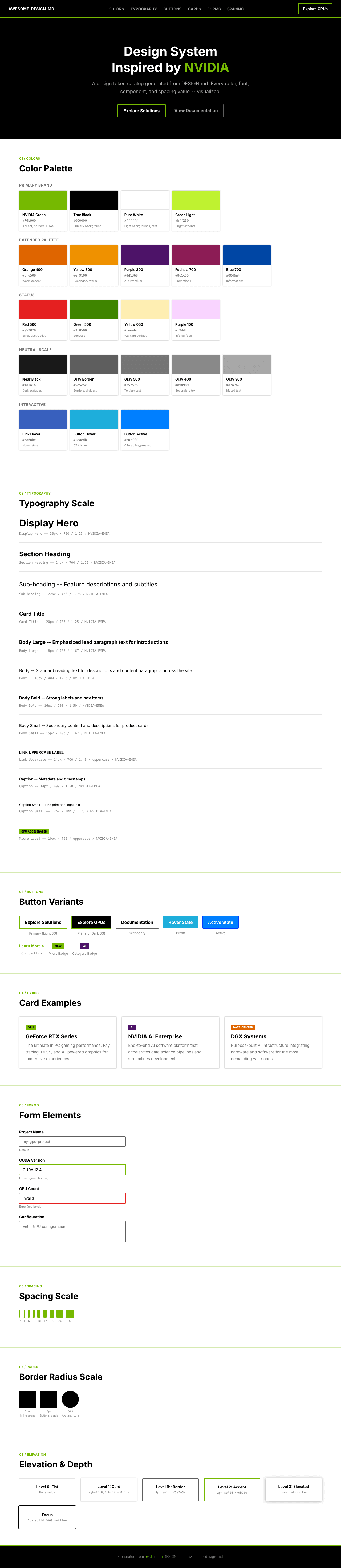
Preview
A sample landing page built with DESIGN.md. It shows the actual colors, typography, buttons, cards, spacing, and elevation, all in one page.
Dark Mode
Light Mode
Design System Inspiration of NVIDIA
1. Visual Theme & Atmosphere
NVIDIA's website is a high-contrast, technology-forward experience that communicates raw computational power through design restraint. The page is built on a stark black (#000000) and white (#ffffff) foundation, punctuated by NVIDIA's signature green (#76b900) -- a color so specific it functions as a brand fingerprint. This is not the lush green of nature; it's the electric, lime-shifted green of GPU-rendered light, a color that sits between chartreuse and kelly green and immediately signals "NVIDIA" to anyone in technology.
The custom NVIDIA-EMEA font family (with Arial and Helvetica fallbacks) creates a clean, industrial typographic voice. Headings at 36px bold with tight 1.25 line-height create dense, authoritative blocks of text. The font lacks the geometric playfulness of Silicon Valley sans-serifs -- it's European, pragmatic, and engineering-focused. Body text runs at 15-16px, comfortable for reading but not generous, maintaining the sense that screen real estate is optimized like GPU memory.
What distinguishes NVIDIA's design from other dark-background tech sites is the disciplined use of the green accent. The #76b900 appears in borders (2px solid #76b900), link underlines (underline 2px rgb(118, 185, 0)), and CTAs -- but never as backgrounds or large surface areas on the main content. The green is a signal, not a surface. Combined with a deep shadow system (rgba(0, 0, 0, 0.3) 0px 0px 5px) and minimal border radius (1-2px), the overall effect is of precision engineering hardware rendered in pixels.
Key Characteristics:
- NVIDIA Green (
#76b900) as pure accent -- borders, underlines, and interactive highlights only - Black (
#000000) dominant background with white (#ffffff) text on dark sections - NVIDIA-EMEA custom font with Arial/Helvetica fallback -- industrial, European, clean
- Tight line-heights (1.25 for headings) creating dense, authoritative text blocks
- Minimal border radius (1-2px) -- sharp, engineered corners throughout
- Green-bordered buttons (
2px solid #76b900) as primary interactive pattern - Font Awesome 6 Pro/Sharp icon system at weight 900 for sharp iconography
- Multi-framework architecture (PrimeReact, Fluent UI, Element Plus) enabling rich interactive components
2. Color Palette & Roles
Primary Brand
- NVIDIA Green (
#76b900): The signature -- borders, link underlines, CTA outlines, active indicators. Never used as large surface fills. - True Black (
#000000): Primary page background, text on light surfaces, dominant tone. - Pure White (
#ffffff): Text on dark backgrounds, light section backgrounds, card surfaces.
Extended Brand Palette
- NVIDIA Green Light (
#bff230): Bright lime accent for highlights and hover states. - Orange 400 (
#df6500): Warm accent for alerts, featured badges, or energy-related contexts. - Yellow 300 (
#ef9100): Secondary warm accent, product category highlights. - Yellow 050 (
#feeeb2): Light warm surface for callout backgrounds.
Status & Semantic
- Red 500 (
#e52020): Error states, destructive actions, critical alerts. - Red 800 (
#650b0b): Deep red for severe warning backgrounds. - Green 500 (
#3f8500): Success states, positive indicators (darker than brand green). - Blue 700 (
#0046a4): Informational accents, link hover alternative.
Decorative
- Purple 800 (
#4d1368): Deep purple for gradient ends, premium/AI contexts. - Purple 100 (
#f9d4ff): Light purple surface tint. - Fuchsia 700 (
#8c1c55): Rich accent for special promotions or featured content.
Neutral Scale
- Gray 300 (
#a7a7a7): Muted text, disabled labels. - Gray 400 (
#898989): Secondary text, metadata. - Gray 500 (
#757575): Tertiary text, placeholders, footers. - Gray Border (
#5e5e5e): Subtle borders, divider lines. - Near Black (
#1a1a1a): Dark surfaces, card backgrounds on black pages.
Interactive States
- Link Default (dark bg) (
#ffffff): White links on dark backgrounds. - Link Default (light bg) (
#000000): Black links with green underline on light backgrounds. - Link Hover (
#3860be): Blue shift on hover across all link variants. - Button Hover (
#1eaedb): Teal highlight for button hover states. - Button Active (
#007fff): Bright blue for active/pressed button states. - Focus Ring (
#000000 solid 2px): Black outline for keyboard focus.
Shadows & Depth
- Card Shadow (
rgba(0, 0, 0, 0.3) 0px 0px 5px 0px): Subtle ambient shadow for elevated cards.
3. Typography Rules
Font Family
- Primary:
NVIDIA-EMEA, with fallbacks:Arial, Helvetica, sans-serif - Icon Font:
Font Awesome 6 Pro(weight 900 for solid icons, 700 for regular) - Icon Sharp:
Font Awesome 6 Sharp(weight 300 for light icons, 400 for regular)
Hierarchy
| Role | Font | Size | Weight | Line Height | Letter Spacing | Notes |
|---|---|---|---|---|---|---|
| Display Hero | NVIDIA-EMEA | 36px (2.25rem) | 700 | 1.25 (tight) | normal | Maximum impact headlines |
| Section Heading | NVIDIA-EMEA | 24px (1.50rem) | 700 | 1.25 (tight) | normal | Section titles, card headings |
| Sub-heading | NVIDIA-EMEA | 22px (1.38rem) | 400 | 1.75 (relaxed) | normal | Feature descriptions, subtitles |
| Card Title | NVIDIA-EMEA | 20px (1.25rem) | 700 | 1.25 (tight) | normal | Card and module headings |
| Body Large | NVIDIA-EMEA | 18px (1.13rem) | 700 | 1.67 (relaxed) | normal | Emphasized body, lead paragraphs |
| Body | NVIDIA-EMEA | 16px (1.00rem) | 400 | 1.50 | normal | Standard reading text |
| Body Bold | NVIDIA-EMEA | 16px (1.00rem) | 700 | 1.50 | normal | Strong labels, nav items |
| Body Small | NVIDIA-EMEA | 15px (0.94rem) | 400 | 1.67 (relaxed) | normal | Secondary content, descriptions |
| Body Small Bold | NVIDIA-EMEA | 15px (0.94rem) | 700 | 1.50 | normal | Emphasized secondary content |
| Button Large | NVIDIA-EMEA | 18px (1.13rem) | 700 | 1.25 (tight) | normal | Primary CTA buttons |
| Button | NVIDIA-EMEA | 16px (1.00rem) | 700 | 1.25 (tight) | normal | Standard buttons |
| Button Compact | NVIDIA-EMEA | 14.4px (0.90rem) | 700 | 1.00 (tight) | 0.144px | Small/compact buttons |
| Link | NVIDIA-EMEA | 14px (0.88rem) | 700 | 1.43 | normal | Navigation links |
| Link Uppercase | NVIDIA-EMEA | 14px (0.88rem) | 700 | 1.43 | normal | text-transform: uppercase, nav labels |
| Caption | NVIDIA-EMEA | 14px (0.88rem) | 600 | 1.50 | normal | Metadata, timestamps |
| Caption Small | NVIDIA-EMEA | 12px (0.75rem) | 400 | 1.25 (tight) | normal | Fine print, legal |
| Micro Label | NVIDIA-EMEA | 10px (0.63rem) | 700 | 1.50 | normal | text-transform: uppercase, tiny badges |
| Micro | NVIDIA-EMEA | 11px (0.69rem) | 700 | 1.00 (tight) | normal | Smallest UI text |
Principles
- Bold as the default voice: NVIDIA leans heavily on weight 700 for headings, buttons, links, and labels. The 400 weight is reserved for body text and descriptions -- everything else is bold, projecting confidence and authority.
- Tight headings, relaxed body: Heading line-height is consistently 1.25 (tight), while body text relaxes to 1.50-1.67. This contrast creates visual density at the top of content blocks and comfortable readability in paragraphs.
- Uppercase for navigation: Link labels use
text-transform: uppercasewith weight 700, creating a navigation voice that reads like hardware specification labels. - No decorative tracking: Letter-spacing is normal throughout, except for compact buttons (0.144px). The font itself carries the industrial character without manipulation.
4. Component Stylings
Buttons
Primary (Green Border)
- Background:
transparent - Text:
#000000 - Padding: 11px 13px
- Border:
2px solid #76b900 - Radius: 2px
- Font: 16px weight 700
- Hover: background
#1eaedb, text#ffffff - Active: background
#007fff, text#ffffff, border1px solid #003eff, scale(1) - Focus: background
#1eaedb, text#ffffff, outline#000000 solid 2px, opacity 0.9 - Use: Primary CTA ("Learn More", "Explore Solutions")
Secondary (Green Border Thin)
- Background: transparent
- Border:
1px solid #76b900 - Radius: 2px
- Use: Secondary actions, alternative CTAs
Compact / Inline
- Font: 14.4px weight 700
- Letter-spacing: 0.144px
- Line-height: 1.00
- Use: Inline CTAs, compact navigation
Cards & Containers
- Background:
#ffffff(light) or#1a1a1a(dark sections) - Border: none (clean edges) or
1px solid #5e5e5e - Radius: 2px
- Shadow:
rgba(0, 0, 0, 0.3) 0px 0px 5px 0pxfor elevated cards - Hover: shadow intensification
- Padding: 16-24px internal
Links
- On Dark Background:
#ffffff, no underline, hover shifts to#3860be - On Light Background:
#000000or#1a1a1a, underline2px solid #76b900, hover shifts to#3860be, underline removed - Green Links:
#76b900, hover shifts to#3860be - Muted Links:
#666666, hover shifts to#3860be
Navigation
- Dark black background (
#000000) - Logo left-aligned, prominent NVIDIA wordmark
- Links: NVIDIA-EMEA 14px weight 700 uppercase,
#ffffff - Hover: color shift, no underline change
- Mega-menu dropdowns for product categories
- Sticky on scroll with backdrop
Image Treatment
- Product/GPU renders as hero images, often full-width
- Screenshot images with subtle shadow for depth
- Green gradient overlays on dark hero sections
- Circular avatar containers with 50% radius
Distinctive Components
Product Cards
- Clean white or dark card with minimal radius (2px)
- Green accent border or underline on title
- Bold heading + lighter description pattern
- CTA with green border at bottom
Tech Spec Tables
- Industrial grid layouts
- Alternating row backgrounds (subtle gray shift)
- Bold labels, regular values
- Green highlights for key metrics
Cookie/Consent Banner
- Fixed bottom positioning
- Rounded buttons (2px radius)
- Gray border treatments
5. Layout Principles
Spacing System
- Base unit: 8px
- Scale: 1px, 2px, 3px, 4px, 5px, 6px, 7px, 8px, 9px, 10px, 11px, 12px, 13px, 15px
- Primary padding values: 8px, 11px, 13px, 16px, 24px, 32px
- Section spacing: 48-80px vertical padding
Grid & Container
- Max content width: approximately 1200px (contained)
- Full-width hero sections with contained text
- Feature sections: 2-3 column grids for product cards
- Single-column for article/blog content
- Sidebar layouts for documentation
Whitespace Philosophy
- Purposeful density: NVIDIA uses tighter spacing than typical SaaS sites, reflecting the density of technical content. White space exists to separate concepts, not to create luxury emptiness.
- Section rhythm: Dark sections alternate with white sections, using background color (not just spacing) to separate content blocks.
- Card density: Product cards sit close together with 16-20px gaps, creating a catalog feel rather than a gallery feel.
Border Radius Scale
- Micro (1px): Inline spans, tiny elements
- Standard (2px): Buttons, cards, containers, inputs -- the default for nearly everything
- Circle (50%): Avatar images, circular tab indicators
6. Depth & Elevation
| Level | Treatment | Use |
|---|---|---|
| Flat (Level 0) | No shadow | Page backgrounds, inline text |
| Subtle (Level 1) | rgba(0,0,0,0.3) 0px 0px 5px 0px |
Standard cards, modals |
| Border (Level 1b) | 1px solid #5e5e5e |
Content dividers, section borders |
| Green accent (Level 2) | 2px solid #76b900 |
Active elements, CTAs, selected items |
| Focus (Accessibility) | 2px solid #000000 outline |
Keyboard focus ring |
Shadow Philosophy: NVIDIA's depth system is minimal and utilitarian. There is essentially one shadow value -- a 5px ambient blur at 30% opacity -- used sparingly for cards and modals. The primary depth signal is not shadow but color contrast: black backgrounds next to white sections, green borders on black surfaces. This creates hardware-like visual layering where depth comes from material difference, not simulated light.
Decorative Depth
- Green gradient washes behind hero content
- Dark-to-darker gradients (black to near-black) for section transitions
- No glassmorphism or blur effects -- clarity over atmosphere
7. Responsive Behavior
Breakpoints
| Name | Width | Key Changes |
|---|---|---|
| Mobile Small | <375px | Compact single column, reduced padding |
| Mobile | 375-425px | Standard mobile layout |
| Mobile Large | 425-600px | Wider mobile, some 2-col hints |
| Tablet Small | 600-768px | 2-column grids begin |
| Tablet | 768-1024px | Full card grids, expanded nav |
| Desktop | 1024-1350px | Standard desktop layout |
| Large Desktop | >1350px | Maximum content width, generous margins |
Touch Targets
- Buttons use 11px 13px padding for comfortable tap targets
- Navigation links at 14px uppercase with adequate spacing
- Green-bordered buttons provide high-contrast touch targets on dark backgrounds
- Mobile: hamburger menu collapse with full-screen overlay
Collapsing Strategy
- Hero: 36px heading scales down proportionally
- Navigation: full horizontal nav collapses to hamburger menu at ~1024px
- Product cards: 3-column to 2-column to single column stacked
- Footer: multi-column grid collapses to single stacked column
- Section spacing: 64-80px reduces to 32-48px on mobile
- Images: maintain aspect ratio, scale to container width
Image Behavior
- GPU/product renders maintain high resolution at all sizes
- Hero images scale proportionally with viewport
- Card images use consistent aspect ratios
- Full-bleed dark sections maintain edge-to-edge treatment
8. Responsive Behavior (Extended)
Typography Scaling
- Display 36px scales to ~24px on mobile
- Section headings 24px scale to ~20px on mobile
- Body text maintains 15-16px across all breakpoints
- Button text maintains 16px for consistent tap targets
Dark/Light Section Strategy
- Dark sections (black bg, white text) alternate with light sections (white bg, black text)
- The green accent remains consistent across both surface types
- On dark: links are white, underlines are green
- On light: links are black, underlines are green
- This alternation creates natural scroll rhythm and content grouping
9. Agent Prompt Guide
Quick Color Reference
- Primary accent: NVIDIA Green (
#76b900) - Background dark: True Black (
#000000) - Background light: Pure White (
#ffffff) - Heading text (dark bg): White (
#ffffff) - Heading text (light bg): Black (
#000000) - Body text (light bg): Black (
#000000) or Near Black (#1a1a1a) - Body text (dark bg): White (
#ffffff) or Gray 300 (#a7a7a7) - Link hover: Blue (
#3860be) - Border accent:
2px solid #76b900 - Button hover: Teal (
#1eaedb)
Example Component Prompts
- "Create a hero section on black background. Headline at 36px NVIDIA-EMEA weight 700, line-height 1.25, color #ffffff. Subtitle at 18px weight 400, line-height 1.67, color #a7a7a7. CTA button with transparent background, 2px solid #76b900 border, 2px radius, 11px 13px padding, text #ffffff. Hover: background #1eaedb, text white."
- "Design a product card: white background, 2px border-radius, box-shadow rgba(0,0,0,0.3) 0px 0px 5px. Title at 20px NVIDIA-EMEA weight 700, line-height 1.25, color #000000. Body at 15px weight 400, line-height 1.67, color #757575. Green underline accent on title: border-bottom 2px solid #76b900."
- "Build a navigation bar: #000000 background, sticky top. NVIDIA logo left-aligned. Links at 14px NVIDIA-EMEA weight 700 uppercase, color #ffffff. Hover: color #3860be. Green-bordered CTA button right-aligned."
- "Create a dark feature section: #000000 background. Section label at 14px weight 700 uppercase, color #76b900. Heading at 24px weight 700, color #ffffff. Description at 16px weight 400, color #a7a7a7. Three product cards in a row with 20px gap."
- "Design a footer: #000000 background. Multi-column layout with link groups. Links at 14px weight 400, color #a7a7a7. Hover: color #76b900. Bottom bar with legal text at 12px, color #757575."
Iteration Guide
- Always use
#76b900as accent, never as a background fill -- it's a signal color for borders, underlines, and highlights - Buttons are transparent with green borders by default -- filled backgrounds appear only on hover/active states
- Weight 700 is the dominant voice for all interactive and heading elements; 400 is only for body paragraphs
- Border radius is 2px for everything -- this sharp, minimal rounding is core to the industrial aesthetic
- Dark sections use white text; light sections use black text -- green accent works identically on both
- Link hover is always
#3860be(blue) regardless of the link's default color - Line-height 1.25 for headings, 1.50-1.67 for body text -- maintain this contrast for visual hierarchy
- Navigation uses uppercase 14px bold -- this hardware-label typography is part of the brand voice