Design detail
Together AI
DESIGN.md extracted from the public Together website. This is not the official design system. Colors, fonts, and spacing may not be 100% accurate. But it's a good starting point for building something similar.
Live preview
Theme-aware preview frame
Both light and dark preview assets are available.
Documentation
README and DESIGN in one place
Together AI Inspired Design System
DESIGN.md extracted from the public Together website. This is not the official design system. Colors, fonts, and spacing may not be 100% accurate. But it's a good starting point for building something similar.
Files
| File | Description |
|---|---|
DESIGN.md |
Complete design system documentation (9 sections) |
preview.html |
Interactive design token catalog (light) |
preview-dark.html |
Interactive design token catalog (dark) |
Use DESIGN.md to use as a reference for AI agents (Claude, Cursor, Stitch) to generate UI that looks like the Together AI design language.
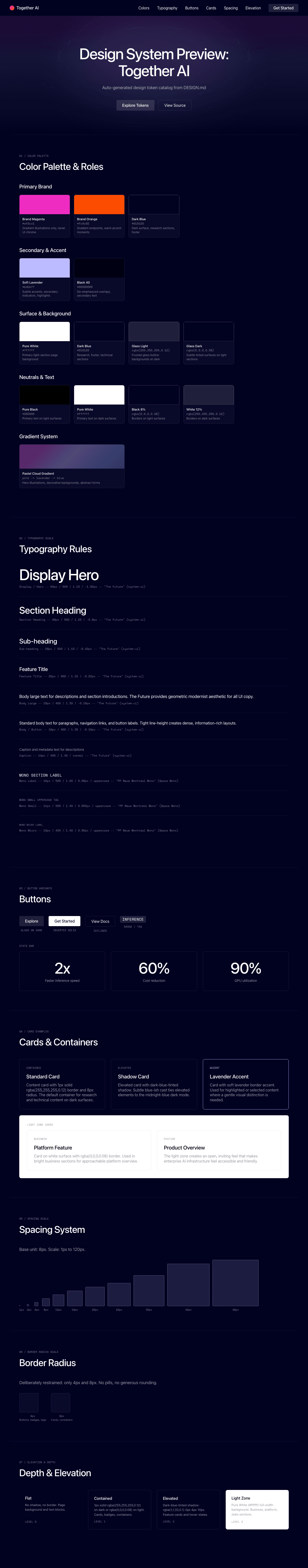
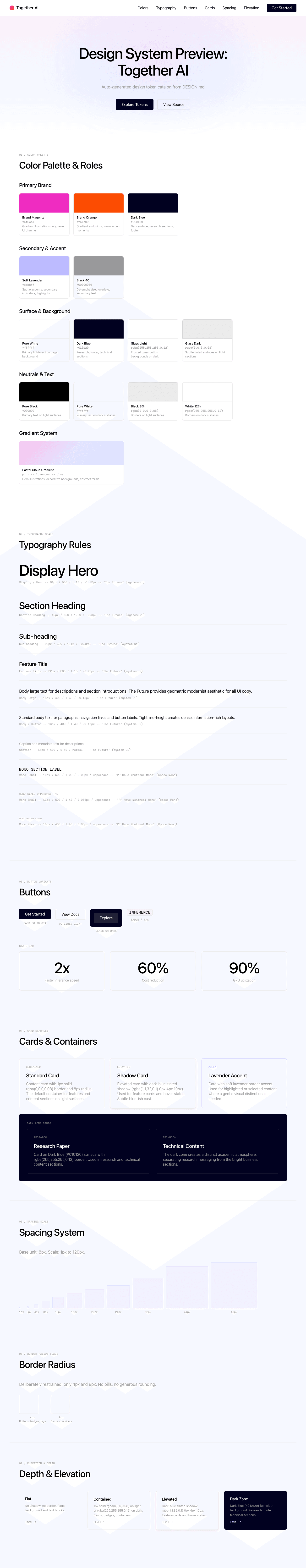
Preview
A sample landing page built with DESIGN.md. It shows the actual colors, typography, buttons, cards, spacing, and elevation, all in one page.
Dark Mode
Light Mode
Design System Inspiration of Together AI
1. Visual Theme & Atmosphere
Together AI's interface is a pastel-gradient dreamscape built for enterprise AI infrastructure — a design that somehow makes GPU clusters and model inference feel light, airy, and optimistic. The hero section blooms with soft pink-blue-lavender gradients and abstract, painterly illustrations that evoke clouds and flight, establishing a visual metaphor for the "AI-Native Cloud" proposition. Against this softness, the typography cuts through with precision: "The Future" display font at 64px with aggressive negative tracking (-1.92px) creates dense, authoritative headline blocks.
The design straddles two worlds: a bright, white-canvas light side where pastel gradients and stats cards create an approachable platform overview, and a dark navy universe (#010120 — not gray-black but a deep midnight blue) where research papers and technical content live. This dual-world approach elegantly separates the "business" messaging (light, friendly, stat-driven) from the "research" messaging (dark, serious, academic).
What makes Together AI distinctive is its type system. "The Future" handles all display and body text with a geometric modernist aesthetic, while "PP Neue Montreal Mono" provides uppercase labels with meticulous letter-spacing — creating a "technical infrastructure company with taste" personality. The brand accents — magenta (#ef2cc1) and orange (#fc4c02) — appear sparingly in the gradient and illustrations, never polluting the clean UI.
Key Characteristics:
- Soft pastel gradients (pink, blue, lavender) against pure white canvas
- Deep midnight blue (
#010120) for dark/research sections — not gray-black - Custom "The Future" font with aggressive negative letter-spacing throughout
- PP Neue Montreal Mono for uppercase technical labels
- Sharp geometry (4px, 8px radius) — not rounded, not pill
- Magenta (#ef2cc1) + orange (#fc4c02) brand accents in illustrations only
- Lavender (#bdbbff) as a soft secondary accent
- Enterprise stats prominently displayed (2x, 60%, 90%)
- Dark-blue-tinted shadows (rgba(1, 1, 32, 0.1))
2. Color Palette & Roles
Primary
- Brand Magenta (
#ef2cc1): The primary brand accent — a vivid pink-magenta used in gradient illustrations and the highest-signal brand moments. Never used as UI chrome. - Brand Orange (
#fc4c02): The secondary brand accent — a vivid orange for gradient endpoints and warm accent moments. - Dark Blue (
#010120): The primary dark surface — a deep midnight blue-black used for research sections, footer, and dark containers. Not gray, not black — distinctly blue.
Secondary & Accent
- Soft Lavender (
#bdbbff): A gentle blue-violet used for subtle accents, secondary indicators, and soft UI highlights. - Black 40 (
#00000066): Semi-transparent black for de-emphasized overlays and secondary text.
Surface & Background
- Pure White (
#ffffff): The primary light-section page background. - Dark Blue (
#010120): Dark-section backgrounds — research, footer, technical content. - Glass Light (
rgba(255, 255, 255, 0.12)): Frosted glass button backgrounds on dark sections. - Glass Dark (
rgba(0, 0, 0, 0.08)): Subtle tinted surfaces on light sections.
Neutrals & Text
- Pure Black (
#000000): Primary text on light surfaces. - Pure White (
#ffffff): Primary text on dark surfaces. - Black 8% (
rgba(0, 0, 0, 0.08)): Borders and subtle containment on light surfaces. - White 12% (
rgba(255, 255, 255, 0.12)): Borders and containment on dark surfaces.
Gradient System
- Pastel Cloud Gradient: Soft pink → lavender → soft blue gradients in hero illustrations. These appear in abstract, painterly forms — clouds, feathers, flowing shapes — that create visual warmth without literal meaning.
- Hero Gradient: The hero background uses soft pastel tints layered over white, creating a dawn-like atmospheric effect.
3. Typography Rules
Font Family
- Primary:
The Future, with fallback:Arial - Monospace / Labels:
PP Neue Montreal Mono, with fallback:Georgia
Hierarchy
| Role | Font | Size | Weight | Line Height | Letter Spacing | Notes |
|---|---|---|---|---|---|---|
| Display / Hero | The Future | 64px (4rem) | 400–500 | 1.00–1.10 (tight) | -1.92px | Maximum impact, dense blocks |
| Section Heading | The Future | 40px (2.5rem) | 500 | 1.20 (tight) | -0.8px | Feature section titles |
| Sub-heading | The Future | 28px (1.75rem) | 500 | 1.15 (tight) | -0.42px | Card headings |
| Feature Title | The Future | 22px (1.38rem) | 500 | 1.15 (tight) | -0.22px | Small feature headings |
| Body Large | The Future | 18px (1.13rem) | 400–500 | 1.30 (tight) | -0.18px | Descriptions, sections |
| Body / Button | The Future | 16px (1rem) | 400–500 | 1.25–1.30 | -0.16px | Standard body, nav, buttons |
| Caption | The Future | 14px (0.88rem) | 400–500 | 1.40 | normal | Metadata, descriptions |
| Mono Label | PP Neue Montreal Mono | 16px (1rem) | 500 | 1.00 (tight) | 0.08px | Uppercase section labels |
| Mono Small | PP Neue Montreal Mono | 11px (0.69rem) | 500 | 1.00–1.40 | 0.055–0.08px | Small uppercase tags |
| Mono Micro | PP Neue Montreal Mono | 10px (0.63rem) | 400 | 1.40 | 0.05px | Smallest uppercase labels |
Principles
- Negative tracking everywhere: Every size of "The Future" uses negative letter-spacing (-0.16px to -1.92px), creating consistently tight, modern text.
- Mono for structure: PP Neue Montreal Mono in uppercase with positive letter-spacing creates technical "label" moments that structure the page without competing with display text.
- Weight 500 as emphasis: The system uses 400 (regular) and 500 (medium) — no bold. Medium weight marks headings and emphasis.
- Tight line-heights throughout: Even body text uses 1.25–1.30 line-height — tighter than typical, creating a dense, information-rich feel.
4. Component Stylings
Buttons
Glass on Dark
- Background:
rgba(255, 255, 255, 0.12)(frosted glass) - Text: Pure White (
#ffffff) - Radius: sharp (4px)
- Opacity: 0.5
- Hover: transparent dark overlay
- Used on dark sections — subtle, glass-like
Dark Solid
- Background: Dark Blue (
#010120) or Pure Black - Text: Pure White
- Radius: sharp (4px)
- The primary CTA on light surfaces
Outlined Light
- Border:
1px solid rgba(0, 0, 0, 0.08) - Background: transparent or subtle glass
- Text: Pure Black
- Radius: sharp (4px)
- Secondary actions on light surfaces
Cards & Containers
- Background: Pure White or subtle glass tint
- Border:
1px solid rgba(0, 0, 0, 0.08)on light;1px solid rgba(255, 255, 255, 0.12)on dark - Radius: sharp (4px) for badges and small elements; comfortable (8px) for larger containers
- Shadow: dark-blue-tinted (
rgba(1, 1, 32, 0.1) 0px 4px 10px) — warm and subtle - Stats cards with large numbers prominently displayed
Badges / Tags
- Background:
rgba(0, 0, 0, 0.04)(light) orrgba(255, 255, 255, 0.12)(dark) - Text: Black (light) or White (dark)
- Padding: 2px 8px (compact)
- Radius: sharp (4px)
- Border:
1px solid rgba(0, 0, 0, 0.08) - PP Neue Montreal Mono, uppercase, 16px
Navigation
- Clean horizontal nav on white/transparent
- Logo: Together AI wordmark
- Links: The Future at 16px, weight 400
- CTA: Dark solid button
- Hover: no text-decoration
Image Treatment
- Abstract pastel gradient illustrations (cloud/feather forms)
- Product UI screenshots on dark/light surfaces
- Team photos in editorial style
- Research paper cards with dark backgrounds
Distinctive Components
Stats Bar
- Large performance metrics (2x, 60%, 90%)
- Bold display numbers
- Short descriptive captions beneath
- Clean horizontal layout
Mono Section Labels
- PP Neue Montreal Mono, uppercase, 11px, letter-spacing 0.055px
- Used as navigational signposts throughout the page
- Technical, structured feel
Research Section
- Dark Blue (#010120) background
- White text, research paper thumbnails
- Creates a distinct "academic" zone
Large Footer Logo
- "together" wordmark rendered at massive scale in the dark footer
- Creates a brand-statement closing moment
5. Layout Principles
Spacing System
- Base unit: 8px
- Scale: 1px, 2px, 4px, 8px, 10px, 12px, 16px, 20px, 24px, 32px, 44px, 48px, 80px, 100px, 120px
- Button/badge padding: 2px 8px (compact)
- Card internal padding: approximately 24–32px
- Section vertical spacing: generous (80–120px)
Grid & Container
- Max container width: approximately 1200px, centered
- Hero: centered with pastel gradient background
- Feature sections: multi-column card grids
- Stats: horizontal row of metric cards
- Research: dark full-width section
Whitespace Philosophy
- Optimistic breathing room: Generous spacing between sections creates an open, inviting feel that makes enterprise AI infrastructure feel accessible.
- Dual atmosphere: Light sections breathe with whitespace; dark sections are denser with content.
- Stats as visual anchors: Large numbers with small captions create natural focal points.
Border Radius Scale
- Sharp (4px): Buttons, badges, tags, small interactive elements — the primary radius
- Comfortable (8px): Larger containers, feature cards
This is a deliberately restrained radius system — no pills, no generous rounding. The sharp geometry contrasts with the soft pastel gradients.
6. Depth & Elevation
| Level | Treatment | Use |
|---|---|---|
| Flat (Level 0) | No shadow, no border | Page background, text blocks |
| Contained (Level 1) | 1px solid rgba(0,0,0,0.08) (light) or rgba(255,255,255,0.12) (dark) |
Cards, badges, containers |
| Elevated (Level 2) | rgba(1, 1, 32, 0.1) 0px 4px 10px |
Feature cards, hover states |
| Dark Zone (Level 3) | Dark Blue (#010120) full-width background | Research, footer, technical sections |
Shadow Philosophy: Together AI uses a single, distinctive shadow — tinted with Dark Blue (rgba(1, 1, 32, 0.1)) rather than generic black. This gives elevated elements a subtle blue-ish cast that ties them to the brand's midnight-blue dark mode. The shadow is soft (10px blur, 4px offset) and always downward — creating gentle paper-hover elevation.
7. Do's and Don'ts
Do
- Use pastel gradients (pink/blue/lavender) for hero illustrations and decorative backgrounds
- Use Dark Blue (#010120) for dark sections — never generic gray-black
- Apply negative letter-spacing on all "The Future" text (scaled by size)
- Use PP Neue Montreal Mono in uppercase for section labels and technical markers
- Keep border-radius sharp (4px) for badges and interactive elements
- Use the dark-blue-tinted shadow for elevation
- Maintain the light/dark section duality — business (light) vs research (dark)
- Show enterprise stats prominently with large display numbers
Don't
- Don't use Brand Magenta (#ef2cc1) or Brand Orange (#fc4c02) as UI colors — they're for illustrations only
- Don't use pill-shaped or generously rounded corners — the geometry is sharp
- Don't use generic gray-black for dark sections — always Dark Blue (#010120)
- Don't use positive letter-spacing on "The Future" — it's always negative
- Don't use bold (700+) weight — 400–500 is the full range
- Don't use warm-toned shadows — always dark-blue-tinted
- Don't reduce section spacing below 48px — the open feeling is core
- Don't mix in additional typefaces — "The Future" + PP Neue Montreal Mono is the pair
8. Responsive Behavior
Breakpoints
| Name | Width | Key Changes |
|---|---|---|
| Mobile | <479px | Compact layout, stacked everything |
| Large Mobile | 479–767px | Single column, hamburger nav |
| Tablet | 768–991px | 2-column grids begin |
| Desktop | 992px+ | Full multi-column layout |
Touch Targets
- Buttons with adequate padding
- Card surfaces as touch targets
- Navigation links at comfortable 16px
Collapsing Strategy
- Navigation: Collapses to hamburger on mobile
- Hero text: 64px → 40px → 28px progressive scaling
- Stats bar: Horizontal → stacked vertical
- Feature grids: Multi-column → single column
- Research section: Cards stack vertically
Image Behavior
- Pastel illustrations scale proportionally
- Product screenshots maintain aspect ratio
- Team photos scale within containers
9. Agent Prompt Guide
Quick Color Reference
- Primary Text (light): "Pure Black (#000000)"
- Primary Text (dark): "Pure White (#ffffff)"
- Page Background: "Pure White (#ffffff)"
- Dark Surface: "Dark Blue (#010120)"
- Brand Accent 1: "Brand Magenta (#ef2cc1)"
- Brand Accent 2: "Brand Orange (#fc4c02)"
- Soft Accent: "Soft Lavender (#bdbbff)"
- Border (light): "rgba(0, 0, 0, 0.08)"
Example Component Prompts
- "Create a hero section on white with soft pastel gradients (pink → lavender → blue) as background. Headline at 64px 'The Future' weight 500, line-height 1.10, letter-spacing -1.92px. Pure Black text. Include a dark blue CTA button (#010120, 4px radius)."
- "Design a stats card: large display number (64px, weight 500) with a small caption below (14px). White background, 8px radius, dark-blue-tinted shadow (rgba(1, 1, 32, 0.1) 0px 4px 10px)."
- "Build a section label: PP Neue Montreal Mono, 11px, weight 500, uppercase, letter-spacing 0.055px. Black text on light, white on dark."
- "Create a dark research section: Dark Blue (#010120) background. White text, section heading at 40px 'The Future' weight 500, letter-spacing -0.8px. Cards with rgba(255, 255, 255, 0.12) border."
- "Design a badge: 4px radius, rgba(0, 0, 0, 0.04) background, 1px solid rgba(0, 0, 0, 0.08) border, 'The Future' 16px text. Padding: 2px 8px."
Iteration Guide
- Always specify negative letter-spacing for "The Future" — it's scaled by size
- Dark sections use #010120 (midnight blue), never generic black
- Shadows are always dark-blue-tinted: rgba(1, 1, 32, 0.1)
- Mono labels are always uppercase with positive letter-spacing
- Keep radius sharp (4px or 8px) — no pills, no generous rounding
- Pastel gradients are for decoration, not UI chrome