Design detail
Webflow
DESIGN.md extracted from the public Webflow website. This is not the official design system. Colors, fonts, and spacing may not be 100% accurate. But it's a good starting point for building something similar.
Live preview
Theme-aware preview frame
Both light and dark preview assets are available.
Documentation
README and DESIGN in one place
Webflow Inspired Design System
DESIGN.md extracted from the public Webflow website. This is not the official design system. Colors, fonts, and spacing may not be 100% accurate. But it's a good starting point for building something similar.
Files
| File | Description |
|---|---|
DESIGN.md |
Complete design system documentation (9 sections) |
preview.html |
Interactive design token catalog (light) |
preview-dark.html |
Interactive design token catalog (dark) |
Use DESIGN.md to use as a reference for AI agents (Claude, Cursor, Stitch) to generate UI that looks like the Webflow design language.
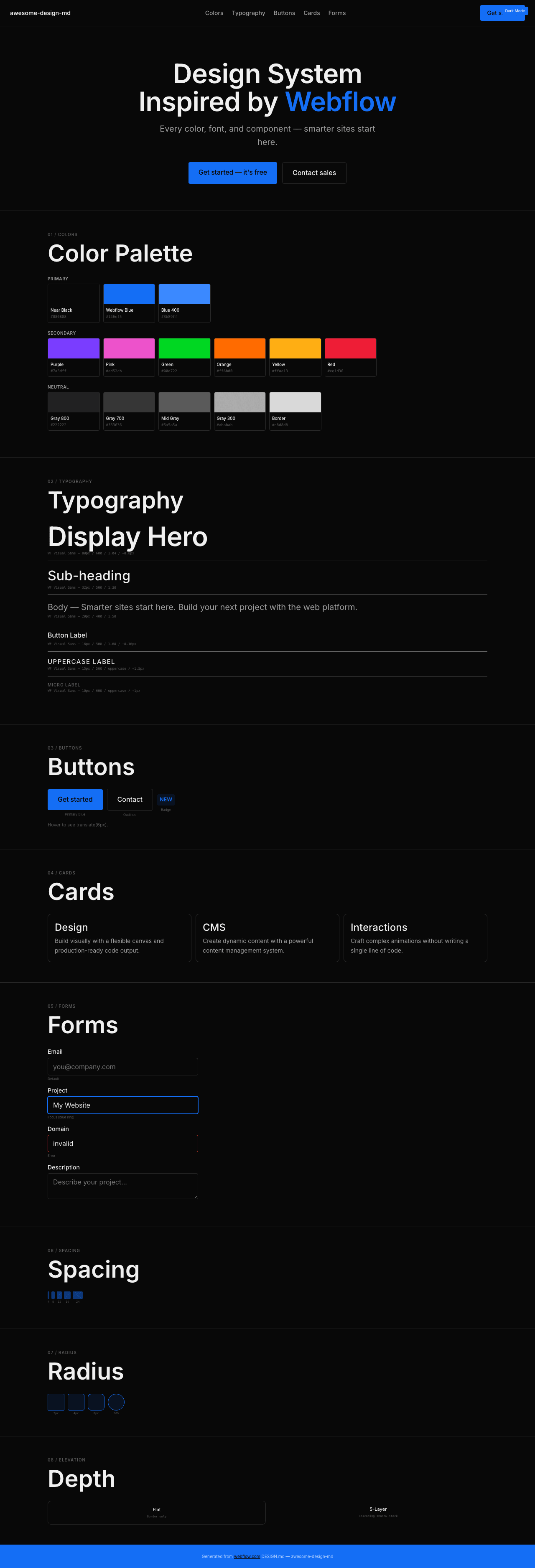
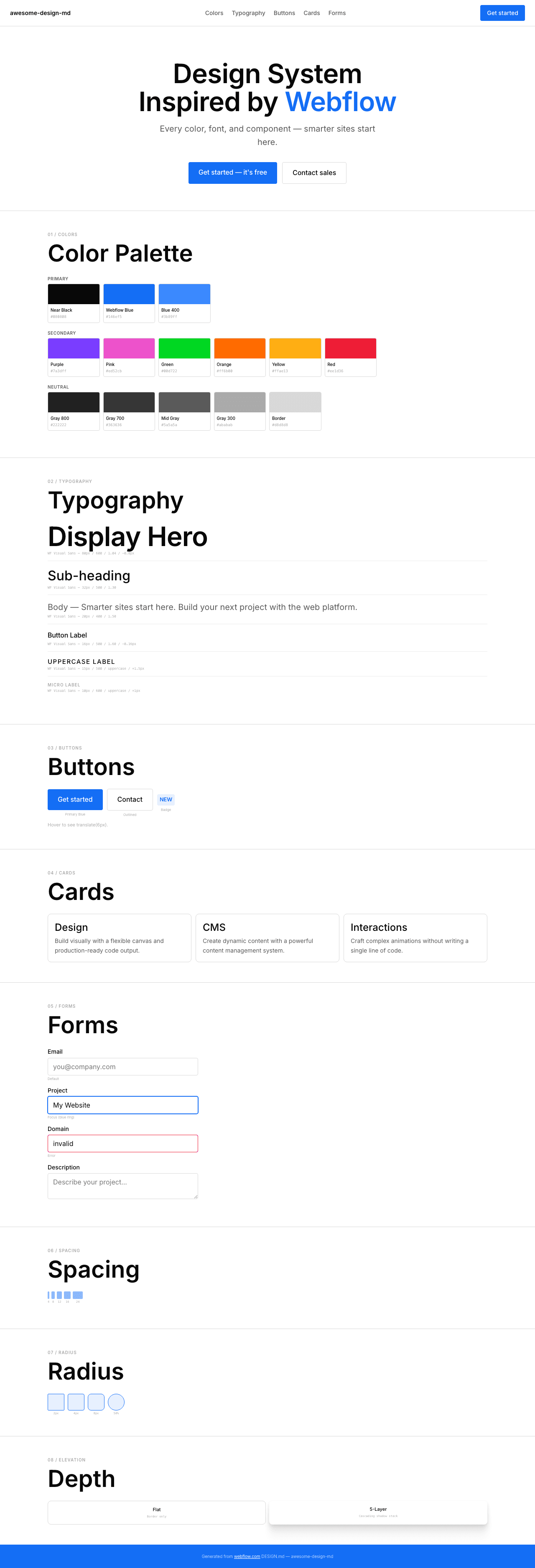
Preview
A sample landing page built with DESIGN.md. It shows the actual colors, typography, buttons, cards, spacing, and elevation, all in one page.
Dark Mode
Light Mode
Design System Inspiration of Webflow
1. Visual Theme & Atmosphere
Webflow's website is a visually rich, tool-forward platform that communicates "design without code" through clean white surfaces, the signature Webflow Blue (#146ef5), and a rich secondary color palette (purple, pink, green, orange, yellow, red). The custom WF Visual Sans Variable font creates a confident, precise typographic system with weight 600 for display and 500 for body.
Key Characteristics:
- White canvas with near-black (
#080808) text - Webflow Blue (
#146ef5) as primary brand + interactive color - WF Visual Sans Variable — custom variable font with weight 500–600
- Rich secondary palette: purple
#7a3dff, pink#ed52cb, green#00d722, orange#ff6b00, yellow#ffae13, red#ee1d36 - Conservative 4px–8px border-radius — sharp, not rounded
- Multi-layer shadow stacks (5-layer cascading shadows)
- Uppercase labels: 10px–15px, weight 500–600, wide letter-spacing (0.6px–1.5px)
- translate(6px) hover animation on buttons
2. Color Palette & Roles
Primary
- Near Black (
#080808): Primary text - Webflow Blue (
#146ef5):--_color---primary--webflow-blue, primary CTA and links - Blue 400 (
#3b89ff):--_color---primary--blue-400, lighter interactive blue - Blue 300 (
#006acc):--_color---blue-300, darker blue variant - Button Hover Blue (
#0055d4):--mkto-embed-color-button-hover
Secondary Accents
- Purple (
#7a3dff):--_color---secondary--purple - Pink (
#ed52cb):--_color---secondary--pink - Green (
#00d722):--_color---secondary--green - Orange (
#ff6b00):--_color---secondary--orange - Yellow (
#ffae13):--_color---secondary--yellow - Red (
#ee1d36):--_color---secondary--red
Neutral
- Gray 800 (
#222222): Dark secondary text - Gray 700 (
#363636): Mid text - Gray 300 (
#ababab): Muted text, placeholder - Mid Gray (
#5a5a5a): Link text - Border Gray (
#d8d8d8): Borders, dividers - Border Hover (
#898989): Hover border
Shadows
- 5-layer cascade:
rgba(0,0,0,0) 0px 84px 24px, rgba(0,0,0,0.01) 0px 54px 22px, rgba(0,0,0,0.04) 0px 30px 18px, rgba(0,0,0,0.08) 0px 13px 13px, rgba(0,0,0,0.09) 0px 3px 7px
3. Typography Rules
Font: WF Visual Sans Variable, fallback: Arial
| Role | Size | Weight | Line Height | Letter Spacing | Notes |
|---|---|---|---|---|---|
| Display Hero | 80px | 600 | 1.04 | -0.8px | |
| Section Heading | 56px | 600 | 1.04 | normal | |
| Sub-heading | 32px | 500 | 1.30 | normal | |
| Feature Title | 24px | 500–600 | 1.30 | normal | |
| Body | 20px | 400–500 | 1.40–1.50 | normal | |
| Body Standard | 16px | 400–500 | 1.60 | -0.16px | |
| Button | 16px | 500 | 1.60 | -0.16px | |
| Uppercase Label | 15px | 500 | 1.30 | 1.5px | uppercase |
| Caption | 14px | 400–500 | 1.40–1.60 | normal | |
| Badge Uppercase | 12.8px | 550 | 1.20 | normal | uppercase |
| Micro Uppercase | 10px | 500–600 | 1.30 | 1px | uppercase |
| Code: Inconsolata (companion monospace font) |
4. Component Stylings
Buttons
- Transparent: text
#080808, translate(6px) on hover - White circle: 50% radius, white bg
- Blue badge:
#146ef5bg, 4px radius, weight 550
Cards: 1px solid #d8d8d8, 4px–8px radius
Badges: Blue-tinted bg at 10% opacity, 4px radius
5. Layout
- Spacing: fractional scale (1px, 2.4px, 3.2px, 4px, 5.6px, 6px, 7.2px, 8px, 9.6px, 12px, 16px, 24px)
- Radius: 2px, 4px, 8px, 50% — conservative, sharp
- Breakpoints: 479px, 768px, 992px
6. Depth: 5-layer cascading shadow system
7. Do's and Don'ts
- Do: Use WF Visual Sans Variable at 500–600. Blue (#146ef5) for CTAs. 4px radius. translate(6px) hover.
- Don't: Round beyond 8px for functional elements. Use secondary colors on primary CTAs.
8. Responsive: 479px, 768px, 992px
9. Agent Prompt Guide
- Text: Near Black (
#080808) - CTA: Webflow Blue (
#146ef5) - Background: White (
#ffffff) - Border:
#d8d8d8 - Secondary: Purple
#7a3dff, Pink#ed52cb, Green#00d722