Design detail
Wise
DESIGN.md extracted from the public Wise website. This is not the official design system. Colors, fonts, and spacing may not be 100% accurate. But it's a good starting point for building something similar.
Live preview
Theme-aware preview frame
Both light and dark preview assets are available.
Documentation
README and DESIGN in one place
Wise Inspired Design System
DESIGN.md extracted from the public Wise website. This is not the official design system. Colors, fonts, and spacing may not be 100% accurate. But it's a good starting point for building something similar.
Files
| File | Description |
|---|---|
DESIGN.md |
Complete design system documentation (9 sections) |
preview.html |
Interactive design token catalog (light) |
preview-dark.html |
Interactive design token catalog (dark) |
Use DESIGN.md to use as a reference for AI agents (Claude, Cursor, Stitch) to generate UI that looks like the Wise design language.
Preview
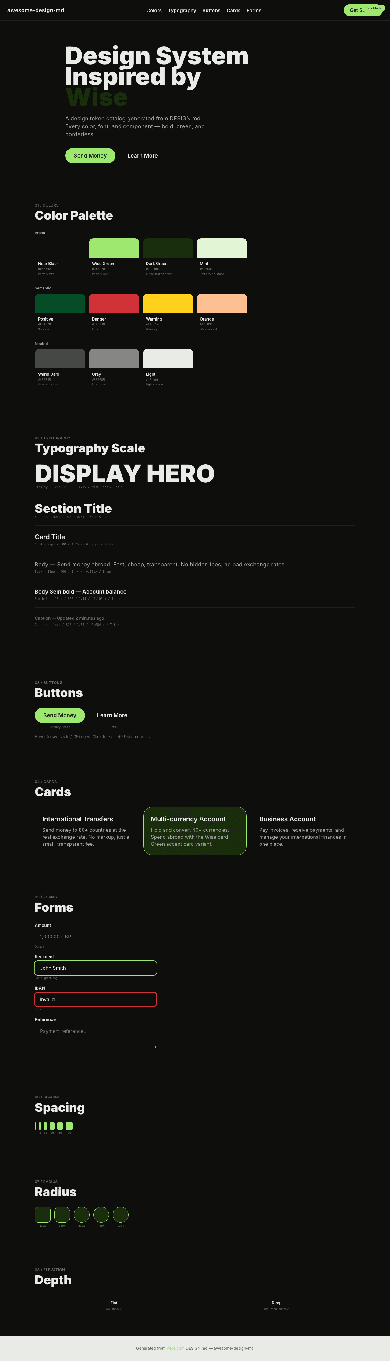
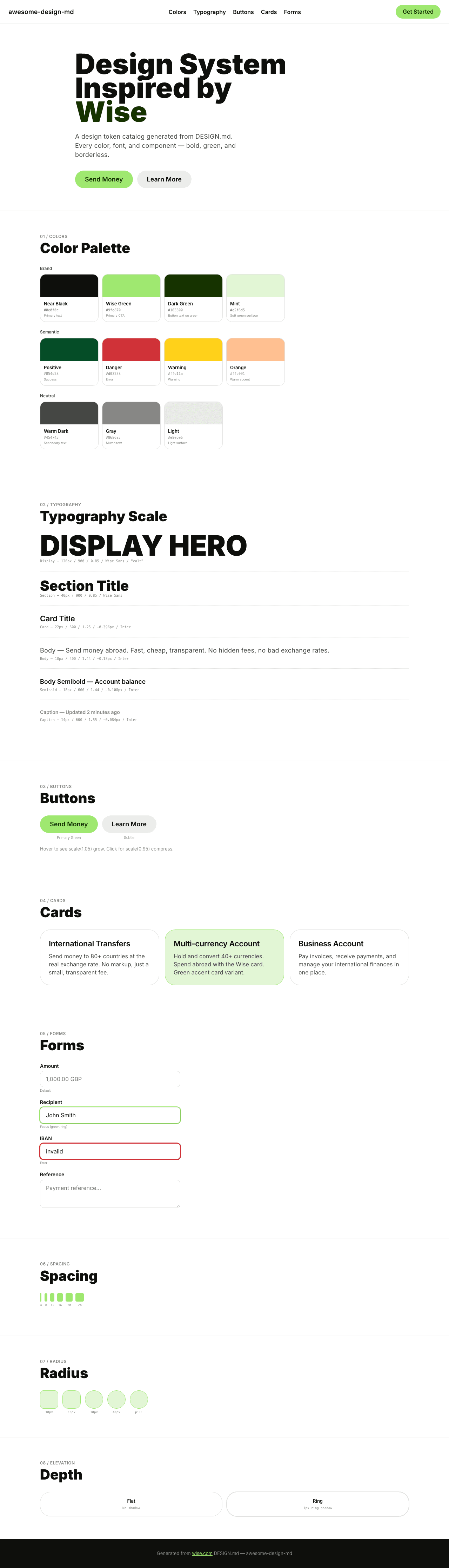
A sample landing page built with DESIGN.md. It shows the actual colors, typography, buttons, cards, spacing, and elevation, all in one page.
Dark Mode
Light Mode
Design System Inspiration of Wise
1. Visual Theme & Atmosphere
Wise's website is a bold, confident fintech platform that communicates "money without borders" through massive typography and a distinctive lime-green accent. The design operates on a warm off-white canvas with near-black text (#0e0f0c) and a signature Wise Green (#9fe870) — a fresh, lime-bright color that feels alive and optimistic, unlike the corporate blues of traditional banking.
The typography uses Wise Sans — a proprietary font used at extreme weight 900 (black) for display headings with a remarkably tight line-height of 0.85 and OpenType "calt" (contextual alternates). At 126px, the text is so dense it feels like a protest sign — bold, urgent, and impossible to ignore. Inter serves as the body font with weight 600 as the default for emphasis, creating a consistently confident voice.
What distinguishes Wise is its green-on-white-on-black material palette. Lime Green (#9fe870) appears on buttons with dark green text (#163300), creating a nature-inspired CTA that feels fresh. Hover states use scale(1.05) expansion rather than color changes — buttons physically grow on interaction. The border-radius system uses 9999px for buttons (pill), 30px–40px for cards, and the shadow system is minimal — just rgba(14,15,12,0.12) 0px 0px 0px 1px ring shadows.
Key Characteristics:
- Wise Sans at weight 900, 0.85 line-height — billboard-scale bold headlines
- Lime Green (
#9fe870) accent with dark green text (#163300) — nature-inspired fintech - Inter body at weight 600 as default — confident, not light
- Near-black (
#0e0f0c) primary with warm green undertone - Scale(1.05) hover animations — buttons physically grow
- OpenType
"calt"on all text - Pill buttons (9999px) and large rounded cards (30px–40px)
- Semantic color system with comprehensive state management
2. Color Palette & Roles
Primary Brand
- Near Black (
#0e0f0c): Primary text, background for dark sections - Wise Green (
#9fe870): Primary CTA button, brand accent - Dark Green (
#163300): Button text on green, deep green accent - Light Mint (
#e2f6d5): Soft green surface, badge backgrounds - Pastel Green (
#cdffad):--color-interactive-contrast-hover, hover accent
Semantic
- Positive Green (
#054d28):--color-sentiment-positive-primary, success - Danger Red (
#d03238):--color-interactive-negative-hover, error/destructive - Warning Yellow (
#ffd11a):--color-sentiment-warning-hover, warnings - Background Cyan (
rgba(56,200,255,0.10)):--color-background-accent, info tint - Bright Orange (
#ffc091):--color-bright-orange, warm accent
Neutral
- Warm Dark (
#454745): Secondary text, borders - Gray (
#868685): Muted text, tertiary - Light Surface (
#e8ebe6): Subtle green-tinted light surface
3. Typography Rules
Font Families
- Display:
Wise Sans, fallback:Inter— OpenType"calt"on all text - Body / UI:
Inter, fallbacks:Helvetica, Arial
Hierarchy
| Role | Font | Size | Weight | Line Height | Letter Spacing | Notes |
|---|---|---|---|---|---|---|
| Display Mega | Wise Sans | 126px (7.88rem) | 900 | 0.85 (ultra-tight) | normal | "calt" |
| Display Hero | Wise Sans | 96px (6.00rem) | 900 | 0.85 | normal | "calt" |
| Section Heading | Wise Sans | 64px (4.00rem) | 900 | 0.85 | normal | "calt" |
| Sub-heading | Wise Sans | 40px (2.50rem) | 900 | 0.85 | normal | "calt" |
| Alt Heading | Inter | 78px (4.88rem) | 600 | 1.10 (tight) | -2.34px | "calt" |
| Card Title | Inter | 26px (1.62rem) | 600 | 1.23 (tight) | -0.39px | "calt" |
| Feature Title | Inter | 22px (1.38rem) | 600 | 1.25 (tight) | -0.396px | "calt" |
| Body | Inter | 18px (1.13rem) | 400 | 1.44 | 0.18px | "calt" |
| Body Semibold | Inter | 18px (1.13rem) | 600 | 1.44 | -0.108px | "calt" |
| Button | Inter | 18px–22px | 600 | 1.00–1.44 | -0.108px | "calt" |
| Caption | Inter | 14px (0.88rem) | 400–600 | 1.50–1.86 | -0.084px to -0.108px | "calt" |
| Small | Inter | 12px (0.75rem) | 400–600 | 1.00–2.17 | -0.084px to -0.108px | "calt" |
Principles
- Weight 900 as identity: Wise Sans Black (900) is used exclusively for display — the heaviest weight in any analyzed system. It creates text that feels stamped, pressed, physical.
- 0.85 line-height: The tightest display line-height analyzed. Letters overlap vertically, creating dense, billboard-like text blocks.
- "calt" everywhere: Contextual alternates enabled on ALL text — both Wise Sans and Inter.
- Weight 600 as body default: Inter Semibold is the standard reading weight — confident, not light.
4. Component Stylings
Buttons
Primary Green Pill
- Background:
#9fe870(Wise Green) - Text:
#163300(Dark Green) - Padding: 5px 16px
- Radius: 9999px
- Hover: scale(1.05) — button physically grows
- Active: scale(0.95) — button compresses
- Focus: inset ring + outline
Secondary Subtle Pill
- Background:
rgba(22, 51, 0, 0.08)(dark green at 8% opacity) - Text:
#0e0f0c - Padding: 8px 12px 8px 16px
- Radius: 9999px
- Same scale hover/active behavior
Cards & Containers
- Radius: 16px (small), 30px (medium), 40px (large cards/tables)
- Border:
1px solid rgba(14,15,12,0.12)or1px solid #9fe870(green accent) - Shadow:
rgba(14,15,12,0.12) 0px 0px 0px 1px(ring shadow)
Navigation
- Green-tinted navigation hover:
rgba(211,242,192,0.4) - Clean header with Wise wordmark
- Pill CTAs right-aligned
5. Layout Principles
Spacing System
- Base unit: 8px
- Scale: 1px, 2px, 3px, 4px, 5px, 8px, 10px, 11px, 12px, 16px, 18px, 19px, 20px, 22px, 24px
Border Radius Scale
- Minimal (2px): Links, inputs
- Standard (10px): Comboboxes, inputs
- Card (16px): Small cards, buttons, radio
- Medium (20px): Links, medium cards
- Large (30px): Feature cards
- Section (40px): Tables, large cards
- Mega (1000px): Presentation elements
- Pill (9999px): All buttons, images
- Circle (50%): Icons, badges
6. Depth & Elevation
| Level | Treatment | Use |
|---|---|---|
| Flat (Level 0) | No shadow | Default |
| Ring (Level 1) | rgba(14,15,12,0.12) 0px 0px 0px 1px |
Card borders |
| Inset (Level 2) | rgb(134,134,133) 0px 0px 0px 1px inset |
Input focus |
Shadow Philosophy: Wise uses minimal shadows — ring shadows only. Depth comes from the bold green accent against the neutral canvas.
7. Do's and Don'ts
Do
- Use Wise Sans weight 900 for display — the extreme boldness IS the brand
- Apply line-height 0.85 on Wise Sans display — ultra-tight is intentional
- Use Lime Green (#9fe870) for primary CTAs with Dark Green (#163300) text
- Apply scale(1.05) hover and scale(0.95) active on buttons
- Enable "calt" on all text
- Use Inter weight 600 as the body default
Don't
- Don't use light font weights for Wise Sans — only 900
- Don't relax the 0.85 line-height on display — the density is the identity
- Don't use the Wise Green as background for large surfaces — it's for buttons and accents
- Don't skip the scale animation on buttons
- Don't use traditional shadows — ring shadows only
8. Responsive Behavior
Breakpoints
| Name | Width | Key Changes |
|---|---|---|
| Mobile | <576px | Single column |
| Tablet | 576–992px | 2-column |
| Desktop | 992–1440px | Full layout |
| Large | >1440px | Expanded |
9. Agent Prompt Guide
Quick Color Reference
- Text: Near Black (
#0e0f0c) - Background: White (
#ffffff/ off-white) - Accent: Wise Green (
#9fe870) - Button text: Dark Green (
#163300) - Secondary: Gray (
#868685)
Example Component Prompts
- "Create hero: white background. Headline at 96px Wise Sans weight 900, line-height 0.85, 'calt' enabled, #0e0f0c text. Green pill CTA (#9fe870, 9999px radius, 5px 16px padding, #163300 text). Hover: scale(1.05)."
- "Build a card: 30px radius, 1px solid rgba(14,15,12,0.12). Title at 22px Inter weight 600, body at 18px weight 400."
Iteration Guide
- Wise Sans 900 at 0.85 line-height — the extreme weight IS the brand
- Lime Green for buttons only — dark green text on green background
- Scale animations (1.05 hover, 0.95 active) on all interactive elements
- "calt" on everything — contextual alternates are mandatory
- Inter 600 for body — confident reading weight