
Intercom
DESIGN.md extracted from the public Intercom website. This is not the official design system. Colors, fonts, and spacing may not be 100% accurate. But it's a good starting point for building something similar.
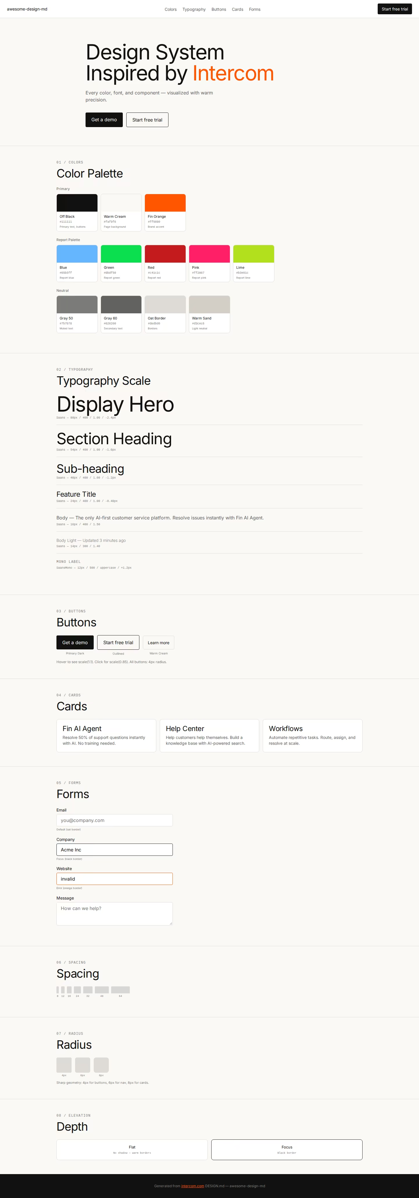
렌더링된 미리보기를 불러오지 못했습니다.실시간 HTML 미리보기 열기
라이트와 다크 미리보기 자산을 모두 사용할 수 있습니다.
README와 DESIGN을 한곳에서
Intercom Inspired Design System
DESIGN.md extracted from the public Intercom website. This is not the official design system. Colors, fonts, and spacing may not be 100% accurate. But it's a good starting point for building something similar.
Files
| File | Description |
|---|---|
DESIGN.md |
Complete design system documentation (9 sections) |
preview.html |
Interactive design token catalog (light) |
preview-dark.html |
Interactive design token catalog (dark) |
Use DESIGN.md to use as a reference for AI agents (Claude, Cursor, Stitch) to generate UI that looks like the Intercom design language.
Preview
A sample landing page built with DESIGN.md. It shows the actual colors, typography, buttons, cards, spacing, and elevation, all in one page.
Dark Mode
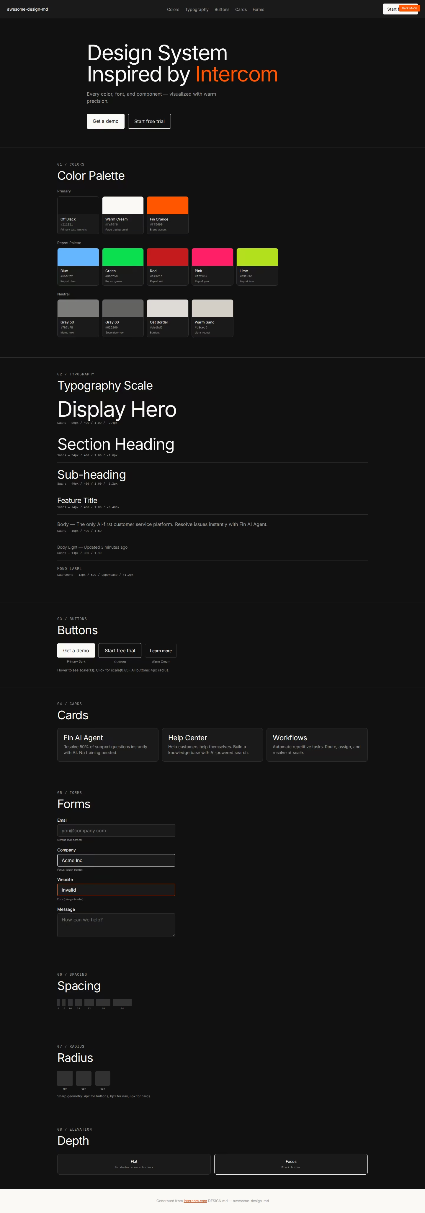
Light Mode
Design System Inspiration of Intercom
1. Visual Theme & Atmosphere
Intercom's website is a warm, confident customer service platform that communicates "AI-first helpdesk" through a clean, editorial design language. The page operates on a warm off-white canvas (#faf9f6) with off-black (#111111) text, creating an intimate, magazine-like reading experience. The signature Fin Orange (#ff5600) — named after Intercom's AI agent — serves as the singular vibrant accent against the warm neutral palette.
The typography uses Saans — a custom geometric sans-serif with aggressive negative letter-spacing (-2.4px at 80px, -0.48px at 24px) and a consistent 1.00 line-height across all heading sizes. This creates ultra-compressed, billboard-like headlines that feel engineered and precise. Serrif provides the serif companion for editorial moments, and SaansMono handles code and uppercase technical labels. MediumLL and LLMedium appear for specific UI contexts, creating a rich five-font ecosystem.
What distinguishes Intercom is its remarkably sharp geometry — 4px border-radius on buttons creates near-rectangular interactive elements that feel industrial and precise, contrasting with the warm surface colors. Button hover states use scale(1.1) expansion, creating a physical "growing" interaction. The border system uses warm oat tones (#dedbd6) and oklab-based opacity values for sophisticated color management.
Key Characteristics:
- Warm off-white canvas (
#faf9f6) with oat-toned borders (#dedbd6) - Saans font with extreme negative tracking (-2.4px at 80px) and 1.00 line-height
- Fin Orange (
#ff5600) as singular brand accent - Sharp 4px border-radius — near-rectangular buttons and elements
- Scale(1.1) hover with scale(0.85) active — physical button interaction
- SaansMono uppercase labels with wide tracking (0.6px–1.2px)
- Rich multi-color report palette (blue, green, red, pink, lime, orange)
- oklab color values for sophisticated opacity management
2. Color Palette & Roles
Primary
- Off Black (
#111111):--color-off-black, primary text, button backgrounds - Pure White (
#ffffff):--wsc-color-content-primary, primary surface - Warm Cream (
#faf9f6): Button backgrounds, card surfaces - Fin Orange (
#ff5600):--color-fin, primary brand accent - Report Orange (
#fe4c02):--color-report-orange, data visualization
Report Palette
- Report Blue (
#65b5ff):--color-report-blue - Report Green (
#0bdf50):--color-report-green - Report Red (
#c41c1c):--color-report-red - Report Pink (
#ff2067):--color-report-pink - Report Lime (
#b3e01c):--color-report-lime-300 - Green (
#00da00):--color-green - Deep Blue (
#0007cb): Deep blue accent
Neutral Scale (Warm)
- Black 80 (
#313130):--wsc-color-black-80, dark neutral - Black 60 (
#626260):--wsc-color-black-60, mid neutral - Black 50 (
#7b7b78):--wsc-color-black-50, muted text - Content Tertiary (
#9c9fa5):--wsc-color-content-tertiary - Oat Border (
#dedbd6): Warm border color - Warm Sand (
#d3cec6): Light warm neutral
3. Typography Rules
Font Families
- Primary:
Saans, fallbacks:Saans Fallback, ui-sans-serif, system-ui - Serif:
Serrif, fallbacks:Serrif Fallback, ui-serif, Georgia - Monospace:
SaansMono, fallbacks:SaansMono Fallback, ui-monospace - UI:
MediumLL/LLMedium, fallbacks:system-ui, -apple-system
Hierarchy
| Role | Font | Size | Weight | Line Height | Letter Spacing |
|---|---|---|---|---|---|
| Display Hero | Saans | 80px | 400 | 1.00 (tight) | -2.4px |
| Section Heading | Saans | 54px | 400 | 1.00 | -1.6px |
| Sub-heading | Saans | 40px | 400 | 1.00 | -1.2px |
| Card Title | Saans | 32px | 400 | 1.00 | -0.96px |
| Feature Title | Saans | 24px | 400 | 1.00 | -0.48px |
| Body Emphasis | Saans | 20px | 400 | 0.95 | -0.2px |
| Nav / UI | Saans | 18px | 400 | 1.00 | normal |
| Body | Saans | 16px | 400 | 1.50 | normal |
| Body Light | Saans | 14px | 300 | 1.40 | normal |
| Button | Saans | 16px / 14px | 400 | 1.50 / 1.43 | normal |
| Button Bold | LLMedium | 16px | 700 | 1.20 | 0.16px |
| Serif Body | Serrif | 16px | 300 | 1.40 | -0.16px |
| Mono Label | SaansMono | 12px | 400–500 | 1.00–1.30 | 0.6px–1.2px uppercase |
4. Component Stylings
Buttons
Primary Dark
- Background:
#111111 - Text:
#ffffff - Padding: 0px 14px
- Radius: 4px
- Hover: white background, dark text, scale(1.1)
- Active: green background (
#2c6415), scale(0.85)
Outlined
- Background: transparent
- Text:
#111111 - Border:
1px solid #111111 - Radius: 4px
- Same scale hover/active behavior
Warm Card Button
- Background:
#faf9f6 - Text:
#111111 - Padding: 16px
- Border:
1px solid oklab(... / 0.1)
Cards & Containers
- Background:
#faf9f6(warm cream) - Border:
1px solid #dedbd6(warm oat) - Radius: 8px
- No visible shadows
Navigation
- Saans 16px for links
- Off-black text on white
- Small 4px–6px radius buttons
- Orange Fin accent for AI features
5. Layout Principles
Spacing: 8px, 10px, 12px, 14px, 16px, 20px, 24px, 32px, 40px, 48px, 60px, 64px, 80px, 96px
Border Radius: 4px (buttons), 6px (nav items), 8px (cards, containers)
6. Depth & Elevation
Minimal shadows. Depth through warm border colors and surface tints.
7. Do's and Don'ts
Do
- Use Saans with 1.00 line-height and negative tracking on all headings
- Apply 4px radius on buttons — sharp geometry is the identity
- Use Fin Orange (#ff5600) for AI/brand accent only
- Apply scale(1.1) hover on buttons
- Use warm neutrals (#faf9f6, #dedbd6)
Don't
- Don't round buttons beyond 4px
- Don't use Fin Orange decoratively
- Don't use cool gray borders — always warm oat tones
- Don't skip the negative tracking on headings
8. Responsive Behavior
Breakpoints: 425px, 530px, 600px, 640px, 768px, 896px
9. Agent Prompt Guide
Quick Color Reference
- Text: Off Black (
#111111) - Background: Warm Cream (
#faf9f6) - Accent: Fin Orange (
#ff5600) - Border: Oat (
#dedbd6) - Muted:
#7b7b78
Example Component Prompts
- "Create hero: warm cream (#faf9f6) background. Saans 80px weight 400, line-height 1.00, letter-spacing -2.4px, #111111. Dark button (#111111, 4px radius). Hover: scale(1.1), white bg."
Hagicode
OpenSpec 워크플로, 멀티 에이전트 실행, Hero 시나리오 인터페이스 아이디어가 이 갤러리 셸에 재사용되었습니다.
더 똑똑하고 빠르며 즐거운 에이전틱 코딩 워크플로로 아이디어를 완성도 높고 쓸모 있는 소프트웨어로 만드세요.
- SmartOpenSpec은 의도를 아이디어에서 배포된 변경까지 이어지는 실행 가능한 경로로 바꿉니다.
- Efficient멀티 에이전트 워크플로가 조사, 구현, 리뷰를 병렬로 진행합니다.
- FunHero Scenario 인터페이스는 긴 코딩 세션을 시각적이고 협업적이며 보람 있게 만듭니다.
HagiCode 홍보 영상
HagiCode가 에이전틱 코딩을 어떻게 현실로 만드는지 확인해 보세요.