
Miro
DESIGN.md extracted from the public Miro website. This is not the official design system. Colors, fonts, and spacing may not be 100% accurate. But it's a good starting point for building something similar.
렌더링된 미리보기를 불러오지 못했습니다.실시간 HTML 미리보기 열기
라이트와 다크 미리보기 자산을 모두 사용할 수 있습니다.
README와 DESIGN을 한곳에서
Miro Inspired Design System
DESIGN.md extracted from the public Miro website. This is not the official design system. Colors, fonts, and spacing may not be 100% accurate. But it's a good starting point for building something similar.
Files
| File | Description |
|---|---|
DESIGN.md |
Complete design system documentation (9 sections) |
preview.html |
Interactive design token catalog (light) |
preview-dark.html |
Interactive design token catalog (dark) |
Use DESIGN.md to use as a reference for AI agents (Claude, Cursor, Stitch) to generate UI that looks like the Miro design language.
Preview
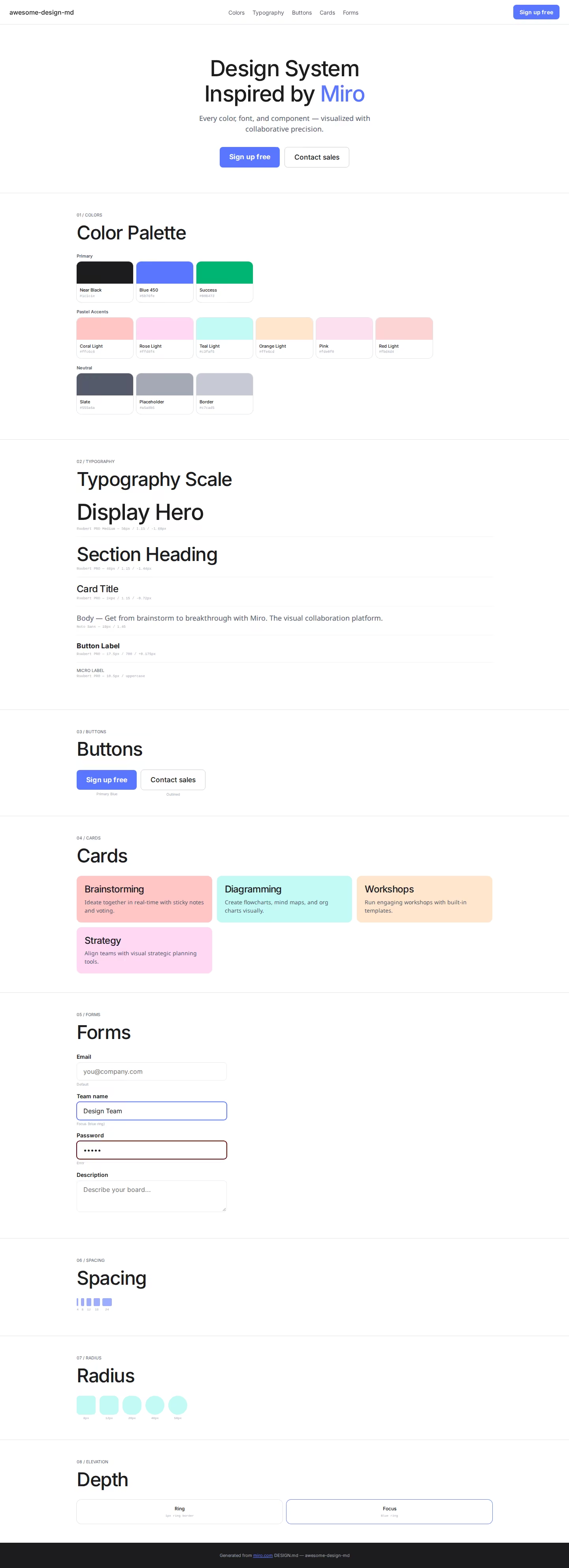
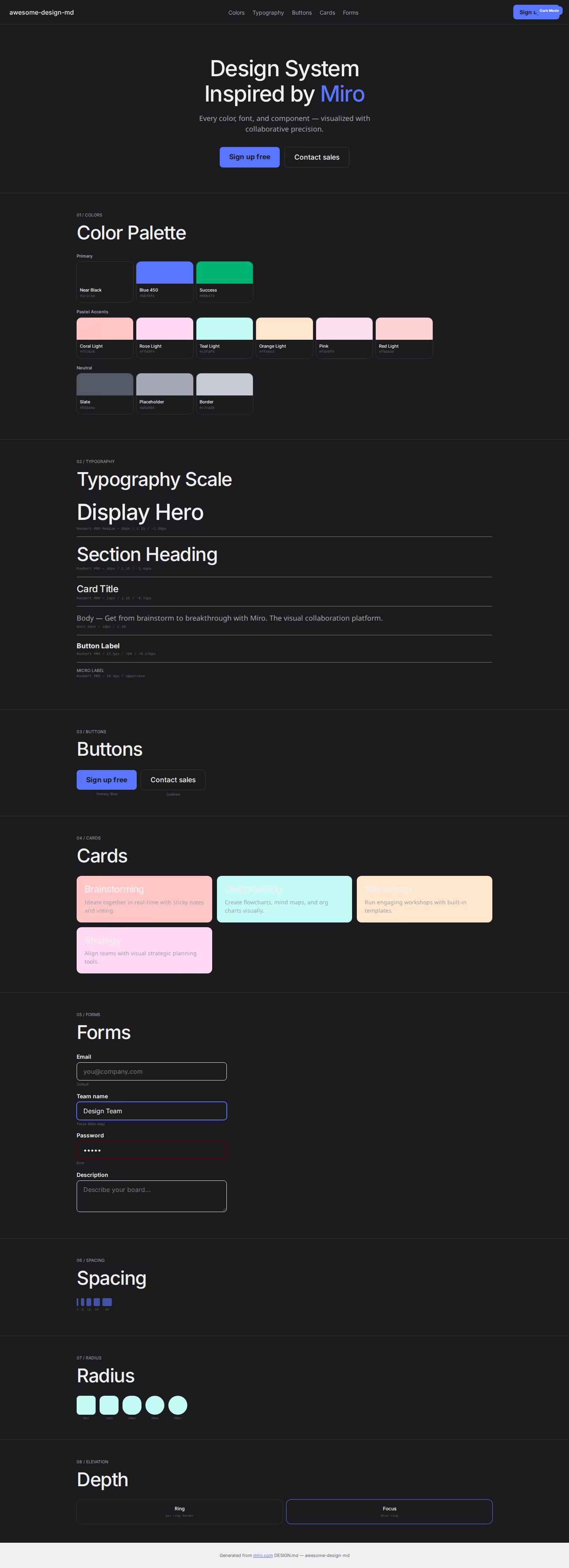
A sample landing page built with DESIGN.md. It shows the actual colors, typography, buttons, cards, spacing, and elevation, all in one page.
Dark Mode
Light Mode
Design System Inspiration of Miro
1. Visual Theme & Atmosphere
Miro's website is a clean, collaborative-tool-forward platform that communicates "visual thinking" through generous whitespace, pastel accent colors, and a confident geometric font. The design uses a predominantly white canvas with near-black text (#1c1c1e) and a distinctive pastel color palette — coral, rose, teal, orange, yellow, moss — each representing different collaboration contexts.
The typography uses Roobert PRO Medium as the primary display font with OpenType character variants ("blwf", "cv03", "cv04", "cv09", "cv11") and negative letter-spacing (-1.68px at 56px). Noto Sans handles body text with its own stylistic set ("liga" 0, "ss01", "ss04", "ss05"). The design is built with Framer, giving it smooth animations and modern component patterns.
Key Characteristics:
- White canvas with near-black (
#1c1c1e) text - Roobert PRO Medium with multiple OpenType character variants
- Pastel accent palette: coral, rose, teal, orange, yellow, moss (light + dark pairs)
- Blue 450 (
#5b76fe) as primary interactive color - Success green (
#00b473) for positive states - Generous border-radius: 8px–50px range
- Framer-built with smooth motion patterns
- Ring shadow border:
rgb(224,226,232) 0px 0px 0px 1px
2. Color Palette & Roles
Primary
- Near Black (
#1c1c1e): Primary text - White (
#ffffff):--tw-color-white, primary surface - Blue 450 (
#5b76fe):--tw-color-blue-450, primary interactive - Actionable Pressed (
#2a41b6):--tw-color-actionable-pressed
Pastel Accents (Light/Dark pairs)
- Coral: Light
#ffc6c6/ Dark#600000 - Rose: Light
#ffd8f4/ Dark (implied) - Teal: Light
#c3faf5/ Dark#187574 - Orange: Light
#ffe6cd - Yellow: Dark
#746019 - Moss: Dark
#187574 - Pink (
#fde0f0): Soft pink surface - Red (
#fbd4d4): Light red surface - Dark Red (
#e3c5c5): Muted red
Semantic
- Success (
#00b473):--tw-color-success-accent
Neutral
- Slate (
#555a6a): Secondary text - Input Placeholder (
#a5a8b5):--tw-color-input-placeholder - Border (
#c7cad5): Button borders - Ring (
rgb(224,226,232)): Shadow-as-border
3. Typography Rules
Font Families
- Display:
Roobert PRO Medium, fallback: Placeholder —"blwf", "cv03", "cv04", "cv09", "cv11" - Display Variants:
Roobert PRO SemiBold,Roobert PRO SemiBold Italic,Roobert PRO - Body:
Noto Sans—"liga" 0, "ss01", "ss04", "ss05"
Hierarchy
| Role | Font | Size | Weight | Line Height | Letter Spacing |
|---|---|---|---|---|---|
| Display Hero | Roobert PRO Medium | 56px | 400 | 1.15 | -1.68px |
| Section Heading | Roobert PRO Medium | 48px | 400 | 1.15 | -1.44px |
| Card Title | Roobert PRO Medium | 24px | 400 | 1.15 | -0.72px |
| Sub-heading | Noto Sans | 22px | 400 | 1.35 | -0.44px |
| Feature | Roobert PRO Medium | 18px | 600 | 1.35 | normal |
| Body | Noto Sans | 18px | 400 | 1.45 | normal |
| Body Standard | Noto Sans | 16px | 400–600 | 1.50 | -0.16px |
| Button | Roobert PRO Medium | 17.5px | 700 | 1.29 | 0.175px |
| Caption | Roobert PRO Medium | 14px | 400 | 1.71 | normal |
| Small | Roobert PRO Medium | 12px | 400 | 1.15 | -0.36px |
| Micro Uppercase | Roobert PRO | 10.5px | 400 | 0.90 | uppercase |
4. Component Stylings
Buttons
- Outlined: transparent bg,
1px solid #c7cad5, 8px radius, 7px 12px padding - White circle: 50% radius, white bg with shadow
- Blue primary (implied from interactive color)
Cards: 12px–24px radius, pastel backgrounds
Inputs: white bg, 1px solid #e9eaef, 8px radius, 16px padding
5. Layout Principles
- Spacing: 1–24px base scale
- Radius: 8px (buttons), 10px–12px (cards), 20px–24px (panels), 40px–50px (large containers)
- Ring shadow:
rgb(224,226,232) 0px 0px 0px 1px
6. Depth & Elevation
Minimal — ring shadow + pastel surface contrast
7. Do's and Don'ts
Do
- Use pastel light/dark pairs for feature sections
- Apply Roobert PRO with OpenType character variants
- Use Blue 450 (#5b76fe) for interactive elements
Don't
- Don't use heavy shadows
- Don't mix more than 2 pastel accents per section
8. Responsive Behavior
Breakpoints: 425px, 576px, 768px, 896px, 1024px, 1200px, 1280px, 1366px, 1700px, 1920px
9. Agent Prompt Guide
Quick Color Reference
- Text: Near Black (
#1c1c1e) - Background: White (
#ffffff) - Interactive: Blue 450 (
#5b76fe) - Success:
#00b473 - Border:
#c7cad5
Example Component Prompts
- "Create hero: white background. Roobert PRO Medium 56px, line-height 1.15, letter-spacing -1.68px. Blue CTA (#5b76fe). Outlined secondary (1px solid #c7cad5, 8px radius)."
Hagicode
OpenSpec 워크플로, 멀티 에이전트 실행, Hero 시나리오 인터페이스 아이디어가 이 갤러리 셸에 재사용되었습니다.
더 똑똑하고 빠르며 즐거운 에이전틱 코딩 워크플로로 아이디어를 완성도 높고 쓸모 있는 소프트웨어로 만드세요.
- SmartOpenSpec은 의도를 아이디어에서 배포된 변경까지 이어지는 실행 가능한 경로로 바꿉니다.
- Efficient멀티 에이전트 워크플로가 조사, 구현, 리뷰를 병렬로 진행합니다.
- FunHero Scenario 인터페이스는 긴 코딩 세션을 시각적이고 협업적이며 보람 있게 만듭니다.
HagiCode 홍보 영상
HagiCode가 에이전틱 코딩을 어떻게 현실로 만드는지 확인해 보세요.