设计详情
Cohere
DESIGN.md extracted from the public Cohere website. This is not the official design system. Colors, fonts, and spacing may not be 100% accurate. But it's a good starting point for building something similar.
实时预览
预览效果
此条目同时提供浅色与深色预览资源。
文档
README & DESIGN
Cohere Inspired Design System
DESIGN.md extracted from the public Cohere website. This is not the official design system. Colors, fonts, and spacing may not be 100% accurate. But it's a good starting point for building something similar.
Files
| File | Description |
|---|---|
DESIGN.md |
Complete design system documentation (9 sections) |
preview.html |
Interactive design token catalog (light) |
preview-dark.html |
Interactive design token catalog (dark) |
Use DESIGN.md to use as a reference for AI agents (Claude, Cursor, Stitch) to generate UI that looks like the Cohere design language.
Preview
A sample landing page built with DESIGN.md. It shows the actual colors, typography, buttons, cards, spacing, and elevation, all in one page.
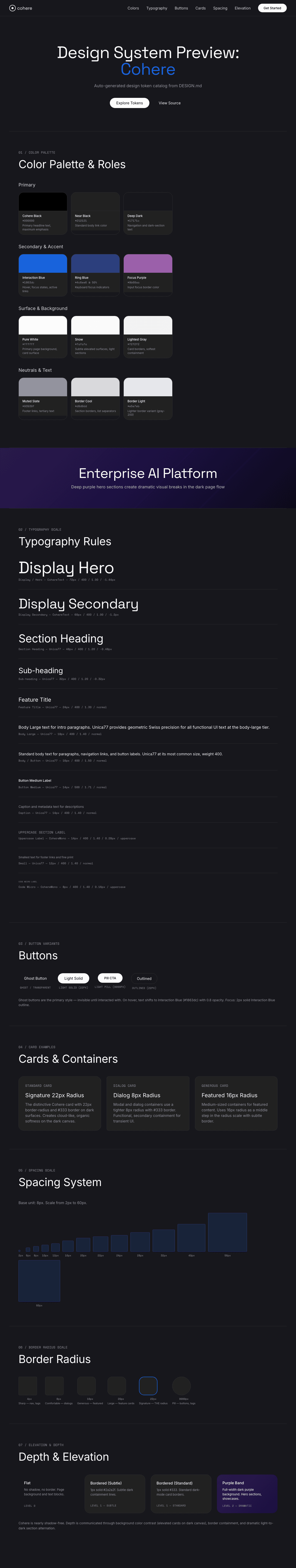
Dark Mode
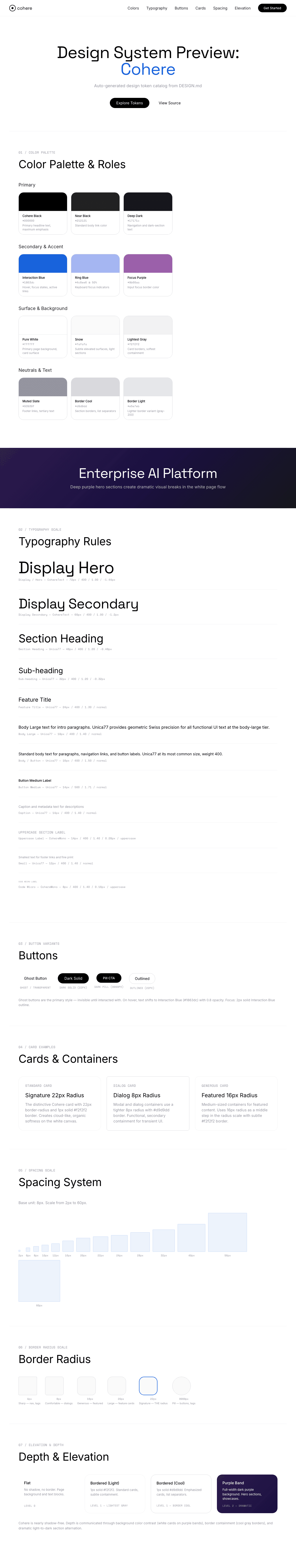
Light Mode
Design System Inspiration of Cohere
1. Visual Theme & Atmosphere
Cohere's interface is a polished enterprise command deck — confident, clean, and designed to make AI feel like serious infrastructure rather than a consumer toy. The experience lives on a bright white canvas where content is organized into generously rounded cards (22px radius) that create an organic, cloud-like containment language. This is a site that speaks to CTOs and enterprise architects: professional without being cold, sophisticated without being intimidating.
The design language bridges two worlds with a dual-typeface system: CohereText, a custom display serif with tight tracking, gives headlines the gravitas of a technology manifesto, while Unica77 Cohere Web handles all body and UI text with geometric Swiss precision. This serif/sans pairing creates a "confident authority meets engineering clarity" personality that perfectly reflects an enterprise AI platform.
Color is used with extreme restraint — the interface is almost entirely black-and-white with cool gray borders (#d9d9dd, #e5e7eb). Purple-violet appears only in photographic hero bands, gradient sections, and the interactive blue (#1863dc) that signals hover and focus states. This chromatic restraint means that when color DOES appear — in product screenshots, enterprise photography, and the deep purple section — it carries maximum visual weight.
Key Characteristics:
- Bright white canvas with cool gray containment borders
- 22px signature border-radius — the distinctive "Cohere card" roundness
- Dual custom typeface: CohereText (display serif) + Unica77 (body sans)
- Enterprise-grade chromatic restraint: black, white, cool grays, minimal purple-blue accent
- Deep purple/violet hero sections providing dramatic contrast
- Ghost/transparent buttons that shift to blue on hover
- Enterprise photography showing diverse real-world applications
- CohereMono for code and technical labels with uppercase transforms
2. Color Palette & Roles
Primary
- Cohere Black (
#000000): Primary headline text and maximum-emphasis elements. - Near Black (
#212121): Standard body link color — slightly softer than pure black. - Deep Dark (
#17171c): A blue-tinted near-black for navigation and dark-section text.
Secondary & Accent
- Interaction Blue (
#1863dc): The primary interactive accent — appears on button hover, focus states, and active links. The sole chromatic action color. - Ring Blue (
#4c6ee6at 50%): Tailwind ring color for keyboard focus indicators. - Focus Purple (
#9b60aa): Input focus border color — a muted violet.
Surface & Background
- Pure White (
#ffffff): The primary page background and card surface. - Snow (
#fafafa): Subtle elevated surfaces and light-section backgrounds. - Lightest Gray (
#f2f2f2): Card borders and the softest containment lines.
Neutrals & Text
- Muted Slate (
#93939f): De-emphasized footer links and tertiary text — a cool-toned gray with a slight blue-violet tint. - Border Cool (
#d9d9dd): Standard section and list-item borders — a cool, slightly purple-tinted gray. - Border Light (
#e5e7eb): Lighter border variant — Tailwind's standard gray-200.
Gradient System
- Purple-Violet Hero Band: Deep purple gradient sections that create dramatic contrast against the white canvas. These appear as full-width bands housing product screenshots and key messaging.
- Dark Footer Gradient: The page transitions through deep purple/charcoal to the black footer, creating a "dusk" effect.
3. Typography Rules
Font Family
- Display:
CohereText, with fallbacks:Space Grotesk, Inter, ui-sans-serif, system-ui - Body / UI:
Unica77 Cohere Web, with fallbacks:Inter, Arial, ui-sans-serif, system-ui - Code:
CohereMono, with fallbacks:Arial, ui-sans-serif, system-ui - Icons:
CohereIconDefault(custom icon font)
Hierarchy
| Role | Font | Size | Weight | Line Height | Letter Spacing | Notes |
|---|---|---|---|---|---|---|
| Display / Hero | CohereText | 72px (4.5rem) | 400 | 1.00 (tight) | -1.44px | Maximum impact, serif authority |
| Display Secondary | CohereText | 60px (3.75rem) | 400 | 1.00 (tight) | -1.2px | Large section headings |
| Section Heading | Unica77 | 48px (3rem) | 400 | 1.20 (tight) | -0.48px | Feature section titles |
| Sub-heading | Unica77 | 32px (2rem) | 400 | 1.20 (tight) | -0.32px | Card headings, feature names |
| Feature Title | Unica77 | 24px (1.5rem) | 400 | 1.30 | normal | Smaller section titles |
| Body Large | Unica77 | 18px (1.13rem) | 400 | 1.40 | normal | Intro paragraphs |
| Body / Button | Unica77 | 16px (1rem) | 400 | 1.50 | normal | Standard body, button text |
| Button Medium | Unica77 | 14px (0.88rem) | 500 | 1.71 (relaxed) | normal | Smaller buttons, emphasized labels |
| Caption | Unica77 | 14px (0.88rem) | 400 | 1.40 | normal | Metadata, descriptions |
| Uppercase Label | Unica77 / CohereMono | 14px (0.88rem) | 400 | 1.40 | 0.28px | Uppercase section labels |
| Small | Unica77 | 12px (0.75rem) | 400 | 1.40 | normal | Smallest text, footer links |
| Code Micro | CohereMono | 8px (0.5rem) | 400 | 1.40 | 0.16px | Tiny uppercase code labels |
Principles
- Serif for declaration, sans for utility: CohereText carries the brand voice at display scale — its serif terminals give headlines the authority of published research. Unica77 handles everything functional with Swiss-geometric neutrality.
- Negative tracking at scale: CohereText uses -1.2px to -1.44px letter-spacing at 60–72px, creating dense, impactful text blocks.
- Single body weight: Nearly all Unica77 usage is weight 400. Weight 500 appears only for small button emphasis. The system relies on size and spacing, not weight contrast.
- Uppercase code labels: CohereMono uses uppercase with positive letter-spacing (0.16–0.28px) for technical tags and section markers.
4. Component Stylings
Buttons
Ghost / Transparent
- Background: transparent (
rgba(255, 255, 255, 0)) - Text: Cohere Black (
#000000) - No border visible
- Hover: text shifts to Interaction Blue (
#1863dc), opacity 0.8 - Focus: solid 2px outline in Interaction Blue
- The primary button style — invisible until interacted with
Dark Solid
- Background: dark/black
- Text: Pure White
- For CTA on light surfaces
- Pill-shaped or standard radius
Outlined
- Border-based containment
- Used in secondary actions
Cards & Containers
- Background: Pure White (
#ffffff) - Border: thin solid Lightest Gray (
1px solid #f2f2f2) for subtle cards; Cool Border (#d9d9dd) for emphasized - Radius: 22px — the signature Cohere radius for primary cards, images, and dialog containers. Also 4px, 8px, 16px, 20px for smaller elements
- Shadow: minimal — Cohere relies on background color and borders rather than shadows
- Special:
0px 0px 22px 22pxradius (bottom-only rounding) for section containers - Dialog: 8px radius for modal/dialog boxes
Inputs & Forms
- Text: white on dark input, black on light
- Focus border: Focus Purple (
#9b60aa) with1px solid - Focus shadow: red ring (
rgb(179, 0, 0) 0px 0px 0px 2px) — likely for error state indication - Focus outline: Interaction Blue solid 2px
Navigation
- Clean horizontal nav on white or dark background
- Logo: Cohere wordmark (custom SVG)
- Links: Dark text at 16px Unica77
- CTA: Dark solid button
- Mobile: hamburger collapse
Image Treatment
- Enterprise photography with diverse subjects and environments
- Purple-tinted hero photography for dramatic sections
- Product UI screenshots on dark surfaces
- Images with 22px radius matching card system
- Full-bleed purple gradient sections
Distinctive Components
22px Card System
- The 22px border-radius is Cohere's visual signature
- All primary cards, images, and containers use this radius
- Creates a cloud-like, organic softness that's distinctive from the typical 8–12px
Enterprise Trust Bar
- Company logos displayed in a horizontal strip
- Demonstrates enterprise adoption
- Clean, monochrome logo treatment
Purple Hero Bands
- Full-width deep purple sections housing product showcases
- Create dramatic visual breaks in the white page flow
- Product screenshots float within the purple environment
Uppercase Code Tags
- CohereMono in uppercase with letter-spacing
- Used as section markers and categorization labels
- Creates a technical, structured information hierarchy
5. Layout Principles
Spacing System
- Base unit: 8px
- Scale: 2px, 6px, 8px, 10px, 12px, 16px, 20px, 22px, 24px, 28px, 32px, 36px, 40px, 56px, 60px
- Button padding varies by variant
- Card internal padding: approximately 24–32px
- Section vertical spacing: generous (56–60px between sections)
Grid & Container
- Max container width: up to 2560px (very wide) with responsive scaling
- Hero: centered with dramatic typography
- Feature sections: multi-column card grids
- Enterprise sections: full-width purple bands
- 26 breakpoints detected — extremely granular responsive system
Whitespace Philosophy
- Enterprise clarity: Each section presents one clear proposition with breathing room between.
- Photography as hero: Large photographic sections provide visual interest without requiring decorative design elements.
- Card grouping: Related content is grouped into 22px-rounded cards, creating natural information clusters.
Border Radius Scale
- Sharp (4px): Navigation elements, small tags, pagination
- Comfortable (8px): Dialog boxes, secondary containers, small cards
- Generous (16px): Featured containers, medium cards
- Large (20px): Large feature cards
- Signature (22px): Primary cards, hero images, main containers — THE Cohere radius
- Pill (9999px): Buttons, tags, status indicators
6. Depth & Elevation
| Level | Treatment | Use |
|---|---|---|
| Flat (Level 0) | No shadow, no border | Page background, text blocks |
| Bordered (Level 1) | 1px solid #f2f2f2 or #d9d9dd |
Standard cards, list separators |
| Purple Band (Level 2) | Full-width dark purple background | Hero sections, feature showcases |
Shadow Philosophy: Cohere is nearly shadow-free. Depth is communicated through background color contrast (white cards on purple bands, white surface on snow), border containment (cool gray borders), and the dramatic light-to-dark section alternation. When elements need elevation, they achieve it through being white-on-dark rather than through shadow casting.
7. Do's and Don'ts
Do
- Use 22px border-radius on all primary cards and containers — it's the visual signature
- Use CohereText for display headings (72px, 60px) with negative letter-spacing
- Use Unica77 for all body and UI text at weight 400
- Keep the palette black-and-white with cool gray borders
- Use Interaction Blue (#1863dc) only for hover/focus interactive states
- Use deep purple sections for dramatic visual breaks and product showcases
- Apply uppercase + letter-spacing on CohereMono for section labels
- Maintain enterprise-appropriate photography with diverse subjects
Don't
- Don't use border-radius other than 22px on primary cards — the signature radius matters
- Don't introduce warm colors — the palette is strictly cool-toned
- Don't use heavy shadows — depth comes from color contrast and borders
- Don't use bold (700+) weight on body text — 400–500 is the range
- Don't skip the serif/sans hierarchy — CohereText for headlines, Unica77 for body
- Don't use purple as a surface color for cards — purple is reserved for full-width sections
- Don't reduce section spacing below 40px — enterprise layouts need breathing room
- Don't use decoration on buttons by default — ghost/transparent is the base state
8. Responsive Behavior
Breakpoints
| Name | Width | Key Changes |
|---|---|---|
| Small Mobile | <425px | Compact layout, minimal spacing |
| Mobile | 425–640px | Single column, stacked cards |
| Large Mobile | 640–768px | Minor spacing adjustments |
| Tablet | 768–1024px | 2-column grids begin |
| Desktop | 1024–1440px | Full multi-column layout |
| Large Desktop | 1440–2560px | Maximum container width |
26 breakpoints detected — one of the most granularly responsive sites in the dataset.
Touch Targets
- Buttons adequately sized for touch interaction
- Navigation links with comfortable spacing
- Card surfaces as touch targets
Collapsing Strategy
- Navigation: Full nav collapses to hamburger
- Feature grids: Multi-column → 2-column → single column
- Hero text: 72px → 48px → 32px progressive scaling
- Purple sections: Maintain full-width, content stacks
- Card grids: 3 → 2 → 1 column
Image Behavior
- Photography scales proportionally within 22px-radius containers
- Product screenshots maintain aspect ratio
- Purple sections scale background proportionally
9. Agent Prompt Guide
Quick Color Reference
- Primary Text: "Cohere Black (#000000)"
- Page Background: "Pure White (#ffffff)"
- Secondary Text: "Near Black (#212121)"
- Hover Accent: "Interaction Blue (#1863dc)"
- Muted Text: "Muted Slate (#93939f)"
- Card Borders: "Lightest Gray (#f2f2f2)"
- Section Borders: "Border Cool (#d9d9dd)"
Example Component Prompts
- "Create a hero section on Pure White (#ffffff) with CohereText at 72px weight 400, line-height 1.0, letter-spacing -1.44px. Cohere Black text. Subtitle in Unica77 at 18px weight 400, line-height 1.4."
- "Design a feature card with 22px border-radius, 1px solid Lightest Gray (#f2f2f2) border on white. Title in Unica77 at 32px, letter-spacing -0.32px. Body in Unica77 at 16px, Muted Slate (#93939f)."
- "Build a ghost button: transparent background, Cohere Black text in Unica77 at 16px. On hover, text shifts to Interaction Blue (#1863dc) with 0.8 opacity. Focus: 2px solid Interaction Blue outline."
- "Create a deep purple full-width section with white text. CohereText at 60px for the heading. Product screenshot floats within using 22px border-radius."
- "Design a section label using CohereMono at 14px, uppercase, letter-spacing 0.28px. Muted Slate (#93939f) text."
Iteration Guide
- Focus on ONE component at a time
- Always use 22px radius for primary cards — "the Cohere card roundness"
- Specify the typeface — CohereText for headlines, Unica77 for body, CohereMono for labels
- Interactive elements use Interaction Blue (#1863dc) on hover only
- Keep surfaces white with cool gray borders — no warm tones
- Purple is for full-width sections, never card backgrounds