设计详情
Coinbase
DESIGN.md extracted from the public Coinbase website. This is not the official design system. Colors, fonts, and spacing may not be 100% accurate. But it's a good starting point for building something similar.
实时预览
预览效果
此条目同时提供浅色与深色预览资源。
文档
README & DESIGN
Coinbase Inspired Design System
DESIGN.md extracted from the public Coinbase website. This is not the official design system. Colors, fonts, and spacing may not be 100% accurate. But it's a good starting point for building something similar.
Files
| File | Description |
|---|---|
DESIGN.md |
Complete design system documentation (9 sections) |
preview.html |
Interactive design token catalog (light) |
preview-dark.html |
Interactive design token catalog (dark) |
Use DESIGN.md to use as a reference for AI agents (Claude, Cursor, Stitch) to generate UI that looks like the Coinbase design language.
Preview
A sample landing page built with DESIGN.md. It shows the actual colors, typography, buttons, cards, spacing, and elevation, all in one page.
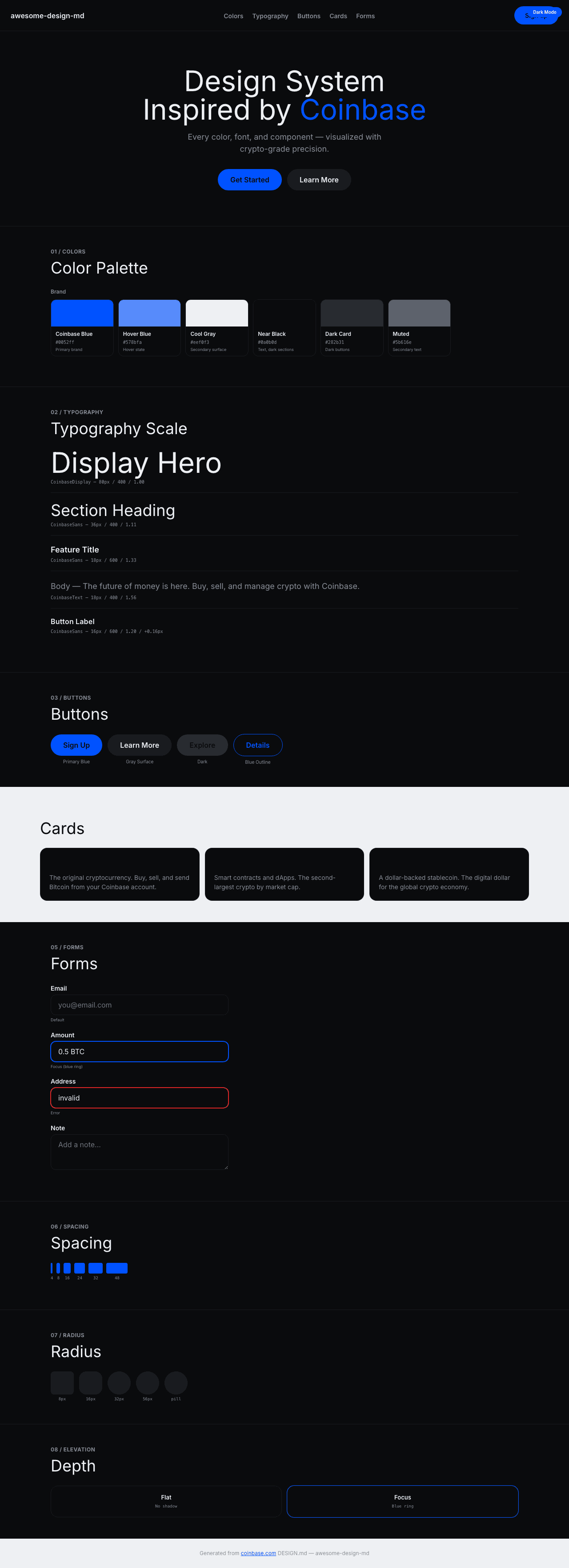
Dark Mode
Light Mode
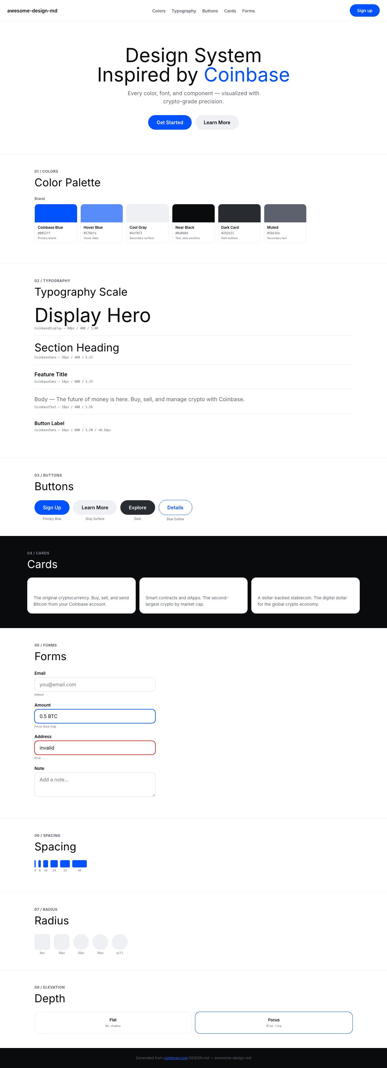
Design System Inspiration of Coinbase
1. Visual Theme & Atmosphere
Coinbase's website is a clean, trustworthy crypto platform that communicates financial reliability through a blue-and-white binary palette. The design uses Coinbase Blue (#0052ff) — a deep, saturated blue — as the singular brand accent against white and near-black surfaces. The proprietary font family includes CoinbaseDisplay for hero headlines, CoinbaseSans for UI text, CoinbaseText for body reading, and CoinbaseIcons for iconography — a comprehensive four-font system.
The button system uses a distinctive 56px radius for pill-shaped CTAs with hover transitions to a lighter blue (#578bfa). The design alternates between white content sections and dark (#0a0b0d, #282b31) feature sections, creating a professional, financial-grade interface.
Key Characteristics:
- Coinbase Blue (
#0052ff) as singular brand accent - Four-font proprietary family: Display, Sans, Text, Icons
- 56px radius pill buttons with blue hover transition
- Near-black (
#0a0b0d) dark sections + white light sections - 1.00 line-height on display headings — ultra-tight
- Cool gray secondary surface (
#eef0f3) with blue tint text-transform: lowercaseon some button labels — unusual
2. Color Palette & Roles
Primary
- Coinbase Blue (
#0052ff): Primary brand, links, CTA borders - Pure White (
#ffffff): Primary light surface - Near Black (
#0a0b0d): Text, dark section backgrounds - Cool Gray Surface (
#eef0f3): Secondary button background
Interactive
- Hover Blue (
#578bfa): Button hover background - Link Blue (
#0667d0): Secondary link color - Muted Blue (
#5b616e): Border color at 20% opacity
Surface
- Dark Card (
#282b31): Dark button/card backgrounds - Light Surface (
rgba(247,247,247,0.88)): Subtle surface
3. Typography Rules
Font Families
- Display:
CoinbaseDisplay— hero headlines - UI / Sans:
CoinbaseSans— buttons, headings, nav - Body:
CoinbaseText— reading text - Icons:
CoinbaseIcons— icon font
Hierarchy
| Role | Font | Size | Weight | Line Height | Notes |
|---|---|---|---|---|---|
| Display Hero | CoinbaseDisplay | 80px | 400 | 1.00 (tight) | Maximum impact |
| Display Secondary | CoinbaseDisplay | 64px | 400 | 1.00 | Sub-hero |
| Display Third | CoinbaseDisplay | 52px | 400 | 1.00 | Third tier |
| Section Heading | CoinbaseSans | 36px | 400 | 1.11 (tight) | Feature sections |
| Card Title | CoinbaseSans | 32px | 400 | 1.13 | Card headings |
| Feature Title | CoinbaseSans | 18px | 600 | 1.33 | Feature emphasis |
| Body Bold | CoinbaseSans | 16px | 700 | 1.50 | Strong body |
| Body Semibold | CoinbaseSans | 16px | 600 | 1.25 | Buttons, nav |
| Body | CoinbaseText | 18px | 400 | 1.56 | Standard reading |
| Body Small | CoinbaseText | 16px | 400 | 1.50 | Secondary reading |
| Button | CoinbaseSans | 16px | 600 | 1.20 | +0.16px tracking |
| Caption | CoinbaseSans | 14px | 600–700 | 1.50 | Metadata |
| Small | CoinbaseSans | 13px | 600 | 1.23 | Tags |
4. Component Stylings
Buttons
Primary Pill (56px radius)
- Background:
#eef0f3or#282b31 - Radius: 56px
- Border:
1px solidmatching background - Hover:
#578bfa(light blue) - Focus:
2px solid blackoutline
Full Pill (100000px radius)
- Used for maximum pill shape
Blue Bordered
- Border:
1px solid #0052ff - Background: transparent
Cards & Containers
- Radius: 8px–40px range
- Borders:
1px solid rgba(91,97,110,0.2)
5. Layout Principles
Spacing System
- Base: 8px
- Scale: 1px, 3px, 4px, 5px, 6px, 8px, 10px, 12px, 15px, 16px, 20px, 24px, 25px, 32px, 48px
Border Radius Scale
- Small (4px–8px): Article links, small cards
- Standard (12px–16px): Cards, menus
- Large (24px–32px): Feature containers
- XL (40px): Large buttons/containers
- Pill (56px): Primary CTAs
- Full (100000px): Maximum pill
6. Depth & Elevation
Minimal shadow system — depth from color contrast between dark/light sections.
7. Do's and Don'ts
Do
- Use Coinbase Blue (#0052ff) for primary interactive elements
- Apply 56px radius for all CTA buttons
- Use CoinbaseDisplay for hero headings only
- Alternate dark (#0a0b0d) and white sections
Don't
- Don't use the blue decoratively — it's functional only
- Don't use sharp corners on CTAs — 56px minimum
8. Responsive Behavior
Breakpoints: 400px, 576px, 640px, 768px, 896px, 1280px, 1440px, 1600px
9. Agent Prompt Guide
Quick Color Reference
- Brand: Coinbase Blue (
#0052ff) - Background: White (
#ffffff) - Dark surface:
#0a0b0d - Secondary surface:
#eef0f3 - Hover:
#578bfa - Text:
#0a0b0d
Example Component Prompts
- "Create hero: white background. CoinbaseDisplay 80px, line-height 1.00. Pill CTA (#eef0f3, 56px radius). Hover: #578bfa."
- "Build dark section: #0a0b0d background. CoinbaseDisplay 64px white text. Blue accent link (#0052ff)."