设计详情
Expo
DESIGN.md extracted from the public Expo website. This is not the official design system. Colors, fonts, and spacing may not be 100% accurate. But it's a good starting point for building something similar.
实时预览
预览效果
此条目同时提供浅色与深色预览资源。
文档
README & DESIGN
Expo Inspired Design System
DESIGN.md extracted from the public Expo website. This is not the official design system. Colors, fonts, and spacing may not be 100% accurate. But it's a good starting point for building something similar.
Files
| File | Description |
|---|---|
DESIGN.md |
Complete design system documentation (9 sections) |
preview.html |
Interactive design token catalog (light) |
preview-dark.html |
Interactive design token catalog (dark) |
Use DESIGN.md to use as a reference for AI agents (Claude, Cursor, Stitch) to generate UI that looks like the Expo design language.
Preview
A sample landing page built with DESIGN.md. It shows the actual colors, typography, buttons, cards, spacing, and elevation, all in one page.
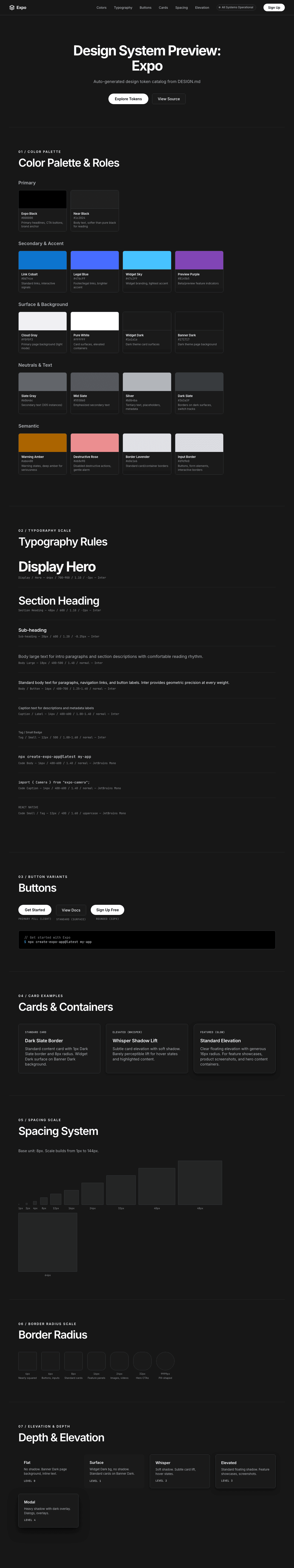
Dark Mode
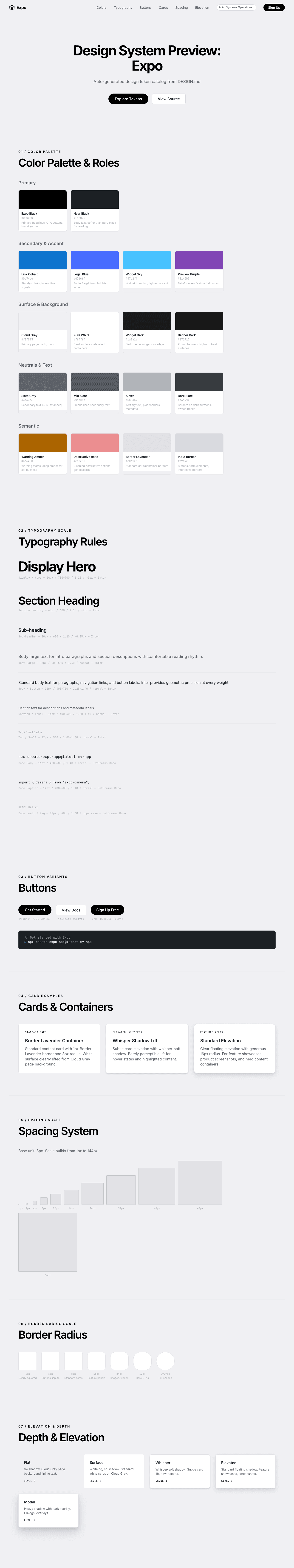
Light Mode
Design System Inspiration of Expo
1. Visual Theme & Atmosphere
Expo's interface is a luminous, confidence-radiating developer platform built on the premise that tools for building apps should feel as polished as the apps themselves. The entire experience lives on a bright, airy canvas — a cool-tinted off-white (#f0f0f3) that gives the page a subtle technological coolness without the starkness of pure white. This is a site that breathes: enormous vertical spacing between sections creates a gallery-like pace where each feature gets its own "room."
The design language is decisively monochromatic — pure black (#000000) headlines against the lightest possible backgrounds, with a spectrum of cool blue-grays (#60646c, #b0b4ba, #555860) handling all secondary communication. Color is almost entirely absent from the interface itself; when it appears, it's reserved for product screenshots, app icons, and the React universe illustration — making the actual content burst with life against the neutral canvas.
What makes Expo distinctive is its pill-shaped geometry. Buttons, tabs, video containers, and even images use generously rounded or fully pill-shaped corners (24px–9999px), creating an organic, approachable feel that contradicts the typical sharp-edged developer tool aesthetic. Combined with tight letter-spacing on massive headlines (-1.6px to -3px at 64px), the result is a design that's simultaneously premium and friendly — like an Apple product page reimagined for developers.
Key Characteristics:
- Luminous cool-white canvas (
#f0f0f3) with gallery-like vertical spacing - Strictly monochromatic: pure black headlines, cool blue-gray body text, no decorative color
- Pill-shaped geometry everywhere — buttons, tabs, containers, images (24px–9999px radius)
- Massive display headlines (64px) with extreme negative letter-spacing (-1.6px to -3px)
- Inter as the sole typeface, used at weights 400–900 for full expressive range
- Whisper-soft shadows that barely lift elements from the surface
- Product screenshots as the only source of color in the interface
2. Color Palette & Roles
Primary
- Expo Black (
#000000): The absolute anchor — used for primary headlines, CTA buttons, and the brand identity. Pure black on cool white creates maximum contrast without feeling aggressive. - Near Black (
#1c2024): The primary text color for body content — a barely perceptible blue-black that's softer than pure #000 for extended reading.
Secondary & Accent
- Link Cobalt (
#0d74ce): The standard link color — a trustworthy, saturated blue that signals interactivity without competing with the monochrome hierarchy. - Legal Blue (
#476cff): A brighter, more saturated blue for legal/footer links — slightly more attention-grabbing than Link Cobalt. - Widget Sky (
#47c2ff): A light, friendly cyan-blue for widget branding elements — the brightest accent in the system. - Preview Purple (
#8145b5): A rich violet used for "preview" or beta feature indicators — creating clear visual distinction from standard content.
Surface & Background
- Cloud Gray (
#f0f0f3): The primary page background — a cool off-white with the faintest blue-violet tint. Not warm, not sterile — precisely technological. - Pure White (
#ffffff): Card surfaces, button backgrounds, and elevated content containers. Creates a clear "lifted" distinction from Cloud Gray. - Widget Dark (
#1a1a1a): Dark surface for dark-theme widgets and overlay elements. - Banner Dark (
#171717): The darkest surface variant, used for promotional banners and high-contrast containers.
Neutrals & Text
- Slate Gray (
#60646c): The workhorse secondary text color (305 instances). A cool blue-gray that's authoritative without being heavy. - Mid Slate (
#555860): Slightly darker than Slate, used for emphasized secondary text. - Silver (
#b0b4ba): Tertiary text, placeholders, and de-emphasized metadata. Comfortably readable but clearly receded. - Pewter (
#999999): Accordion icons and deeply de-emphasized UI elements in dark contexts. - Light Silver (
#cccccc): Arrow icons and decorative elements in dark contexts. - Dark Slate (
#363a3f): Borders on dark surfaces, switch tracks, and emphasized containment. - Charcoal (
#333333): Dark mode switch backgrounds and deep secondary surfaces.
Semantic & Accent
- Warning Amber (
#ab6400): A warm, deep amber for warning states — deliberately not bright yellow, conveying seriousness. - Destructive Rose (
#eb8e90): A soft pink-coral for disabled destructive actions — gentler than typical red, reducing alarm fatigue. - Border Lavender (
#e0e1e6): Standard card/container borders — a cool lavender-gray that's visible without being heavy. - Input Border (
#d9d9e0): Button and form element borders — slightly warmer/darker than card borders for interactive elements. - Dark Focus Ring (
#2547d0): Deep blue for keyboard focus indicators in dark theme contexts.
Gradient System
- The design is notably gradient-free in the interface layer. Visual richness comes from product screenshots, the React universe illustration, and careful shadow layering rather than color gradients. This absence IS the design decision — gradients would undermine the clinical precision.
3. Typography Rules
Font Family
- Primary:
Inter, with fallbacks:-apple-system, system-ui - Monospace:
JetBrains Mono, with fallback:ui-monospace - System Fallback:
system-ui, Segoe UI, Roboto, Helvetica, Arial, Apple Color Emoji, Segoe UI Emoji
Hierarchy
| Role | Font | Size | Weight | Line Height | Letter Spacing | Notes |
|---|---|---|---|---|---|---|
| Display / Hero | Inter | 64px (4rem) | 700–900 | 1.10 (tight) | -1.6px to -3px | Maximum impact, extreme tracking |
| Section Heading | Inter | 48px (3rem) | 600 | 1.10 (tight) | -2px | Feature section anchors |
| Sub-heading | Inter | 20px (1.25rem) | 600 | 1.20 (tight) | -0.25px | Card titles, feature names |
| Body Large | Inter | 18px (1.13rem) | 400–500 | 1.40 | normal | Intro paragraphs, section descriptions |
| Body / Button | Inter | 16px (1rem) | 400–700 | 1.25–1.40 | normal | Standard text, nav links, buttons |
| Caption / Label | Inter | 14px (0.88rem) | 400–600 | 1.00–1.40 | normal | Descriptions, metadata, badge text |
| Tag / Small | Inter | 12px (0.75rem) | 500 | 1.00–1.60 | normal | Smallest sans-serif text, badges |
| Code Body | JetBrains Mono | 16px (1rem) | 400–600 | 1.40 | normal | Inline code, terminal commands |
| Code Caption | JetBrains Mono | 14px (0.88rem) | 400–600 | 1.40 | normal | Code snippets, technical labels |
| Code Small | JetBrains Mono | 12px (0.75rem) | 400 | 1.60 | normal | Uppercase tech tags |
Principles
- One typeface, full expression: Inter is the only sans-serif, used from weight 400 (regular) through 900 (black). This gives the design a unified voice while still achieving dramatic contrast between whisper-light body text and thundering display headlines.
- Extreme negative tracking at scale: Headlines at 64px use -1.6px to -3px letter-spacing, creating ultra-dense text blocks that feel like logotypes. This aggressive compression is the signature typographic move.
- Weight as hierarchy: 700–900 for display, 600 for headings, 500 for emphasis, 400 for body. The jumps are decisive — no ambiguous in-between weights.
- Consistent 1.40 body line-height: Nearly all body and UI text shares 1.40 line-height, creating a rhythmic vertical consistency.
4. Component Stylings
Buttons
Primary (White on border)
- Background: Pure White (
#ffffff) - Text: Near Black (
#1c2024) - Padding: 0px 12px (compact, content-driven height)
- Border: thin solid Input Border (
1px solid #d9d9e0) - Radius: subtly rounded (6px)
- Shadow: subtle combined shadow on hover
- The understated default — clean, professional, unheroic
Primary Pill
- Same as Primary but with pill-shaped radius (9999px)
- Used for hero CTAs and high-emphasis actions
- The extra roundness signals "start here"
Dark Primary
- Background: Expo Black (
#000000) - Text: Pure White (
#ffffff) - Pill-shaped (9999px) or generously rounded (32–36px)
- No border (black IS the border)
- The maximum-emphasis CTA — reserved for primary conversion actions
Cards & Containers
- Background: Pure White (
#ffffff) — clearly lifted from Cloud Gray page - Border: thin solid Border Lavender (
1px solid #e0e1e6) for standard cards - Radius: comfortably rounded (8px) for standard cards; generously rounded (16–24px) for featured containers
- Shadow Level 1: Whisper (
rgba(0,0,0,0.08) 0px 3px 6px, rgba(0,0,0,0.07) 0px 2px 4px) — barely perceptible lift - Shadow Level 2: Standard (
rgba(0,0,0,0.1) 0px 10px 20px, rgba(0,0,0,0.05) 0px 3px 6px) — clear floating elevation - Hover: likely subtle shadow deepening or background shift
Inputs & Forms
- Background: Pure White (
#ffffff) - Text: Near Black (
#1c2024) - Border: thin solid Input Border (
1px solid #d9d9e0) - Padding: 0px 12px (inline with button sizing)
- Radius: subtly rounded (6px)
- Focus: blue ring shadow via CSS custom property
Navigation
- Sticky top nav on transparent/blurred background
- Logo: Expo wordmark in black
- Links: Near Black (
#1c2024) or Slate Gray (#60646c) at 14–16px Inter weight 500 - CTA: Black pill button ("Sign Up") on the right
- GitHub star badge as social proof
- Status indicator ("All Systems Operational") with green dot
Image Treatment
- Product screenshots and device mockups are the visual heroes
- Generously rounded corners (24px) on video and image containers
- Screenshots shown in realistic device frames
- Dark UI screenshots provide contrast against the light canvas
- Full-bleed within rounded containers
Distinctive Components
Universe React Logo
- Animated/illustrated React logo as the visual centerpiece
- Connects Expo's identity to the React ecosystem
- The only illustrative element on an otherwise photographic page
Device Preview Grid
- Multiple device types (phone, tablet, web) shown simultaneously
- Demonstrates cross-platform capability visually
- Each device uses realistic device chrome
Status Badge
- "All Systems Operational" pill in the nav
- Green dot + text — compact trust signal
- Pill-shaped (36px radius)
5. Layout Principles
Spacing System
- Base unit: 8px
- Scale: 1px, 2px, 4px, 8px, 12px, 16px, 24px, 32px, 40px, 48px, 64px, 80px, 96px, 144px
- Button padding: 0px 12px (unusually compact — height driven by line-height)
- Card internal padding: approximately 24–32px
- Section vertical spacing: enormous (estimated 96–144px between major sections)
- Component gap: 16–24px between sibling elements
Grid & Container
- Max container width: approximately 1200–1400px, centered
- Hero: centered single-column with massive breathing room
- Feature sections: alternating layouts (image left/right, full-width showcases)
- Card grids: 2–3 column for feature highlights
- Full-width sections with contained inner content
Whitespace Philosophy
- Gallery-like pacing: Each section feels like its own exhibit, surrounded by vast empty space. This creates a premium, unhurried browsing experience.
- Breathing room is the design: The generous whitespace IS the primary design element — it communicates confidence, quality, and that each feature deserves individual attention.
- Content islands: Sections float as isolated "islands" in the white space, connected by scrolling rather than visual continuation.
Border Radius Scale
- Nearly squared (4px): Small inline elements, tags
- Subtly rounded (6px): Buttons, form inputs, combo boxes — the functional interactive radius
- Comfortably rounded (8px): Standard content cards, containers
- Generously rounded (16px): Feature tabs, content panels
- Very rounded (24px): Buttons, video/image containers, tabpanels — the signature softness
- Highly rounded (32–36px): Hero CTAs, status badges, nav buttons
- Pill-shaped (9999px): Primary action buttons, tags, avatars — maximum friendliness
6. Depth & Elevation
| Level | Treatment | Use |
|---|---|---|
| Flat (Level 0) | No shadow | Cloud Gray page background, inline text |
| Surface (Level 1) | White bg, no shadow | Standard white cards on Cloud Gray |
| Whisper (Level 2) | rgba(0,0,0,0.08) 0px 3px 6px + rgba(0,0,0,0.07) 0px 2px 4px |
Subtle card lift, hover states |
| Elevated (Level 3) | rgba(0,0,0,0.1) 0px 10px 20px + rgba(0,0,0,0.05) 0px 3px 6px |
Feature showcases, product screenshots |
| Modal (Level 4) | Dark overlay (--dialog-overlay-background-color) + heavy shadow |
Dialogs, overlays |
Shadow Philosophy: Expo uses shadows as gentle whispers rather than architectural statements. The primary depth mechanism is background color contrast — white cards floating on Cloud Gray — rather than shadow casting. When shadows appear, they're soft, diffused, and directional (downward), creating the feeling of paper hovering millimeters above a desk.
7. Do's and Don'ts
Do
- Use Cloud Gray (
#f0f0f3) as the page background and Pure White (#ffffff) for elevated cards — the two-tone light system is essential - Keep display headlines at extreme negative letter-spacing (-1.6px to -3px at 64px) for the signature compressed look
- Use pill-shaped (9999px) radius for primary CTA buttons — the organic shape is core to the identity
- Reserve black (
#000000) for headlines and primary CTAs — it carries maximum authority on the light canvas - Use Slate Gray (
#60646c) for secondary text — it's the precise balance between readable and receded - Maintain enormous vertical spacing between sections (96px+) — the gallery pacing defines the premium feel
- Use product screenshots as the primary visual content — the interface stays monochrome, the products bring color
- Apply Inter at the full weight range (400–900) — weight contrast IS the hierarchy
Don't
- Don't introduce decorative colors into the interface chrome — the monochromatic palette is intentional
- Don't use sharp corners (border-radius < 6px) on interactive elements — the pill/rounded geometry is the signature
- Don't reduce section spacing below 64px — the breathing room is the design
- Don't use heavy drop shadows — depth comes from background contrast and whisper-soft shadows
- Don't mix in additional typefaces — Inter handles everything from display to caption
- Don't use letter-spacing wider than -0.25px on body text — extreme tracking is reserved for display only
- Don't use borders heavier than 2px — containment is subtle, achieved through background color and gentle borders
- Don't add gradients to the interface — visual richness comes from content, not decoration
- Don't use saturated colors outside of semantic contexts — the palette is strictly grayscale + functional blue
8. Responsive Behavior
Breakpoints
| Name | Width | Key Changes |
|---|---|---|
| Mobile | <640px | Single column, hamburger nav, stacked cards, hero text scales to ~36px |
| Tablet | 640–1024px | 2-column grids, condensed nav, medium hero text |
| Desktop | >1024px | Full multi-column layout, expanded nav, massive hero (64px) |
Only one explicit breakpoint detected (640px), suggesting a fluid, container-query or min()/clamp()-based responsive system rather than fixed breakpoint snapping.
Touch Targets
- Buttons use generous radius (24–36px) creating large, finger-friendly surfaces
- Navigation links spaced with adequate gap
- Status badge sized for touch (36px radius)
- Minimum recommended: 44x44px
Collapsing Strategy
- Navigation: Full horizontal nav with CTA collapses to hamburger on mobile
- Feature sections: Multi-column → stacked single column
- Hero text: 64px → ~36px progressive scaling
- Device previews: Grid → stacked/carousel
- Cards: Side-by-side → vertical stacking
- Spacing: Reduces proportionally but maintains generous rhythm
Image Behavior
- Product screenshots scale proportionally
- Device mockups may simplify or show fewer devices on mobile
- Rounded corners maintained at all sizes
- Lazy loading for below-fold content
9. Agent Prompt Guide
Quick Color Reference
- Primary CTA / Headlines: "Expo Black (#000000)"
- Page Background: "Cloud Gray (#f0f0f3)"
- Card Surface: "Pure White (#ffffff)"
- Body Text: "Near Black (#1c2024)"
- Secondary Text: "Slate Gray (#60646c)"
- Borders: "Border Lavender (#e0e1e6)"
- Links: "Link Cobalt (#0d74ce)"
- Tertiary Text: "Silver (#b0b4ba)"
Example Component Prompts
- "Create a hero section on Cloud Gray (#f0f0f3) with a massive headline at 64px Inter weight 700, line-height 1.10, letter-spacing -3px. Text in Expo Black (#000000). Below, add a subtitle in Slate Gray (#60646c) at 18px. Place a black pill-shaped CTA button (9999px radius) beneath."
- "Design a feature card on Pure White (#ffffff) with a 1px solid Border Lavender (#e0e1e6) border and comfortably rounded corners (8px). Title in Near Black (#1c2024) at 20px Inter weight 600, description in Slate Gray (#60646c) at 16px. Add a whisper shadow (rgba(0,0,0,0.08) 0px 3px 6px)."
- "Build a navigation bar with Expo logo on the left, text links in Near Black (#1c2024) at 14px Inter weight 500, and a black pill CTA button on the right. Background: transparent with blur backdrop. Bottom border: 1px solid Border Lavender (#e0e1e6)."
- "Create a code block using JetBrains Mono at 14px on a Pure White surface with Border Lavender border and 8px radius. Code in Near Black, keywords in Link Cobalt (#0d74ce)."
- "Design a status badge pill (9999px radius) with a green dot and 'All Systems Operational' text in Inter 12px weight 500. Background: Pure White, border: 1px solid Input Border (#d9d9e0)."
Iteration Guide
- Focus on ONE component at a time
- Reference specific color names and hex codes — "use Slate Gray (#60646c)" not "make it gray"
- Use radius values deliberately — 6px for buttons, 8px for cards, 24px for images, 9999px for pills
- Describe the "feel" alongside measurements — "enormous breathing room with 96px section spacing"
- Always specify Inter and the exact weight — weight contrast IS the hierarchy
- For shadows, specify "whisper shadow" or "standard elevation" from the elevation table
- Keep the interface monochrome — let product content be the color