设计详情
Kraken
DESIGN.md extracted from the public Kraken website. This is not the official design system. Colors, fonts, and spacing may not be 100% accurate. But it's a good starting point for building something similar.
实时预览
预览效果
此条目同时提供浅色与深色预览资源。
文档
README & DESIGN
Kraken Inspired Design System
DESIGN.md extracted from the public Kraken website. This is not the official design system. Colors, fonts, and spacing may not be 100% accurate. But it's a good starting point for building something similar.
Files
| File | Description |
|---|---|
DESIGN.md |
Complete design system documentation (9 sections) |
preview.html |
Interactive design token catalog (light) |
preview-dark.html |
Interactive design token catalog (dark) |
Use DESIGN.md to use as a reference for AI agents (Claude, Cursor, Stitch) to generate UI that looks like the Kraken design language.
Preview
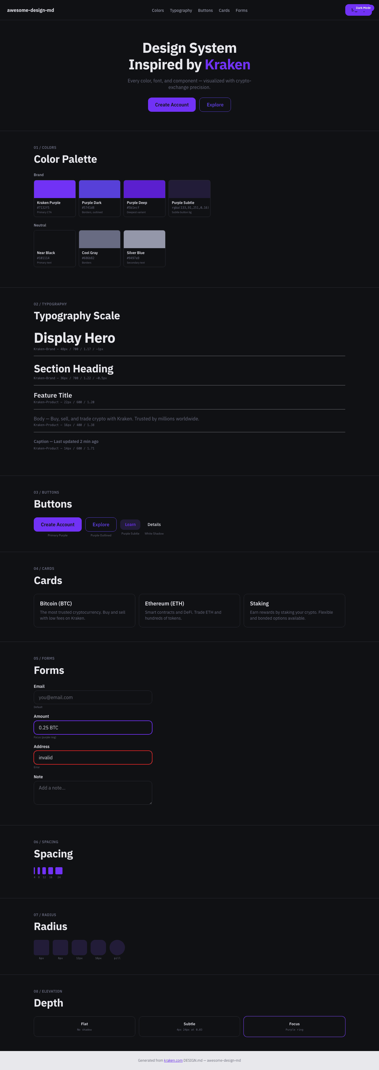
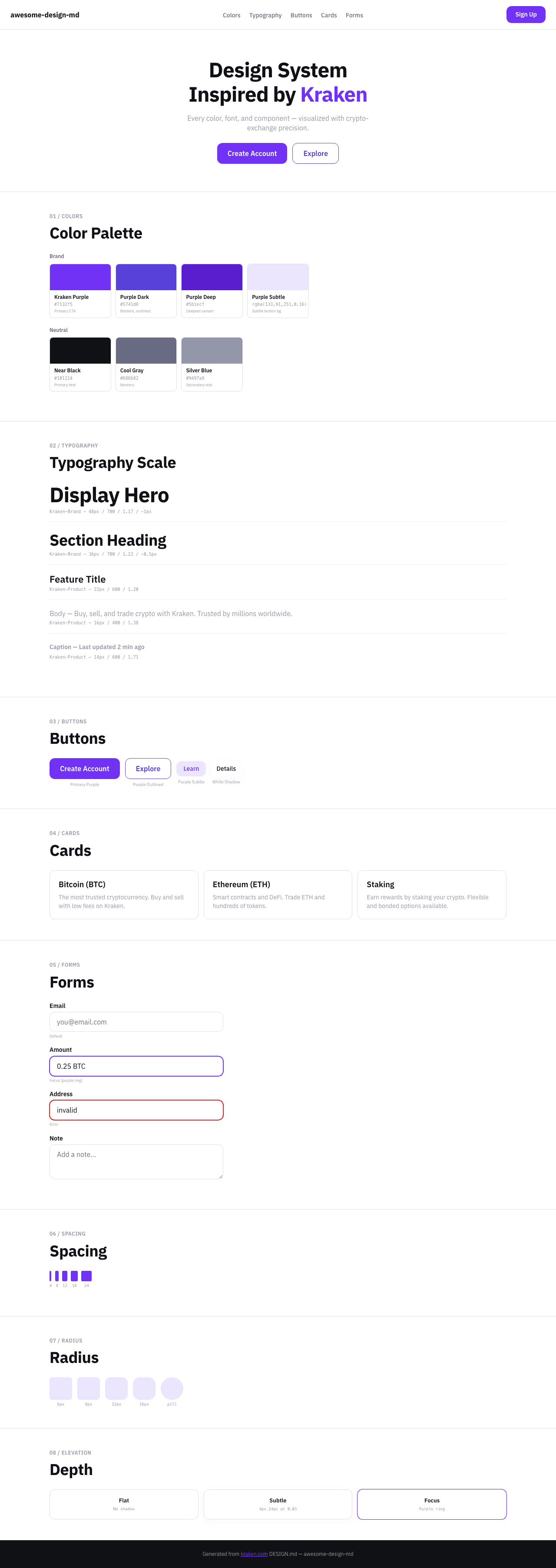
A sample landing page built with DESIGN.md. It shows the actual colors, typography, buttons, cards, spacing, and elevation, all in one page.
Dark Mode
Light Mode
Design System Inspiration of Kraken
1. Visual Theme & Atmosphere
Kraken's website is a clean, trustworthy crypto exchange that uses purple as its commanding brand color. The design operates on white backgrounds with Kraken Purple (#7132f5, #5741d8, #5b1ecf) creating a distinctive, professional crypto identity. The proprietary Kraken-Brand font handles display headings with bold (700) weight and negative tracking, while Kraken-Product (with IBM Plex Sans fallback) serves as the UI workhorse.
Key Characteristics:
- Kraken Purple (
#7132f5) as primary brand with darker variants (#5741d8,#5b1ecf) - Kraken-Brand (display) + Kraken-Product (UI) dual font system
- Near-black (
#101114) text with cool blue-gray neutral scale - 12px radius buttons (rounded but not pill)
- Subtle shadows (
rgba(0,0,0,0.03) 0px 4px 24px) — whisper-level - Green accent (
#149e61) for positive/success states
2. Color Palette & Roles
Primary
- Kraken Purple (
#7132f5): Primary CTA, brand accent, links - Purple Dark (
#5741d8): Button borders, outlined variants - Purple Deep (
#5b1ecf): Deepest purple - Purple Subtle (
rgba(133,91,251,0.16)): Purple at 16% — subtle button backgrounds - Near Black (
#101114): Primary text
Neutral
- Cool Gray (
#686b82): Primary neutral, borders at 24% opacity - Silver Blue (
#9497a9): Secondary text, muted elements - White (
#ffffff): Primary surface - Border Gray (
#dedee5): Divider borders
Semantic
- Green (
#149e61): Success/positive at 16% opacity for badges - Green Dark (
#026b3f): Badge text
3. Typography Rules
Font Families
- Display:
Kraken-Brand, fallbacks:IBM Plex Sans, Helvetica, Arial - UI / Body:
Kraken-Product, fallbacks:Helvetica Neue, Helvetica, Arial
Hierarchy
| Role | Font | Size | Weight | Line Height | Letter Spacing |
|---|---|---|---|---|---|
| Display Hero | Kraken-Brand | 48px | 700 | 1.17 | -1px |
| Section Heading | Kraken-Brand | 36px | 700 | 1.22 | -0.5px |
| Sub-heading | Kraken-Brand | 28px | 700 | 1.29 | -0.5px |
| Feature Title | Kraken-Product | 22px | 600 | 1.20 | normal |
| Body | Kraken-Product | 16px | 400 | 1.38 | normal |
| Body Medium | Kraken-Product | 16px | 500 | 1.38 | normal |
| Button | Kraken-Product | 16px | 500–600 | 1.38 | normal |
| Caption | Kraken-Product | 14px | 400–700 | 1.43–1.71 | normal |
| Small | Kraken-Product | 12px | 400–500 | 1.33 | normal |
| Micro | Kraken-Product | 7px | 500 | 1.00 | uppercase |
4. Component Stylings
Buttons
Primary Purple
- Background:
#7132f5 - Text:
#ffffff - Padding: 13px 16px
- Radius: 12px
Purple Outlined
- Background:
#ffffff - Text:
#5741d8 - Border:
1px solid #5741d8 - Radius: 12px
Purple Subtle
- Background:
rgba(133,91,251,0.16) - Text:
#7132f5 - Padding: 8px
- Radius: 12px
White Button
- Background:
#ffffff - Text:
#101114 - Radius: 10px
- Shadow:
rgba(0,0,0,0.03) 0px 4px 24px
Secondary Gray
- Background:
rgba(148,151,169,0.08) - Text:
#101114 - Radius: 12px
Badges
- Success:
rgba(20,158,97,0.16)bg,#026b3ftext, 6px radius - Neutral:
rgba(104,107,130,0.12)bg,#484b5etext, 8px radius
5. Layout Principles
Spacing: 1px, 2px, 3px, 4px, 5px, 6px, 8px, 10px, 12px, 13px, 15px, 16px, 20px, 24px, 25px
Border Radius: 3px, 6px, 8px, 10px, 12px, 16px, 9999px, 50%
6. Depth & Elevation
- Subtle:
rgba(0,0,0,0.03) 0px 4px 24px - Micro:
rgba(16,24,40,0.04) 0px 1px 4px
7. Do's and Don'ts
Do
- Use Kraken Purple (#7132f5) for CTAs and links
- Apply 12px radius on all buttons
- Use Kraken-Brand for headings, Kraken-Product for body
Don't
- Don't use pill buttons — 12px is the max radius for buttons
- Don't use other purples outside the defined scale
8. Responsive Behavior
Breakpoints: 375px, 425px, 640px, 768px, 1024px, 1280px, 1536px
9. Agent Prompt Guide
Quick Color Reference
- Brand: Kraken Purple (
#7132f5) - Dark variant:
#5741d8 - Text: Near Black (
#101114) - Secondary text:
#9497a9 - Background: White (
#ffffff)
Example Component Prompts
- "Create hero: white background. Kraken-Brand 48px weight 700, letter-spacing -1px. Purple CTA (#7132f5, 12px radius, 13px 16px padding)."