设计详情
Replicate
DESIGN.md extracted from the public Replicate website. This is not the official design system. Colors, fonts, and spacing may not be 100% accurate. But it's a good starting point for building something similar.
实时预览
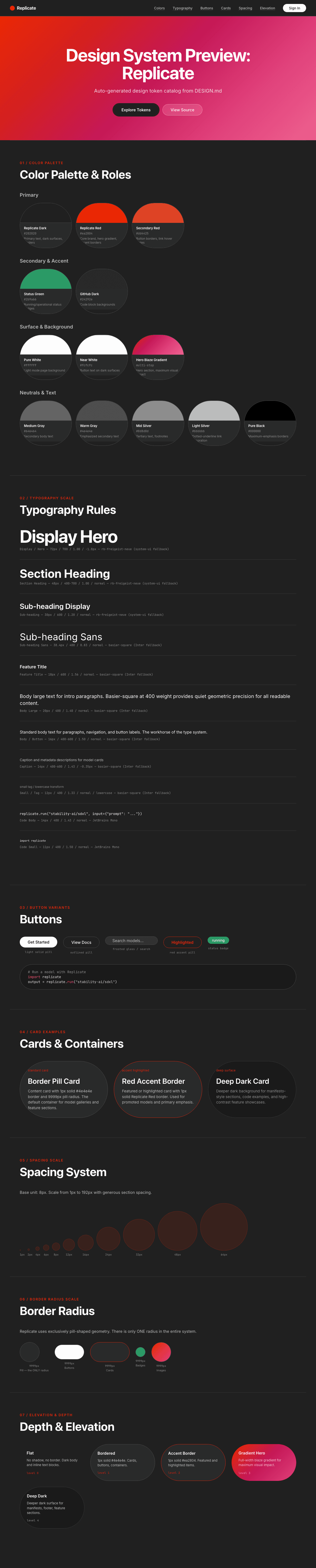
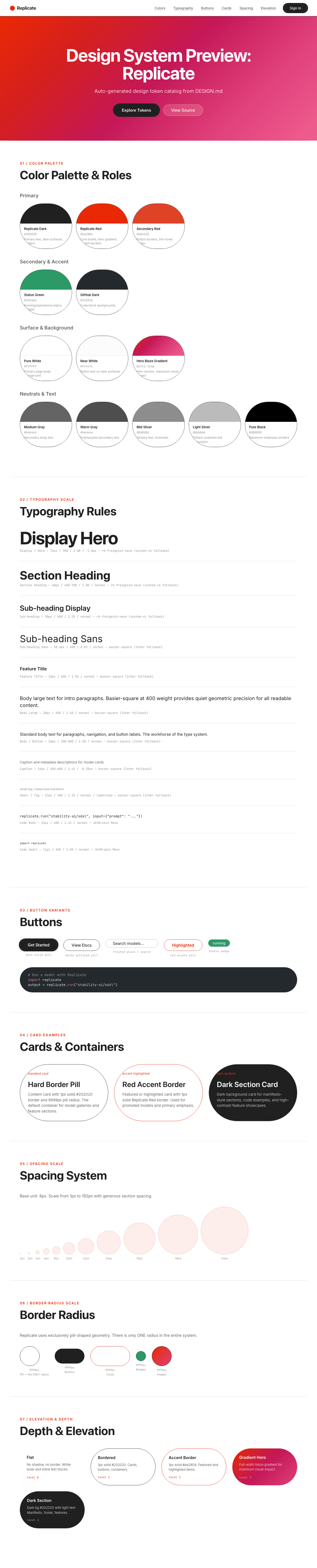
预览效果
此条目同时提供浅色与深色预览资源。
文档
README & DESIGN
Replicate Inspired Design System
DESIGN.md extracted from the public Replicate website. This is not the official design system. Colors, fonts, and spacing may not be 100% accurate. But it's a good starting point for building something similar.
Files
| File | Description |
|---|---|
DESIGN.md |
Complete design system documentation (9 sections) |
preview.html |
Interactive design token catalog (light) |
preview-dark.html |
Interactive design token catalog (dark) |
Use DESIGN.md to use as a reference for AI agents (Claude, Cursor, Stitch) to generate UI that looks like the Replicate design language.
Preview
A sample landing page built with DESIGN.md. It shows the actual colors, typography, buttons, cards, spacing, and elevation, all in one page.
Dark Mode
Light Mode
Design System Inspiration of Replicate
1. Visual Theme & Atmosphere
Replicate's interface is a developer playground crackling with creative energy — a bold, high-contrast design that feels more like a music festival poster than a typical API platform. The hero section explodes with a vibrant orange-red-magenta gradient that immediately signals "this is where AI models come alive," while the body of the page grounds itself in a clean white canvas where code snippets and model galleries take center stage.
The design personality is defined by two extreme choices: massive display typography (up to 128px) using the custom rb-freigeist-neue face, and exclusively pill-shaped geometry (9999px radius on everything). The display font is thick, bold, and confident — its heavy weight at enormous sizes creates text that feels like it's shouting with joy rather than whispering authority. Combined with basier-square for body text (a clean geometric sans) and JetBrains Mono for code, the system serves developers who want power and playfulness in equal measure.
What makes Replicate distinctive is its community-powered energy. The model gallery with AI-generated images, the dotted-underline links, the green status badges, and the "Imagine what you can build" closing manifesto all create a space that feels alive and participatory — not a corporate product page but a launchpad for creative developers.
Key Characteristics:
- Explosive orange-red-magenta gradient hero (#ea2804 brand anchor)
- Massive display typography (128px) in heavy rb-freigeist-neue
- Exclusively pill-shaped geometry: 9999px radius on EVERYTHING
- High-contrast black (#202020) and white palette with red brand accent
- Developer-community energy: model galleries, code examples, dotted-underline links
- Green status badges (#2b9a66) for live/operational indicators
- Bold/heavy font weights (600-700) creating maximum typographic impact
- Playful closing manifesto: "Imagine what you can build."
2. Color Palette & Roles
Primary
- Replicate Dark (
#202020): The primary text color and dark surface — a near-black that's the anchor of all text and borders. Slightly warmer than pure #000. - Replicate Red (
#ea2804): The core brand color — a vivid, saturated orange-red used in the hero gradient, accent borders, and high-signal moments. - Secondary Red (
#dd4425): A slightly warmer variant for button borders and link hover states.
Secondary & Accent
- Status Green (
#2b9a66): Badge/pill background for "running" or operational status indicators. - GitHub Dark (
#24292e): A blue-tinted dark used for code block backgrounds and developer contexts.
Surface & Background
- Pure White (
#ffffff): The primary page body background. - Near White (
#fcfcfc): Button text on dark surfaces and the lightest content. - Hero Gradient: A dramatic orange → red → magenta → pink gradient for the hero section. Transitions from warm (#ea2804 family) through hot pink.
Neutrals & Text
- Medium Gray (
#646464): Secondary body text and de-emphasized content. - Warm Gray (
#4e4e4e): Emphasized secondary text. - Mid Silver (
#8d8d8d): Tertiary text, footnotes. - Light Silver (
#bbbbbb): Dotted-underline link decoration color, muted metadata. - Pure Black (
#000000): Maximum-emphasis borders and occasional text.
Gradient System
- Hero Blaze: A dramatic multi-stop gradient flowing through orange (
#ea2804) → red → magenta → hot pink. This gradient occupies the full hero section and is the most visually dominant element on the page. - Dark Sections: Deep dark (#202020) sections with white/near-white text provide contrast against the white body.
3. Typography Rules
Font Family
- Display:
rb-freigeist-neue, with fallbacks:ui-sans-serif, system-ui - Body / UI:
basier-square, with fallbacks:ui-sans-serif, system-ui - Code:
jetbrains-mono, with fallbacks:ui-monospace, SFMono-Regular, Menlo, Monaco, Consolas, Liberation Mono, Courier New
Hierarchy
| Role | Font | Size | Weight | Line Height | Letter Spacing | Notes |
|---|---|---|---|---|---|---|
| Display Mega | rb-freigeist-neue | 128px (8rem) | 700 | 1.00 (tight) | normal | The maximum: closing manifesto |
| Display / Hero | rb-freigeist-neue | 72px (4.5rem) | 700 | 1.00 (tight) | -1.8px | Hero section headline |
| Section Heading | rb-freigeist-neue | 48px (3rem) | 400–700 | 1.00 (tight) | normal | Feature section titles |
| Sub-heading | rb-freigeist-neue | 30px (1.88rem) | 600 | 1.20 (tight) | normal | Card headings |
| Sub-heading Sans | basier-square | 38.4px (2.4rem) | 400 | 0.83 (ultra-tight) | normal | Large body headings |
| Feature Title | basier-square / rb-freigeist-neue | 18px (1.13rem) | 600 | 1.56 | normal | Small section titles, labels |
| Body Large | basier-square | 20px (1.25rem) | 400 | 1.40 | normal | Intro paragraphs |
| Body / Button | basier-square | 16–18px (1–1.13rem) | 400–600 | 1.50–1.56 | normal | Standard text, buttons |
| Caption | basier-square | 14px (0.88rem) | 400–600 | 1.43 | -0.35px to normal | Metadata, descriptions |
| Small / Tag | basier-square | 12px (0.75rem) | 400 | 1.33 | normal | Tags (lowercase transform) |
| Code | jetbrains-mono | 14px (0.88rem) | 400 | 1.43 | normal | Code snippets, API examples |
| Code Small | jetbrains-mono | 11px (0.69rem) | 400 | 1.50 | normal | Tiny code references |
Principles
- Heavy display, light body: rb-freigeist-neue at 700 weight creates thundering headlines, while basier-square at 400 handles body text with quiet efficiency. The contrast is extreme and intentional.
- 128px is a real size: The closing manifesto "Imagine what you can build." uses 128px — bigger than most mobile screens. This is the design equivalent of shouting from a rooftop.
- Negative tracking on hero: -1.8px letter-spacing at 72px creates dense, impactful hero text.
- Lowercase tags: 12px basier-square uses
text-transform: lowercase— an unusual choice that creates a casual, developer-friendly vibe. - Weight 600 as emphasis: When basier-square needs emphasis, it uses 600 (semibold) — never bold (700), which is reserved for rb-freigeist-neue display text.
4. Component Stylings
Buttons
Dark Solid
- Background: Replicate Dark (
#202020) - Text: Near White (
#fcfcfc) - Padding: 0px 4px (extremely compact)
- Outline: Replicate Dark 4px solid
- Radius: pill-shaped (implied by system)
- Maximum emphasis — dark pill on light surface
White Outlined
- Background: Pure White (
#ffffff) - Text: Replicate Dark (
#202020) - Border:
1px solid #202020 - Radius: pill-shaped
- Clean outlined pill for secondary actions
Transparent Glass
- Background:
rgba(255, 255, 255, 0.1)(frosted glass) - Text: Replicate Dark (
#202020) - Padding: 6px 56px 6px 28px (asymmetric — icon/search layout)
- Border: transparent
- Outline: Light Silver (
#bbbbbb) 1px solid - Used for search/input-like buttons
Cards & Containers
- Background: Pure White or subtle gray
- Border:
1px solid #202020for prominent containment - Radius: pill-shaped (9999px) for badges, labels, images
- Shadow: minimal standard shadows
- Model gallery: grid of AI-generated image thumbnails
- Accent border:
1px solid #ea2804for highlighted/featured items
Inputs & Forms
- Background:
rgba(255, 255, 255, 0.1)(frosted glass) - Text: Replicate Dark (
#202020) - Border: transparent with outline
- Padding: 6px 56px 6px 28px (search-bar style)
Navigation
- Clean horizontal nav on white
- Logo: Replicate wordmark in dark
- Links: dark text with dotted underline on hover
- CTA: Dark pill button
- GitHub link and sign-in
Image Treatment
- AI-generated model output images in a gallery grid
- Pill-shaped image containers (9999px)
- Full-width gradient hero section
- Product screenshots with dark backgrounds
Distinctive Components
Model Gallery Grid
- Horizontal scrolling or grid of AI-generated images
- Each image in a pill-shaped container
- Model names and run counts displayed
- The visual heart of the community platform
Dotted Underline Links
- Links use
text-decoration: underline dotted #bbbbbb - A distinctive, developer-notebook aesthetic
- Lighter and more casual than solid underlines
Status Badges
- Status Green (
#2b9a66) background with white text - Pill-shaped (9999px)
- 14px font size
- Indicates model availability/operational status
Manifesto Section
- "Imagine what you can build." at 128px
- Dark background with white text
- Images embedded between words
- The emotional climax of the page
5. Layout Principles
Spacing System
- Base unit: 8px
- Scale: 1px, 2px, 4px, 6px, 8px, 10px, 12px, 16px, 24px, 32px, 48px, 64px, 96px, 160px, 192px
- Button padding: varies widely (0px 4px to 6px 56px)
- Section vertical spacing: very generous (96–192px)
Grid & Container
- Fluid width with responsive constraints
- Hero: full-width gradient with centered content
- Model gallery: multi-column responsive grid
- Feature sections: mixed layouts
- Code examples: contained dark blocks
Whitespace Philosophy
- Bold and generous: Massive spacing between sections (up to 192px) creates distinct zones.
- Dense within galleries: Model images are tightly packed in the grid for browsable density.
- The gradient IS the whitespace: The hero gradient section occupies significant vertical space as a colored void.
Border Radius Scale
- Pill (9999px): The ONLY radius in the system. Everything interactive, every image, every badge, every label, every container uses 9999px. This is the most extreme pill-radius commitment in any major tech brand.
6. Depth & Elevation
| Level | Treatment | Use |
|---|---|---|
| Flat (Level 0) | No shadow | White body, text blocks |
| Bordered (Level 1) | 1px solid #202020 |
Cards, buttons, containers |
| Accent Border (Level 2) | 1px solid #ea2804 |
Featured/highlighted items |
| Gradient Hero (Level 3) | Full-width blaze gradient | Hero section, maximum visual impact |
| Dark Section (Level 4) | Dark bg (#202020) with light text | Manifesto, footer, feature sections |
Shadow Philosophy: Replicate relies on borders and background color for depth rather than shadows. The 1px solid #202020 border is the primary containment mechanism. The dramatic gradient hero and dark/light section alternation provide all the depth the design needs.
7. Do's and Don'ts
Do
- Use pill-shaped (9999px) radius on EVERYTHING — buttons, images, badges, containers
- Use rb-freigeist-neue at weight 700 for display text — go big (72px+) or go home
- Use the orange-red brand gradient for hero sections
- Use Replicate Dark (#202020) as the primary dark — not pure black
- Apply dotted underline decoration on text links (#bbbbbb)
- Use Status Green (#2b9a66) for operational/success badges
- Keep body text in basier-square at 400–600 weight
- Use JetBrains Mono for all code content
- Create a "manifesto" section with 128px type for emotional impact
Don't
- Don't use any border-radius other than 9999px — the pill system is absolute
- Don't use the brand red (#ea2804) as a surface/background color — it's for gradients and accent borders
- Don't reduce display text below 48px on desktop — the heavy display font needs size to breathe
- Don't use light/thin font weights on rb-freigeist-neue — 600–700 is the range
- Don't use solid underlines on links — dotted is the signature
- Don't add drop shadows — depth comes from borders and background color
- Don't use warm neutrals — the gray scale is purely neutral (#202020 → #bbbbbb)
- Don't skip the code examples — they're primary content, not decoration
- Don't make the hero gradient subtle — it should be BOLD and vibrant
8. Responsive Behavior
Breakpoints
No explicit breakpoints detected — likely using fluid/container-query responsive system.
Touch Targets
- Pill buttons with generous padding
- Gallery images as large touch targets
- Navigation adequately spaced
Collapsing Strategy
- Hero text: 128px → 72px → 48px progressive scaling
- Model gallery: Grid reduces columns
- Navigation: Collapses to hamburger
- Manifesto: Scales down but maintains impact
Image Behavior
- AI-generated images scale within pill containers
- Gallery reflows to fewer columns on narrow screens
- Hero gradient maintained at all sizes
9. Agent Prompt Guide
Quick Color Reference
- Primary Text: "Replicate Dark (#202020)"
- Page Background: "Pure White (#ffffff)"
- Brand Accent: "Replicate Red (#ea2804)"
- Secondary Text: "Medium Gray (#646464)"
- Muted/Decoration: "Light Silver (#bbbbbb)"
- Status: "Status Green (#2b9a66)"
- Dark Surface: "Replicate Dark (#202020)"
Example Component Prompts
- "Create a hero section with a vibrant orange-red-magenta gradient background. Headline at 72px rb-freigeist-neue weight 700, white text, -1.8px letter-spacing. Include a dark pill CTA button and a white outlined pill button."
- "Design a model card with pill-shaped (9999px) image container, model name at 16px basier-square weight 600, run count at 14px in Medium Gray. Border: 1px solid #202020."
- "Build a status badge: pill-shaped (9999px), Status Green (#2b9a66) background, white text at 14px basier-square."
- "Create a manifesto section on Replicate Dark (#202020) with 'Imagine what you can build.' at 128px rb-freigeist-neue weight 700, white text. Embed small AI-generated images between the words."
- "Design a code block: dark background (#24292e), JetBrains Mono at 14px, white text. Pill-shaped container."
Iteration Guide
- Everything is pill-shaped — never specify any other border-radius
- Display text is HEAVY — weight 700, sizes 48px+
- Links use dotted underline (#bbbbbb) — never solid
- The gradient hero is the visual anchor — make it bold
- Use basier-square for body, rb-freigeist-neue for display, JetBrains Mono for code