设计详情
Revolut
DESIGN.md extracted from the public Revolut website. This is not the official design system. Colors, fonts, and spacing may not be 100% accurate. But it's a good starting point for building something similar.
实时预览
预览效果
此条目同时提供浅色与深色预览资源。
文档
README & DESIGN
Revolut Inspired Design System
DESIGN.md extracted from the public Revolut website. This is not the official design system. Colors, fonts, and spacing may not be 100% accurate. But it's a good starting point for building something similar.
Files
| File | Description |
|---|---|
DESIGN.md |
Complete design system documentation (9 sections) |
preview.html |
Interactive design token catalog (light) |
preview-dark.html |
Interactive design token catalog (dark) |
Use DESIGN.md to use as a reference for AI agents (Claude, Cursor, Stitch) to generate UI that looks like the Revolut design language.
Preview
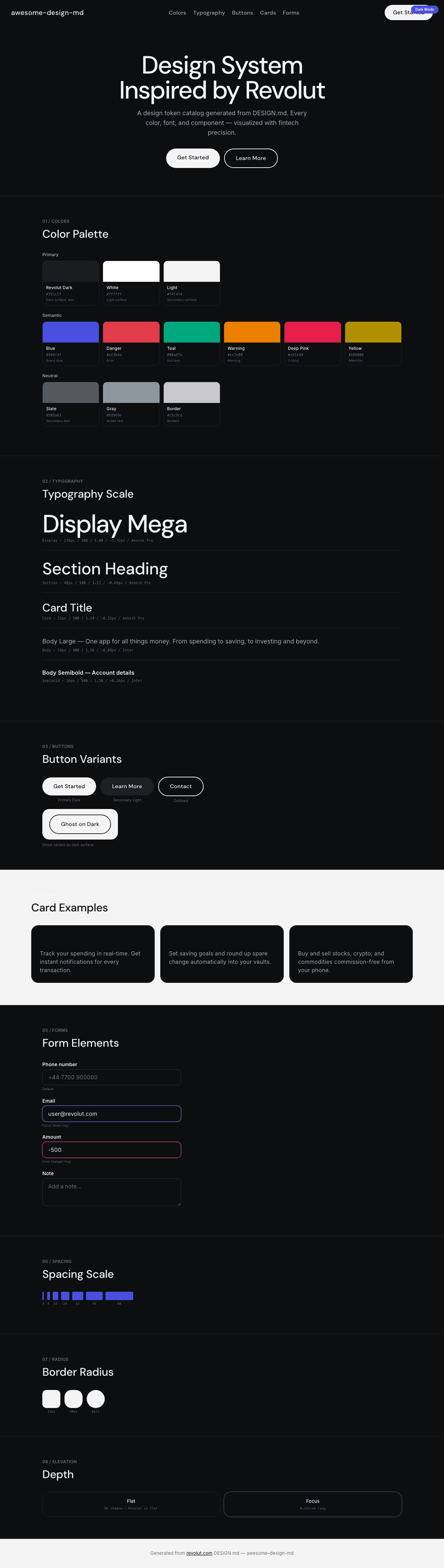
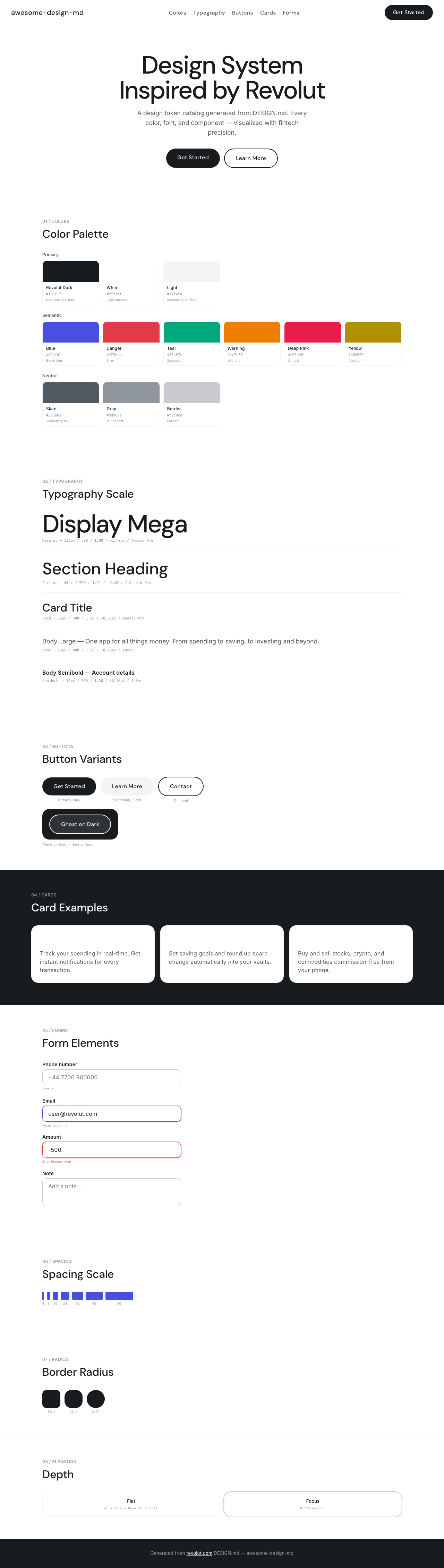
A sample landing page built with DESIGN.md. It shows the actual colors, typography, buttons, cards, spacing, and elevation, all in one page.
Dark Mode
Light Mode
Design System Inspiration of Revolut
1. Visual Theme & Atmosphere
Revolut's website is fintech confidence distilled into pixels — a design system that communicates "your money is in capable hands" through massive typography, generous whitespace, and a disciplined neutral palette. The visual language is built on Aeonik Pro, a geometric grotesque that creates billboard-scale headlines at 136px with weight 500 and aggressive negative tracking (-2.72px). This isn't subtle branding; it's fintech at stadium scale.
The color system is built on a comprehensive --rui-* (Revolut UI) token architecture with semantic naming for every state: danger (#e23b4a), warning (#ec7e00), teal (#00a87e), blue (#494fdf), deep-pink (#e61e49), and more. But the marketing surface itself is remarkably restrained — near-black (#191c1f) and pure white (#ffffff) dominate, with the colorful semantic tokens reserved for the product interface, not the marketing page.
What distinguishes Revolut is its pill-everything button system. Every button uses 9999px radius — primary dark (#191c1f), secondary light (#f4f4f4), outlined (transparent + 2px solid), and ghost on dark (rgba(244,244,244,0.1) + 2px solid). The padding is generous (14px 32px–34px), creating large, confident touch targets. Combined with Inter for body text at various weights and positive letter-spacing (0.16px–0.24px), the result is a design that feels both premium and accessible — banking for the modern era.
Key Characteristics:
- Aeonik Pro display at 136px weight 500 — billboard-scale fintech headlines
- Near-black (
#191c1f) + white binary with comprehensive--rui-*semantic tokens - Universal pill buttons (9999px radius) with generous padding (14px 32px)
- Inter for body text with positive letter-spacing (0.16px–0.24px)
- Rich semantic color system: blue, teal, pink, yellow, green, brown, danger, warning
- Zero shadows detected — depth through color contrast only
- Tight display line-heights (1.00) with relaxed body (1.50–1.56)
2. Color Palette & Roles
Primary
- Revolut Dark (
#191c1f): Primary dark surface, button background, near-black text - Pure White (
#ffffff):--rui-color-action-label, primary light surface - Light Surface (
#f4f4f4): Secondary button background, subtle surface
Brand / Interactive
- Revolut Blue (
#494fdf):--rui-color-blue, primary brand blue - Action Blue (
#4f55f1):--rui-color-action-photo-header-text, header accent - Blue Text (
#376cd5):--website-color-blue-text, link blue
Semantic
- Danger Red (
#e23b4a):--rui-color-danger, error/destructive - Deep Pink (
#e61e49):--rui-color-deep-pink, critical accent - Warning Orange (
#ec7e00):--rui-color-warning, warning states - Yellow (
#b09000):--rui-color-yellow, attention - Teal (
#00a87e):--rui-color-teal, success/positive - Light Green (
#428619):--rui-color-light-green, secondary success - Green Text (
#006400):--website-color-green-text, green text - Light Blue (
#007bc2):--rui-color-light-blue, informational - Brown (
#936d62):--rui-color-brown, warm neutral accent - Red Text (
#8b0000):--website-color-red-text, dark red text
Neutral Scale
- Mid Slate (
#505a63): Secondary text - Cool Gray (
#8d969e): Muted text, tertiary - Gray Tone (
#c9c9cd):--rui-color-grey-tone-20, borders/dividers
3. Typography Rules
Font Families
- Display:
Aeonik Pro— geometric grotesque, no detected fallbacks - Body / UI:
Inter— standard system sans - Fallback:
Arialfor specific button contexts
Hierarchy
| Role | Font | Size | Weight | Line Height | Letter Spacing | Notes |
|---|---|---|---|---|---|---|
| Display Mega | Aeonik Pro | 136px (8.50rem) | 500 | 1.00 (tight) | -2.72px | Stadium-scale hero |
| Display Hero | Aeonik Pro | 80px (5.00rem) | 500 | 1.00 (tight) | -0.8px | Primary hero |
| Section Heading | Aeonik Pro | 48px (3.00rem) | 500 | 1.21 (tight) | -0.48px | Feature sections |
| Sub-heading | Aeonik Pro | 40px (2.50rem) | 500 | 1.20 (tight) | -0.4px | Sub-sections |
| Card Title | Aeonik Pro | 32px (2.00rem) | 500 | 1.19 (tight) | -0.32px | Card headings |
| Feature Title | Aeonik Pro | 24px (1.50rem) | 400 | 1.33 | normal | Light headings |
| Nav / UI | Aeonik Pro | 20px (1.25rem) | 500 | 1.40 | normal | Navigation, buttons |
| Body Large | Inter | 18px (1.13rem) | 400 | 1.56 | -0.09px | Introductions |
| Body | Inter | 16px (1.00rem) | 400 | 1.50 | 0.24px | Standard reading |
| Body Semibold | Inter | 16px (1.00rem) | 600 | 1.50 | 0.16px | Emphasized body |
| Body Bold Link | Inter | 16px (1.00rem) | 700 | 1.50 | 0.24px | Bold links |
Principles
- Weight 500 as display default: Aeonik Pro uses medium (500) for ALL headings — no bold. This creates authority through size and tracking, not weight.
- Billboard tracking: -2.72px at 136px is extremely compressed — text designed to be read at a glance, like airport signage.
- Positive tracking on body: Inter uses +0.16px to +0.24px, creating airy, well-spaced reading text that contrasts with the compressed headings.
4. Component Stylings
Buttons
Primary Dark Pill
- Background:
#191c1f - Text:
#ffffff - Padding: 14px 32px
- Radius: 9999px (full pill)
- Hover: opacity 0.85
- Focus:
0 0 0 0.125remring
Secondary Light Pill
- Background:
#f4f4f4 - Text:
#000000 - Padding: 14px 34px
- Radius: 9999px
- Hover: opacity 0.85
Outlined Pill
- Background: transparent
- Text:
#191c1f - Border:
2px solid #191c1f - Padding: 14px 32px
- Radius: 9999px
Ghost on Dark
- Background:
rgba(244, 244, 244, 0.1) - Text:
#f4f4f4 - Border:
2px solid #f4f4f4 - Padding: 14px 32px
- Radius: 9999px
Cards & Containers
- Radius: 12px (small), 20px (cards)
- No shadows — flat surfaces with color contrast
- Dark and light section alternation
Navigation
- Aeonik Pro 20px weight 500
- Clean header, hamburger toggle at 12px radius
- Pill CTAs right-aligned
5. Layout Principles
Spacing System
- Base unit: 8px
- Scale: 4px, 6px, 8px, 14px, 16px, 20px, 24px, 32px, 40px, 48px, 80px, 88px, 120px
- Large section spacing: 80px–120px
Border Radius Scale
- Standard (12px): Navigation, small buttons
- Card (20px): Feature cards
- Pill (9999px): All buttons
6. Depth & Elevation
| Level | Treatment | Use |
|---|---|---|
| Flat (Level 0) | No shadow | Everything — Revolut uses zero shadows |
| Focus | 0 0 0 0.125rem ring |
Accessibility focus |
Shadow Philosophy: Revolut uses ZERO shadows. Depth comes entirely from the dark/light section contrast and the generous whitespace between elements.
7. Do's and Don'ts
Do
- Use Aeonik Pro weight 500 for all display headings
- Apply 9999px radius to all buttons — pill shape is universal
- Use generous button padding (14px 32px)
- Keep the palette to near-black + white for marketing surfaces
- Apply positive letter-spacing on Inter body text
Don't
- Don't use shadows — Revolut is flat by design
- Don't use bold (700) for Aeonik Pro headings — 500 is the weight
- Don't use small buttons — the generous padding is intentional
- Don't apply semantic colors to marketing surfaces — they're for the product
8. Responsive Behavior
Breakpoints
| Name | Width | Key Changes |
|---|---|---|
| Mobile Small | <400px | Compact, single column |
| Mobile | 400–720px | Standard mobile |
| Tablet | 720–1024px | 2-column layouts |
| Desktop | 1024–1280px | Standard desktop |
| Large | 1280–1920px | Full layout |
9. Agent Prompt Guide
Quick Color Reference
- Dark: Revolut Dark (
#191c1f) - Light: White (
#ffffff) - Surface: Light (
#f4f4f4) - Blue: Revolut Blue (
#494fdf) - Danger: Red (
#e23b4a) - Success: Teal (
#00a87e)
Example Component Prompts
- "Create a hero: white background. Headline at 136px Aeonik Pro weight 500, line-height 1.00, letter-spacing -2.72px, #191c1f text. Dark pill CTA (#191c1f, 9999px, 14px 32px). Outlined pill secondary (transparent, 2px solid #191c1f)."
- "Build a pill button: #191c1f background, white text, 9999px radius, 14px 32px padding, 20px Aeonik Pro weight 500. Hover: opacity 0.85."
Iteration Guide
- Aeonik Pro 500 for headings — never bold
- All buttons are pills (9999px) with generous padding
- Zero shadows — flat is the Revolut identity
- Near-black + white for marketing, semantic colors for product