设计详情
Spacex
DESIGN.md extracted from the public SpaceX website. This is not the official design system. Colors, fonts, and spacing may not be 100% accurate. But it's a good starting point for building something similar.
实时预览
预览效果
此条目同时提供浅色与深色预览资源。
文档
README & DESIGN
Spacex Inspired Design System
DESIGN.md extracted from the public SpaceX website. This is not the official design system. Colors, fonts, and spacing may not be 100% accurate. But it's a good starting point for building something similar.
Files
| File | Description |
|---|---|
DESIGN.md |
Complete design system documentation (9 sections) |
preview.html |
Interactive design token catalog (light) |
preview-dark.html |
Interactive design token catalog (dark) |
Use DESIGN.md to use as a reference for AI agents (Claude, Cursor, Stitch) to generate UI that looks like the Spacex design language.
Preview
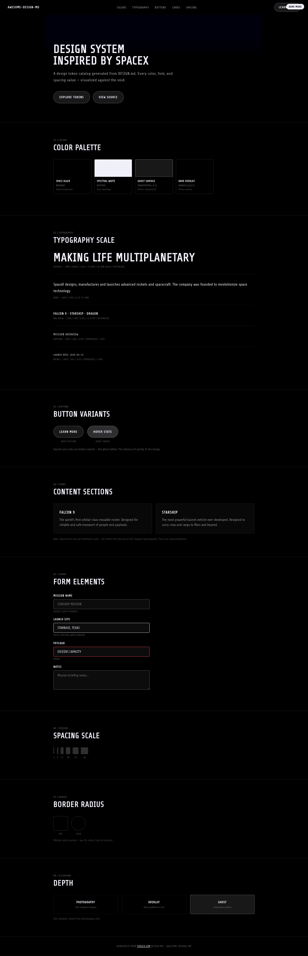
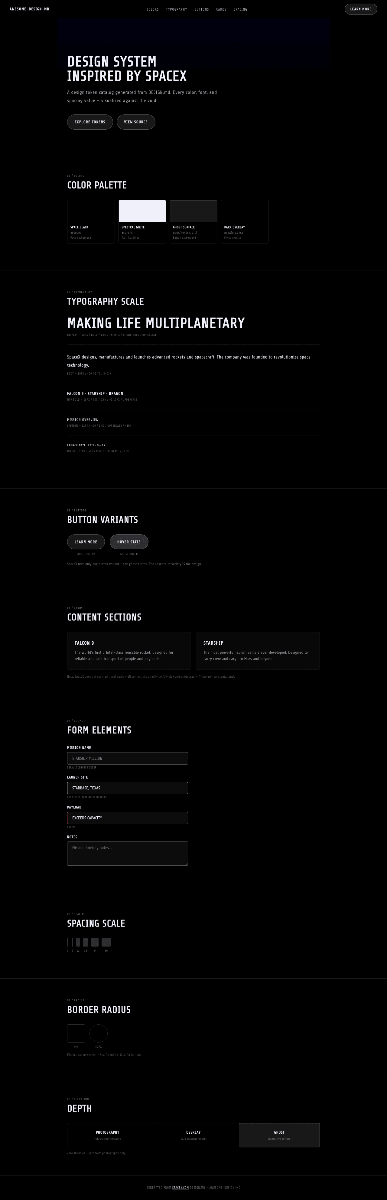
A sample landing page built with DESIGN.md. It shows the actual colors, typography, buttons, cards, spacing, and elevation, all in one page.
Dark Mode
Light Mode
Design System Inspiration of SpaceX
1. Visual Theme & Atmosphere
SpaceX's website is a full-screen cinematic experience that treats aerospace engineering like a film — every section is a scene, every photograph is a frame, and the interface disappears entirely behind the imagery. The design is pure black (#000000) with photography of rockets, space, and planets occupying 100% of the viewport. Text overlays sit directly on these photographs with no background panels, cards, or containers — just type on image, bold and unapologetic.
The typography system uses D-DIN, an industrial geometric typeface with DIN heritage (the German industrial standard). The defining characteristic is that virtually ALL text is uppercase with positive letter-spacing (0.96px–1.17px), creating a military/aerospace labeling system where every word feels stenciled onto a spacecraft hull. D-DIN-Bold at 48px with uppercase and 0.96px tracking for the hero creates headlines that feel like mission briefing titles. Even body text at 16px maintains the uppercase/tracked treatment at smaller scales.
What makes SpaceX distinctive is its radical minimalism: no shadows, no borders (except one ghost button border at rgba(240,240,250,0.35)), no color (only black and a spectral near-white #f0f0fa), no cards, no grids. The only visual element is photography + text. The ghost button with rgba(240,240,250,0.1) background and 32px radius is the sole interactive element — barely visible, floating over the imagery like a heads-up display. This isn't a design system in the traditional sense — it's a photographic exhibition with a type system and a single button.
Key Characteristics:
- Pure black canvas with full-viewport cinematic photography — the interface is invisible
- D-DIN / D-DIN-Bold — industrial DIN-heritage typeface
- Universal uppercase + positive letter-spacing (0.96px–1.17px) — aerospace stencil aesthetic
- Near-white spectral text (
#f0f0fa) — not pure white, a slight blue-violet tint - Zero shadows, zero cards, zero containers — text on image only
- Single ghost button:
rgba(240,240,250,0.1)background with spectral border - Full-viewport sections — each section is a cinematic "scene"
- No decorative elements — every pixel serves the photography
2. Color Palette & Roles
Primary
- Space Black (
#000000): Page background, the void of space — at 50% opacity for overlay gradient - Spectral White (
#f0f0fa): Text color — not pure white, a slight blue-violet tint that mimics starlight
Interactive
- Ghost Surface (
rgba(240, 240, 250, 0.1)): Button background — nearly invisible, 10% opacity - Ghost Border (
rgba(240, 240, 250, 0.35)): Button border — spectral, 35% opacity - Hover White (
var(--white-100)): Link hover state — full spectral white
Gradient
- Dark Overlay (
rgba(0, 0, 0, 0.5)): Gradient overlay on photographs to ensure text legibility
3. Typography Rules
Font Families
- Display:
D-DIN-Bold— bold industrial geometric - Body / UI:
D-DIN, fallbacks:Arial, Verdana
Hierarchy
| Role | Font | Size | Weight | Line Height | Letter Spacing | Notes |
|---|---|---|---|---|---|---|
| Display Hero | D-DIN-Bold | 48px (3.00rem) | 700 | 1.00 (tight) | 0.96px | text-transform: uppercase |
| Body | D-DIN | 16px (1.00rem) | 400 | 1.50–1.70 | normal | Standard reading text |
| Nav Link Bold | D-DIN | 13px (0.81rem) | 700 | 0.94 (tight) | 1.17px | text-transform: uppercase |
| Nav Link | D-DIN | 12px (0.75rem) | 400 | 2.00 (relaxed) | normal | text-transform: uppercase |
| Caption Bold | D-DIN | 13px (0.81rem) | 700 | 0.94 (tight) | 1.17px | text-transform: uppercase |
| Caption | D-DIN | 12px (0.75rem) | 400 | 1.00 (tight) | normal | text-transform: uppercase |
| Micro | D-DIN | 10px (0.63rem) | 400 | 0.94 (tight) | 1px | text-transform: uppercase |
Principles
- Universal uppercase: Nearly every text element uses
text-transform: uppercase. This creates a systematic military/aerospace voice where all communication feels like official documentation. - Positive letter-spacing as identity: 0.96px on display, 1.17px on nav — the wide tracking creates the stenciled, industrial feel that connects to DIN's heritage as a German engineering standard.
- Two weights, strict hierarchy: D-DIN-Bold (700) for headlines and nav emphasis, D-DIN (400) for body. No medium or semibold weights exist in the system.
- Tight line-heights: 0.94–1.00 across most text — compressed, efficient, mission-critical communication.
4. Component Stylings
Buttons
Ghost Button
- Background:
rgba(240, 240, 250, 0.1)(barely visible) - Text: Spectral White (
#f0f0fa) - Padding: 18px
- Radius: 32px
- Border:
1px solid rgba(240, 240, 250, 0.35) - Hover: background brightens, text to
var(--white-100) - Use: The only button variant — "LEARN MORE" CTAs on photography
Cards & Containers
- None. SpaceX does not use cards, panels, or containers. All content is text directly on full-viewport photographs. The absence of containers IS the design.
Inputs & Forms
- Not present on the homepage. The site is purely presentational.
Navigation
- Transparent overlay nav on photography
- D-DIN 13px weight 700, uppercase, 1.17px tracking
- Spectral white text on dark imagery
- Logo: SpaceX wordmark at 147x19px
- Mobile: hamburger collapse
Image Treatment
- Full-viewport (100vh) photography sections
- Professional aerospace photography: rockets, Mars, space
- Dark gradient overlays (
rgba(0,0,0,0.5)) for text legibility - Each section = one full-screen photograph with text overlay
- No border radius, no frames — edge-to-edge imagery
5. Layout Principles
Spacing System
- Base unit: 8px
- Scale: 3px, 5px, 12px, 15px, 18px, 20px, 24px, 30px
- Minimal scale — spacing is not the organizing principle; photography is
Grid & Container
- No traditional grid — each section is a full-viewport cinematic frame
- Text is positioned absolutely or with generous padding over imagery
- Left-aligned text blocks on photography backgrounds
- No max-width container — content bleeds to viewport edges
Whitespace Philosophy
- Photography IS the whitespace: Empty space in the design is never empty — it's filled with the dark expanse of space, the curve of a planet, or the flame of a rocket engine. Traditional whitespace concepts don't apply.
- Vertical pacing through viewport: Each section is exactly one viewport tall, creating a rhythmic scroll where each "page" reveals a new scene.
Border Radius Scale
- Sharp (4px): Small dividers, utility elements
- Button (32px): Ghost buttons — the only rounded element
6. Depth & Elevation
| Level | Treatment | Use |
|---|---|---|
| Photography (Level 0) | Full-viewport imagery | Background layer — always present |
| Overlay (Level 1) | rgba(0, 0, 0, 0.5) gradient |
Text legibility layer over photography |
| Text (Level 2) | Spectral white text, no shadow | Content layer — text floats directly on image |
| Ghost (Level 3) | rgba(240, 240, 250, 0.1) surface |
Barely-visible interactive layer |
Shadow Philosophy: SpaceX uses ZERO shadows. In a design built entirely on photography, shadows are meaningless — every surface is already a photograph with natural lighting. Depth comes from the photographic content itself: the receding curvature of Earth, the diminishing trail of a rocket, the atmospheric haze around Mars.
7. Do's and Don'ts
Do
- Use full-viewport photography as the primary design element — every section is a scene
- Apply uppercase + positive letter-spacing to ALL text — the aerospace stencil voice
- Use D-DIN exclusively — no other fonts exist in the system
- Keep the color palette to black + spectral white (
#f0f0fa) only - Use ghost buttons (
rgba(240,240,250,0.1)) as the sole interactive element - Apply dark gradient overlays for text legibility on photographs
- Let photography carry the emotional weight — the type system is functional, not expressive
Don't
- Don't add cards, panels, or containers — text sits directly on photography
- Don't use shadows — they have no meaning in a photographic context
- Don't introduce colors — the palette is strictly achromatic with spectral tint
- Don't use sentence case — everything is uppercase
- Don't use negative letter-spacing — all tracking is positive (0.96px–1.17px)
- Don't reduce photography to thumbnails — every image is full-viewport
- Don't add decorative elements (icons, badges, dividers) — the design is photography + type + one button
8. Responsive Behavior
Breakpoints
| Name | Width | Key Changes |
|---|---|---|
| Mobile | <600px | Stacked, reduced padding, smaller type |
| Tablet Small | 600–960px | Adjusted layout |
| Tablet | 960–1280px | Standard scaling |
| Desktop | 1280–1350px | Full layout |
| Large Desktop | 1350–1500px | Expanded |
| Ultra-wide | >1500px | Maximum viewport |
Touch Targets
- Ghost buttons: 18px padding provides adequate touch area
- Navigation links: uppercase with generous letter-spacing aids readability
Collapsing Strategy
- Photography: maintains full-viewport at all sizes, content reposition
- Hero text: 48px → scales down proportionally
- Navigation: horizontal → hamburger
- Text blocks: reposition but maintain overlay-on-photography pattern
- Full-viewport sections maintained on mobile
Image Behavior
- Edge-to-edge photography at all viewport sizes
- Background-size: cover with center focus
- Dark overlay gradients adapt to content position
- No art direction changes — same photographs, responsive positioning
9. Agent Prompt Guide
Quick Color Reference
- Background: Space Black (
#000000) - Text: Spectral White (
#f0f0fa) - Button background: Ghost (
rgba(240, 240, 250, 0.1)) - Button border: Ghost Border (
rgba(240, 240, 250, 0.35)) - Overlay:
rgba(0, 0, 0, 0.5)
Example Component Prompts
- "Create a full-viewport hero: background-image covering 100vh, dark gradient overlay rgba(0,0,0,0.5). Headline at 48px D-DIN-Bold, uppercase, letter-spacing 0.96px, spectral white (#f0f0fa) text. Ghost CTA button: rgba(240,240,250,0.1) bg, 1px solid rgba(240,240,250,0.35) border, 32px radius, 18px padding."
- "Design a navigation: transparent over photography. D-DIN 13px weight 700, uppercase, letter-spacing 1.17px, spectral white text. SpaceX wordmark left-aligned."
- "Build a content section: full-viewport height, background photography with dark overlay. Left-aligned text block with 48px D-DIN-Bold uppercase heading, 16px D-DIN body text, and ghost button below."
- "Create a micro label: D-DIN 10px, uppercase, letter-spacing 1px, spectral white, line-height 0.94."
Iteration Guide
- Start with photography — the image IS the design
- All text is uppercase with positive letter-spacing — no exceptions
- Only two colors: black and spectral white (#f0f0fa)
- Ghost buttons are the only interactive element — transparent, spectral-bordered
- Zero shadows, zero cards, zero decorative elements
- Every section is full-viewport (100vh) — cinematic pacing