设计详情
Stripe
DESIGN.md extracted from the public Stripe website. This is not the official design system. Colors, fonts, and spacing may not be 100% accurate. But it's a good starting point for building something similar.
实时预览
预览效果
此条目同时提供浅色与深色预览资源。
文档
README & DESIGN
Stripe Inspired Design System
DESIGN.md extracted from the public Stripe website. This is not the official design system. Colors, fonts, and spacing may not be 100% accurate. But it's a good starting point for building something similar.
Files
| File | Description |
|---|---|
DESIGN.md |
Complete design system documentation (9 sections) |
preview.html |
Interactive design token catalog (light) |
preview-dark.html |
Interactive design token catalog (dark) |
Use DESIGN.md to use as a reference for AI agents (Claude, Cursor, Stitch) to generate UI that looks like the Stripe design language.
Preview
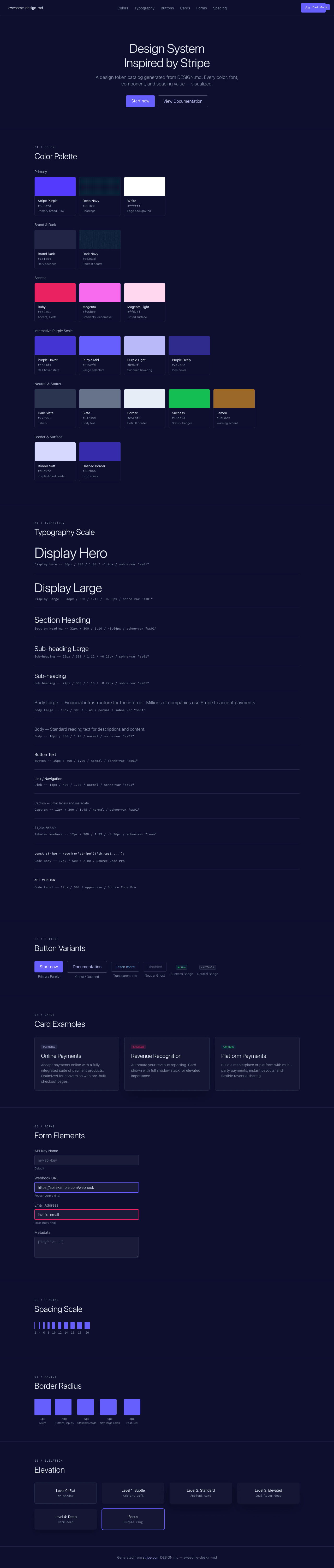
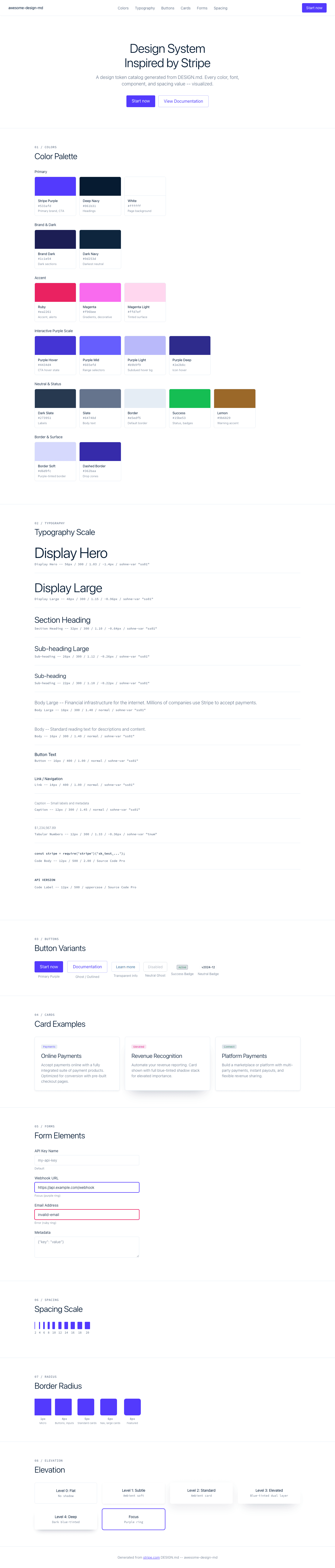
A sample landing page built with DESIGN.md. It shows the actual colors, typography, buttons, cards, spacing, and elevation, all in one page.
Dark Mode
Light Mode
Design System Inspiration of Stripe
1. Visual Theme & Atmosphere
Stripe's website is the gold standard of fintech design -- a system that manages to feel simultaneously technical and luxurious, precise and warm. The page opens on a clean white canvas (#ffffff) with deep navy headings (#061b31) and a signature purple (#533afd) that functions as both brand anchor and interactive accent. This isn't the cold, clinical purple of enterprise software; it's a rich, saturated violet that reads as confident and premium. The overall impression is of a financial institution redesigned by a world-class type foundry.
The custom sohne-var variable font is the defining element of Stripe's visual identity. Every text element enables the OpenType "ss01" stylistic set, which modifies character shapes for a distinctly geometric, modern feel. At display sizes (48px-56px), sohne-var runs at weight 300 -- an extraordinarily light weight for headlines that creates an ethereal, almost whispered authority. This is the opposite of the "bold hero headline" convention; Stripe's headlines feel like they don't need to shout. The negative letter-spacing (-1.4px at 56px, -0.96px at 48px) tightens the text into dense, engineered blocks. At smaller sizes, the system also uses weight 300 with proportionally reduced tracking, and tabular numerals via "tnum" for financial data display.
What truly distinguishes Stripe is its shadow system. Rather than the flat or single-layer approach of most sites, Stripe uses multi-layer, blue-tinted shadows: the signature rgba(50,50,93,0.25) combined with rgba(0,0,0,0.1) creates shadows with a cool, almost atmospheric depth -- like elements are floating in a twilight sky. The blue-gray undertone of the primary shadow color (50,50,93) ties directly to the navy-purple brand palette, making even elevation feel on-brand.
Key Characteristics:
- sohne-var with OpenType
"ss01"on all text -- a custom stylistic set that defines the brand's letterforms - Weight 300 as the signature headline weight -- light, confident, anti-convention
- Negative letter-spacing at display sizes (-1.4px at 56px, progressive relaxation downward)
- Blue-tinted multi-layer shadows using
rgba(50,50,93,0.25)-- elevation that feels brand-colored - Deep navy (
#061b31) headings instead of black -- warm, premium, financial-grade - Conservative border-radius (4px-8px) -- nothing pill-shaped, nothing harsh
- Ruby (
#ea2261) and magenta (#f96bee) accents for gradient and decorative elements SourceCodeProas the monospace companion for code and technical labels
2. Color Palette & Roles
Primary
- Stripe Purple (
#533afd): Primary brand color, CTA backgrounds, link text, interactive highlights. A saturated blue-violet that anchors the entire system. - Deep Navy (
#061b31):--hds-color-heading-solid. Primary heading color. Not black, not gray -- a very dark blue that adds warmth and depth to text. - Pure White (
#ffffff): Page background, card surfaces, button text on dark backgrounds.
Brand & Dark
- Brand Dark (
#1c1e54):--hds-color-util-brand-900. Deep indigo for dark sections, footer backgrounds, and immersive brand moments. - Dark Navy (
#0d253d):--hds-color-core-neutral-975. The darkest neutral -- almost-black with a blue undertone for maximum depth without harshness.
Accent Colors
- Ruby (
#ea2261):--hds-color-accentColorMode-ruby-icon-solid. Warm red-pink for icons, alerts, and accent elements. - Magenta (
#f96bee):--hds-color-accentColorMode-magenta-icon-gradientMiddle. Vivid pink-purple for gradients and decorative highlights. - Magenta Light (
#ffd7ef):--hds-color-util-accent-magenta-100. Tinted surface for magenta-themed cards and badges.
Interactive
- Primary Purple (
#533afd): Primary link color, active states, selected elements. - Purple Hover (
#4434d4): Darker purple for hover states on primary elements. - Purple Deep (
#2e2b8c):--hds-color-button-ui-iconHover. Dark purple for icon hover states. - Purple Light (
#b9b9f9):--hds-color-action-bg-subduedHover. Soft lavender for subdued hover backgrounds. - Purple Mid (
#665efd):--hds-color-input-selector-text-range. Range selector and input highlight color.
Neutral Scale
- Heading (
#061b31): Primary headings, nav text, strong labels. - Label (
#273951):--hds-color-input-text-label. Form labels, secondary headings. - Body (
#64748d): Secondary text, descriptions, captions. - Success Green (
#15be53): Status badges, success indicators (with 0.2-0.4 alpha for backgrounds/borders). - Success Text (
#108c3d): Success badge text color. - Lemon (
#9b6829):--hds-color-core-lemon-500. Warning and highlight accent.
Surface & Borders
- Border Default (
#e5edf5): Standard border color for cards, dividers, and containers. - Border Purple (
#b9b9f9): Active/selected state borders on buttons and inputs. - Border Soft Purple (
#d6d9fc): Subtle purple-tinted borders for secondary elements. - Border Magenta (
#ffd7ef): Pink-tinted borders for magenta-themed elements. - Border Dashed (
#362baa): Dashed borders for drop zones and placeholder elements.
Shadow Colors
- Shadow Blue (
rgba(50,50,93,0.25)): The signature -- blue-tinted primary shadow color. - Shadow Dark Blue (
rgba(3,3,39,0.25)): Deeper blue shadow for elevated elements. - Shadow Black (
rgba(0,0,0,0.1)): Secondary shadow layer for depth reinforcement. - Shadow Ambient (
rgba(23,23,23,0.08)): Soft ambient shadow for subtle elevation. - Shadow Soft (
rgba(23,23,23,0.06)): Minimal ambient shadow for light lift.
3. Typography Rules
Font Family
- Primary:
sohne-var, with fallback:SF Pro Display - Monospace:
SourceCodePro, with fallback:SFMono-Regular - OpenType Features:
"ss01"enabled globally on all sohne-var text;"tnum"for tabular numbers on financial data and captions.
Hierarchy
| Role | Font | Size | Weight | Line Height | Letter Spacing | Features | Notes |
|---|---|---|---|---|---|---|---|
| Display Hero | sohne-var | 56px (3.50rem) | 300 | 1.03 (tight) | -1.4px | ss01 | Maximum size, whisper-weight authority |
| Display Large | sohne-var | 48px (3.00rem) | 300 | 1.15 (tight) | -0.96px | ss01 | Secondary hero headlines |
| Section Heading | sohne-var | 32px (2.00rem) | 300 | 1.10 (tight) | -0.64px | ss01 | Feature section titles |
| Sub-heading Large | sohne-var | 26px (1.63rem) | 300 | 1.12 (tight) | -0.26px | ss01 | Card headings, sub-sections |
| Sub-heading | sohne-var | 22px (1.38rem) | 300 | 1.10 (tight) | -0.22px | ss01 | Smaller section heads |
| Body Large | sohne-var | 18px (1.13rem) | 300 | 1.40 | normal | ss01 | Feature descriptions, intro text |
| Body | sohne-var | 16px (1.00rem) | 300-400 | 1.40 | normal | ss01 | Standard reading text |
| Button | sohne-var | 16px (1.00rem) | 400 | 1.00 (tight) | normal | ss01 | Primary button text |
| Button Small | sohne-var | 14px (0.88rem) | 400 | 1.00 (tight) | normal | ss01 | Secondary/compact buttons |
| Link | sohne-var | 14px (0.88rem) | 400 | 1.00 (tight) | normal | ss01 | Navigation links |
| Caption | sohne-var | 13px (0.81rem) | 400 | normal | normal | ss01 | Small labels, metadata |
| Caption Small | sohne-var | 12px (0.75rem) | 300-400 | 1.33-1.45 | normal | ss01 | Fine print, timestamps |
| Caption Tabular | sohne-var | 12px (0.75rem) | 300-400 | 1.33 | -0.36px | tnum | Financial data, numbers |
| Micro | sohne-var | 10px (0.63rem) | 300 | 1.15 (tight) | 0.1px | ss01 | Tiny labels, axis markers |
| Micro Tabular | sohne-var | 10px (0.63rem) | 300 | 1.15 (tight) | -0.3px | tnum | Chart data, small numbers |
| Nano | sohne-var | 8px (0.50rem) | 300 | 1.07 (tight) | normal | ss01 | Smallest labels |
| Code Body | SourceCodePro | 12px (0.75rem) | 500 | 2.00 (relaxed) | normal | -- | Code blocks, syntax |
| Code Bold | SourceCodePro | 12px (0.75rem) | 700 | 2.00 (relaxed) | normal | -- | Bold code, keywords |
| Code Label | SourceCodePro | 12px (0.75rem) | 500 | 2.00 (relaxed) | normal | uppercase | Technical labels |
| Code Micro | SourceCodePro | 9px (0.56rem) | 500 | 1.00 (tight) | normal | ss01 | Tiny code annotations |
Principles
- Light weight as signature: Weight 300 at display sizes is Stripe's most distinctive typographic choice. Where others use 600-700 to command attention, Stripe uses lightness as luxury -- the text is so confident it doesn't need weight to be authoritative.
- ss01 everywhere: The
"ss01"stylistic set is non-negotiable. It modifies specific glyphs (likely alternatea,g,lforms) to create a more geometric, contemporary feel across all sohne-var text. - Two OpenType modes:
"ss01"for display/body text,"tnum"for tabular numerals in financial data. These never overlap -- a number in a paragraph uses ss01, a number in a data table uses tnum. - Progressive tracking: Letter-spacing tightens proportionally with size: -1.4px at 56px, -0.96px at 48px, -0.64px at 32px, -0.26px at 26px, normal at 16px and below.
- Two-weight simplicity: Primarily 300 (body and headings) and 400 (UI/buttons). No bold (700) in the primary font -- SourceCodePro uses 500/700 for code contrast.
4. Component Stylings
Buttons
Primary Purple
- Background:
#533afd - Text:
#ffffff - Padding: 8px 16px
- Radius: 4px
- Font: 16px sohne-var weight 400,
"ss01" - Hover:
#4434d4background - Use: Primary CTA ("Start now", "Contact sales")
Ghost / Outlined
- Background: transparent
- Text:
#533afd - Padding: 8px 16px
- Radius: 4px
- Border:
1px solid #b9b9f9 - Font: 16px sohne-var weight 400,
"ss01" - Hover: background shifts to
rgba(83,58,253,0.05) - Use: Secondary actions
Transparent Info
- Background: transparent
- Text:
#2874ad - Padding: 8px 16px
- Radius: 4px
- Border:
1px solid rgba(43,145,223,0.2) - Use: Tertiary/info-level actions
Neutral Ghost
- Background: transparent (
rgba(255,255,255,0)) - Text:
rgba(16,16,16,0.3) - Padding: 8px 16px
- Radius: 4px
- Outline:
1px solid rgb(212,222,233) - Use: Disabled or muted actions
Cards & Containers
- Background:
#ffffff - Border:
1px solid #e5edf5(standard) or1px solid #061b31(dark accent) - Radius: 4px (tight), 5px (standard), 6px (comfortable), 8px (featured)
- Shadow (standard):
rgba(50,50,93,0.25) 0px 30px 45px -30px, rgba(0,0,0,0.1) 0px 18px 36px -18px - Shadow (ambient):
rgba(23,23,23,0.08) 0px 15px 35px 0px - Hover: shadow intensifies, often adding the blue-tinted layer
Badges / Tags / Pills
Neutral Pill
- Background:
#ffffff - Text:
#000000 - Padding: 0px 6px
- Radius: 4px
- Border:
1px solid #f6f9fc - Font: 11px weight 400
Success Badge
- Background:
rgba(21,190,83,0.2) - Text:
#108c3d - Padding: 1px 6px
- Radius: 4px
- Border:
1px solid rgba(21,190,83,0.4) - Font: 10px weight 300
Inputs & Forms
- Border:
1px solid #e5edf5 - Radius: 4px
- Focus:
1px solid #533afdor purple ring - Label:
#273951, 14px sohne-var - Text:
#061b31 - Placeholder:
#64748d
Navigation
- Clean horizontal nav on white, sticky with blur backdrop
- Brand logotype left-aligned
- Links: sohne-var 14px weight 400,
#061b31text with"ss01" - Radius: 6px on nav container
- CTA: purple button right-aligned ("Sign in", "Start now")
- Mobile: hamburger toggle with 6px radius
Decorative Elements
Dashed Borders
1px dashed #362baa(purple) for placeholder/drop zones1px dashed #ffd7ef(magenta) for magenta-themed decorative borders
Gradient Accents
- Ruby-to-magenta gradients (
#ea2261to#f96bee) for hero decorations - Brand dark sections use
#1c1e54backgrounds with white text
5. Layout Principles
Spacing System
- Base unit: 8px
- Scale: 1px, 2px, 4px, 6px, 8px, 10px, 11px, 12px, 14px, 16px, 18px, 20px
- Notable: The scale is dense at the small end (every 2px from 4-12), reflecting Stripe's precision-oriented UI for financial data
Grid & Container
- Max content width: approximately 1080px
- Hero: centered single-column with generous padding, lightweight headlines
- Feature sections: 2-3 column grids for feature cards
- Full-width dark sections with
#1c1e54background for brand immersion - Code/dashboard previews as contained cards with blue-tinted shadows
Whitespace Philosophy
- Precision spacing: Unlike the vast emptiness of minimalist systems, Stripe uses measured, purposeful whitespace. Every gap is a deliberate typographic choice.
- Dense data, generous chrome: Financial data displays (tables, charts) are tightly packed, but the UI chrome around them is generously spaced. This creates a sense of controlled density -- like a well-organized spreadsheet in a beautiful frame.
- Section rhythm: White sections alternate with dark brand sections (
#1c1e54), creating a dramatic light/dark cadence that prevents monotony without introducing arbitrary color.
Border Radius Scale
- Micro (1px): Fine-grained elements, subtle rounding
- Standard (4px): Buttons, inputs, badges, cards -- the workhorse
- Comfortable (5px): Standard card containers
- Relaxed (6px): Navigation, larger interactive elements
- Large (8px): Featured cards, hero elements
- Compound:
0px 0px 6px 6pxfor bottom-rounded containers (tab panels, dropdown footers)
6. Depth & Elevation
| Level | Treatment | Use |
|---|---|---|
| Flat (Level 0) | No shadow | Page background, inline text |
| Ambient (Level 1) | rgba(23,23,23,0.06) 0px 3px 6px |
Subtle card lift, hover hints |
| Standard (Level 2) | rgba(23,23,23,0.08) 0px 15px 35px |
Standard cards, content panels |
| Elevated (Level 3) | rgba(50,50,93,0.25) 0px 30px 45px -30px, rgba(0,0,0,0.1) 0px 18px 36px -18px |
Featured cards, dropdowns, popovers |
| Deep (Level 4) | rgba(3,3,39,0.25) 0px 14px 21px -14px, rgba(0,0,0,0.1) 0px 8px 17px -8px |
Modals, floating panels |
| Ring (Accessibility) | 2px solid #533afd outline |
Keyboard focus ring |
Shadow Philosophy: Stripe's shadow system is built on a principle of chromatic depth. Where most design systems use neutral gray or black shadows, Stripe's primary shadow color (rgba(50,50,93,0.25)) is a deep blue-gray that echoes the brand's navy palette. This creates shadows that don't just add depth -- they add brand atmosphere. The multi-layer approach pairs this blue-tinted shadow with a pure black secondary layer (rgba(0,0,0,0.1)) at a different offset, creating a parallax-like depth where the branded shadow sits farther from the element and the neutral shadow sits closer. The negative spread values (-30px, -18px) ensure shadows don't extend beyond the element's footprint horizontally, keeping elevation vertical and controlled.
Decorative Depth
- Dark brand sections (
#1c1e54) create immersive depth through background color contrast - Gradient overlays with ruby-to-magenta transitions for hero decorations
- Shadow color
rgba(0,55,112,0.08)(--hds-color-shadow-sm-top) for top-edge shadows on sticky elements
7. Do's and Don'ts
Do
- Use sohne-var with
"ss01"on every text element -- the stylistic set IS the brand - Use weight 300 for all headlines and body text -- lightness is the signature
- Apply blue-tinted shadows (
rgba(50,50,93,0.25)) for all elevated elements - Use
#061b31(deep navy) for headings instead of#000000-- the warmth matters - Keep border-radius between 4px-8px -- conservative rounding is intentional
- Use
"tnum"for any tabular/financial number display - Layer shadows: blue-tinted far + neutral close for depth parallax
- Use
#533afdpurple as the primary interactive/CTA color
Don't
- Don't use weight 600-700 for sohne-var headlines -- weight 300 is the brand voice
- Don't use large border-radius (12px+, pill shapes) on cards or buttons -- Stripe is conservative
- Don't use neutral gray shadows -- always tint with blue (
rgba(50,50,93,...)) - Don't skip
"ss01"on any sohne-var text -- the alternate glyphs define the personality - Don't use pure black (
#000000) for headings -- always#061b31deep navy - Don't use warm accent colors (orange, yellow) for interactive elements -- purple is primary
- Don't apply positive letter-spacing at display sizes -- Stripe tracks tight
- Don't use the magenta/ruby accents for buttons or links -- they're decorative/gradient only
8. Responsive Behavior
Breakpoints
| Name | Width | Key Changes |
|---|---|---|
| Mobile | <640px | Single column, reduced heading sizes, stacked cards |
| Tablet | 640-1024px | 2-column grids, moderate padding |
| Desktop | 1024-1280px | Full layout, 3-column feature grids |
| Large Desktop | >1280px | Centered content with generous margins |
Touch Targets
- Buttons use comfortable padding (8px-16px vertical)
- Navigation links at 14px with adequate spacing
- Badges have 6px horizontal padding minimum for tap targets
- Mobile nav toggle with 6px radius button
Collapsing Strategy
- Hero: 56px display -> 32px on mobile, weight 300 maintained
- Navigation: horizontal links + CTAs -> hamburger toggle
- Feature cards: 3-column -> 2-column -> single column stacked
- Dark brand sections: maintain full-width treatment, reduce internal padding
- Financial data tables: horizontal scroll on mobile
- Section spacing: 64px+ -> 40px on mobile
- Typography scale compresses: 56px -> 48px -> 32px hero sizes across breakpoints
Image Behavior
- Dashboard/product screenshots maintain blue-tinted shadow at all sizes
- Hero gradient decorations simplify on mobile
- Code blocks maintain
SourceCodeProtreatment, may horizontally scroll - Card images maintain consistent 4px-6px border-radius
9. Agent Prompt Guide
Quick Color Reference
- Primary CTA: Stripe Purple (
#533afd) - CTA Hover: Purple Dark (
#4434d4) - Background: Pure White (
#ffffff) - Heading text: Deep Navy (
#061b31) - Body text: Slate (
#64748d) - Label text: Dark Slate (
#273951) - Border: Soft Blue (
#e5edf5) - Link: Stripe Purple (
#533afd) - Dark section: Brand Dark (
#1c1e54) - Success: Green (
#15be53) - Accent decorative: Ruby (
#ea2261), Magenta (#f96bee)
Example Component Prompts
- "Create a hero section on white background. Headline at 48px sohne-var weight 300, line-height 1.15, letter-spacing -0.96px, color #061b31, font-feature-settings 'ss01'. Subtitle at 18px weight 300, line-height 1.40, color #64748d. Purple CTA button (#533afd, 4px radius, 8px 16px padding, white text) and ghost button (transparent, 1px solid #b9b9f9, #533afd text, 4px radius)."
- "Design a card: white background, 1px solid #e5edf5 border, 6px radius. Shadow: rgba(50,50,93,0.25) 0px 30px 45px -30px, rgba(0,0,0,0.1) 0px 18px 36px -18px. Title at 22px sohne-var weight 300, letter-spacing -0.22px, color #061b31, 'ss01'. Body at 16px weight 300, #64748d."
- "Build a success badge: rgba(21,190,83,0.2) background, #108c3d text, 4px radius, 1px 6px padding, 10px sohne-var weight 300, border 1px solid rgba(21,190,83,0.4)."
- "Create navigation: white sticky header with backdrop-filter blur(12px). sohne-var 14px weight 400 for links, #061b31 text, 'ss01'. Purple CTA 'Start now' right-aligned (#533afd bg, white text, 4px radius). Nav container 6px radius."
- "Design a dark brand section: #1c1e54 background, white text. Headline 32px sohne-var weight 300, letter-spacing -0.64px, 'ss01'. Body 16px weight 300, rgba(255,255,255,0.7). Cards inside use rgba(255,255,255,0.1) border with 6px radius."
Iteration Guide
- Always enable
font-feature-settings: "ss01"on sohne-var text -- this is the brand's typographic DNA - Weight 300 is the default; use 400 only for buttons/links/navigation
- Shadow formula:
rgba(50,50,93,0.25) 0px Y1 B1 -S1, rgba(0,0,0,0.1) 0px Y2 B2 -S2where Y1/B1 are larger (far shadow) and Y2/B2 are smaller (near shadow) - Heading color is
#061b31(deep navy), body is#64748d(slate), labels are#273951(dark slate) - Border-radius stays in the 4px-8px range -- never use pill shapes or large rounding
- Use
"tnum"for any numbers in tables, charts, or financial displays - Dark sections use
#1c1e54-- not black, not gray, but a deep branded indigo - SourceCodePro for code at 12px/500 with 2.00 line-height (very generous for readability)