
設計詳情
Miro
DESIGN.md extracted from the public Miro website. This is not the official design system. Colors, fonts, and spacing may not be 100% accurate. But it's a good starting point for building something similar.
即時預覽
支援主題的預覽框
此項目同時提供淺色與深色預覽資源。
文件
README 與 DESIGN 集中檢視
Miro Inspired Design System
DESIGN.md extracted from the public Miro website. This is not the official design system. Colors, fonts, and spacing may not be 100% accurate. But it's a good starting point for building something similar.
Files
| File | Description |
|---|---|
DESIGN.md |
Complete design system documentation (9 sections) |
preview.html |
Interactive design token catalog (light) |
preview-dark.html |
Interactive design token catalog (dark) |
Use DESIGN.md to use as a reference for AI agents (Claude, Cursor, Stitch) to generate UI that looks like the Miro design language.
Preview
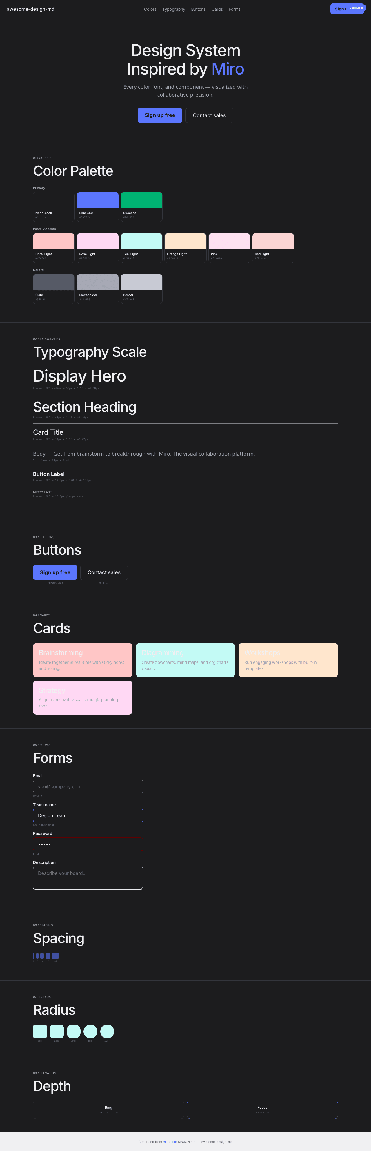
A sample landing page built with DESIGN.md. It shows the actual colors, typography, buttons, cards, spacing, and elevation, all in one page.
Dark Mode
Light Mode
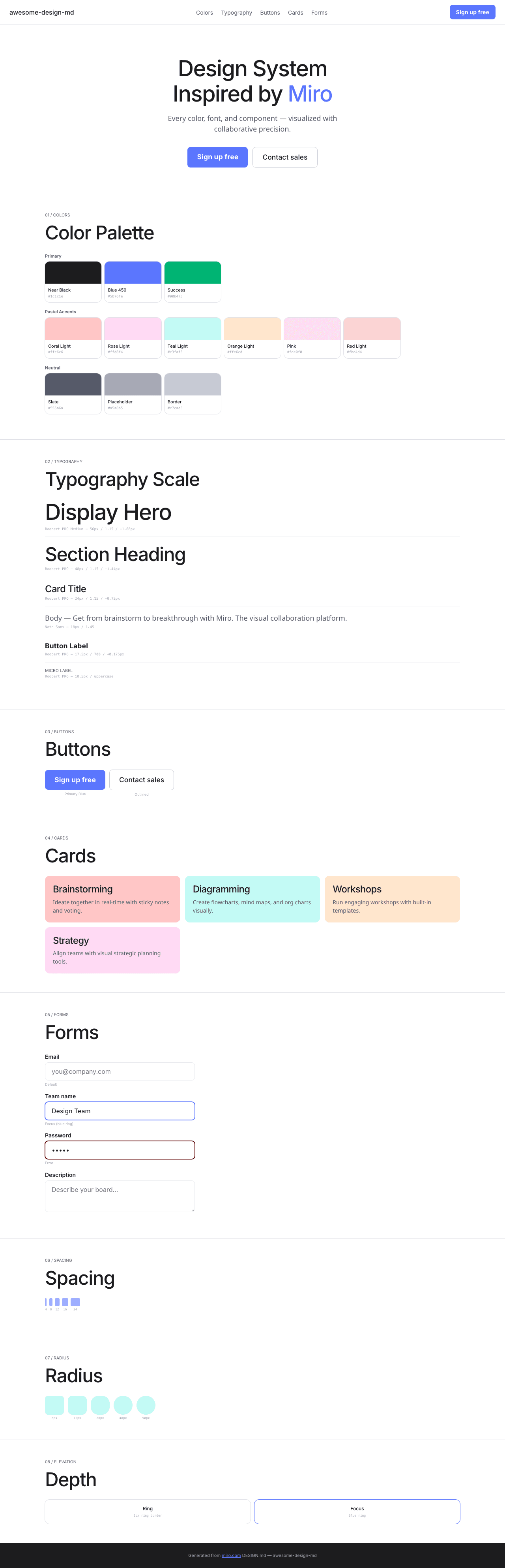
Design System Inspiration of Miro
1. Visual Theme & Atmosphere
Miro's website is a clean, collaborative-tool-forward platform that communicates "visual thinking" through generous whitespace, pastel accent colors, and a confident geometric font. The design uses a predominantly white canvas with near-black text (#1c1c1e) and a distinctive pastel color palette — coral, rose, teal, orange, yellow, moss — each representing different collaboration contexts.
The typography uses Roobert PRO Medium as the primary display font with OpenType character variants ("blwf", "cv03", "cv04", "cv09", "cv11") and negative letter-spacing (-1.68px at 56px). Noto Sans handles body text with its own stylistic set ("liga" 0, "ss01", "ss04", "ss05"). The design is built with Framer, giving it smooth animations and modern component patterns.
Key Characteristics:
- White canvas with near-black (
#1c1c1e) text - Roobert PRO Medium with multiple OpenType character variants
- Pastel accent palette: coral, rose, teal, orange, yellow, moss (light + dark pairs)
- Blue 450 (
#5b76fe) as primary interactive color - Success green (
#00b473) for positive states - Generous border-radius: 8px–50px range
- Framer-built with smooth motion patterns
- Ring shadow border:
rgb(224,226,232) 0px 0px 0px 1px
2. Color Palette & Roles
Primary
- Near Black (
#1c1c1e): Primary text - White (
#ffffff):--tw-color-white, primary surface - Blue 450 (
#5b76fe):--tw-color-blue-450, primary interactive - Actionable Pressed (
#2a41b6):--tw-color-actionable-pressed
Pastel Accents (Light/Dark pairs)
- Coral: Light
#ffc6c6/ Dark#600000 - Rose: Light
#ffd8f4/ Dark (implied) - Teal: Light
#c3faf5/ Dark#187574 - Orange: Light
#ffe6cd - Yellow: Dark
#746019 - Moss: Dark
#187574 - Pink (
#fde0f0): Soft pink surface - Red (
#fbd4d4): Light red surface - Dark Red (
#e3c5c5): Muted red
Semantic
- Success (
#00b473):--tw-color-success-accent
Neutral
- Slate (
#555a6a): Secondary text - Input Placeholder (
#a5a8b5):--tw-color-input-placeholder - Border (
#c7cad5): Button borders - Ring (
rgb(224,226,232)): Shadow-as-border
3. Typography Rules
Font Families
- Display:
Roobert PRO Medium, fallback: Placeholder —"blwf", "cv03", "cv04", "cv09", "cv11" - Display Variants:
Roobert PRO SemiBold,Roobert PRO SemiBold Italic,Roobert PRO - Body:
Noto Sans—"liga" 0, "ss01", "ss04", "ss05"
Hierarchy
| Role | Font | Size | Weight | Line Height | Letter Spacing |
|---|---|---|---|---|---|
| Display Hero | Roobert PRO Medium | 56px | 400 | 1.15 | -1.68px |
| Section Heading | Roobert PRO Medium | 48px | 400 | 1.15 | -1.44px |
| Card Title | Roobert PRO Medium | 24px | 400 | 1.15 | -0.72px |
| Sub-heading | Noto Sans | 22px | 400 | 1.35 | -0.44px |
| Feature | Roobert PRO Medium | 18px | 600 | 1.35 | normal |
| Body | Noto Sans | 18px | 400 | 1.45 | normal |
| Body Standard | Noto Sans | 16px | 400–600 | 1.50 | -0.16px |
| Button | Roobert PRO Medium | 17.5px | 700 | 1.29 | 0.175px |
| Caption | Roobert PRO Medium | 14px | 400 | 1.71 | normal |
| Small | Roobert PRO Medium | 12px | 400 | 1.15 | -0.36px |
| Micro Uppercase | Roobert PRO | 10.5px | 400 | 0.90 | uppercase |
4. Component Stylings
Buttons
- Outlined: transparent bg,
1px solid #c7cad5, 8px radius, 7px 12px padding - White circle: 50% radius, white bg with shadow
- Blue primary (implied from interactive color)
Cards: 12px–24px radius, pastel backgrounds
Inputs: white bg, 1px solid #e9eaef, 8px radius, 16px padding
5. Layout Principles
- Spacing: 1–24px base scale
- Radius: 8px (buttons), 10px–12px (cards), 20px–24px (panels), 40px–50px (large containers)
- Ring shadow:
rgb(224,226,232) 0px 0px 0px 1px
6. Depth & Elevation
Minimal — ring shadow + pastel surface contrast
7. Do's and Don'ts
Do
- Use pastel light/dark pairs for feature sections
- Apply Roobert PRO with OpenType character variants
- Use Blue 450 (#5b76fe) for interactive elements
Don't
- Don't use heavy shadows
- Don't mix more than 2 pastel accents per section
8. Responsive Behavior
Breakpoints: 425px, 576px, 768px, 896px, 1024px, 1200px, 1280px, 1366px, 1700px, 1920px
9. Agent Prompt Guide
Quick Color Reference
- Text: Near Black (
#1c1c1e) - Background: White (
#ffffff) - Interactive: Blue 450 (
#5b76fe) - Success:
#00b473 - Border:
#c7cad5
Example Component Prompts
- "Create hero: white background. Roobert PRO Medium 56px, line-height 1.15, letter-spacing -1.68px. Blue CTA (#5b76fe). Outlined secondary (1px solid #c7cad5, 8px radius)."
Hagicode
OpenSpec 工作流、多 Agent 執行與 Hero Dungeon 介面,是用來打造這個畫廊外殼的產品概念。
讓想法更快變成好用的軟體,讓智慧編碼更聰明、更高效,也更有趣。
- SmartOpenSpec 將意圖轉化為從想法到交付的可執行路徑。
- Efficient多 Agent 工作流程讓研究、實作與審閱平行推進。
- FunHero Dungeon 讓長時間編碼協作更直觀、更有參與感。
HagiCode promo
看看 HagiCode 如何讓 Agentic Coding 真正運轉起來。